The world has just surpassed the mark of 13 billion COVID-19 vaccinations. This is a remarkable feat as at no other time in history we have managed to develop vaccines so quickly and deploy them so widely as during this pandemic. These accomplishments notwithstanding, the business is unfinished: a large share of the global population remains either unvaccinated or undervaccinated.
Yet, the momentum to fill the remaining vaccination gaps has almost completely ground to a premature halt, while inequalities across countries are widening. On current trends, the present gaps will likely persist and get larger as immunities wane, causing entirely preventable suffering for the years to come.
This post documents the status of the global vaccination campaign: what we have accomplished, what remains to be done and why this is not the time to give up on vaccinating the world.
Let us first characterize the progress made under the primary vaccination campaign. We will provide absolute and relative perspectives on primary vaccination, highlight how many unvaccinated people remain, where they live and how diverse the experiences have been at the country level.
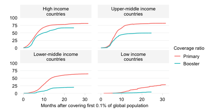
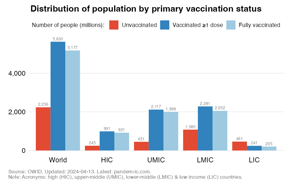
Since inequality across countries is the hallmark of this data analytics resource, we first cut the data by World Bank income group. This allows us to assess vaccination progress across high, upper-middle, lower-middle and low income countries (HICs, UMICs, LMICs and LICs). The chart below then shows the population-weighted results for primary vaccination for the world and across these income groups.
The chart shows:
Cutting the data by UN subregion provides a complementary geographical perspective to the functional perspective of the income classification. The UN classification divides the world into 22 subregions, which yields a granular geographical view of primary vaccination progress.
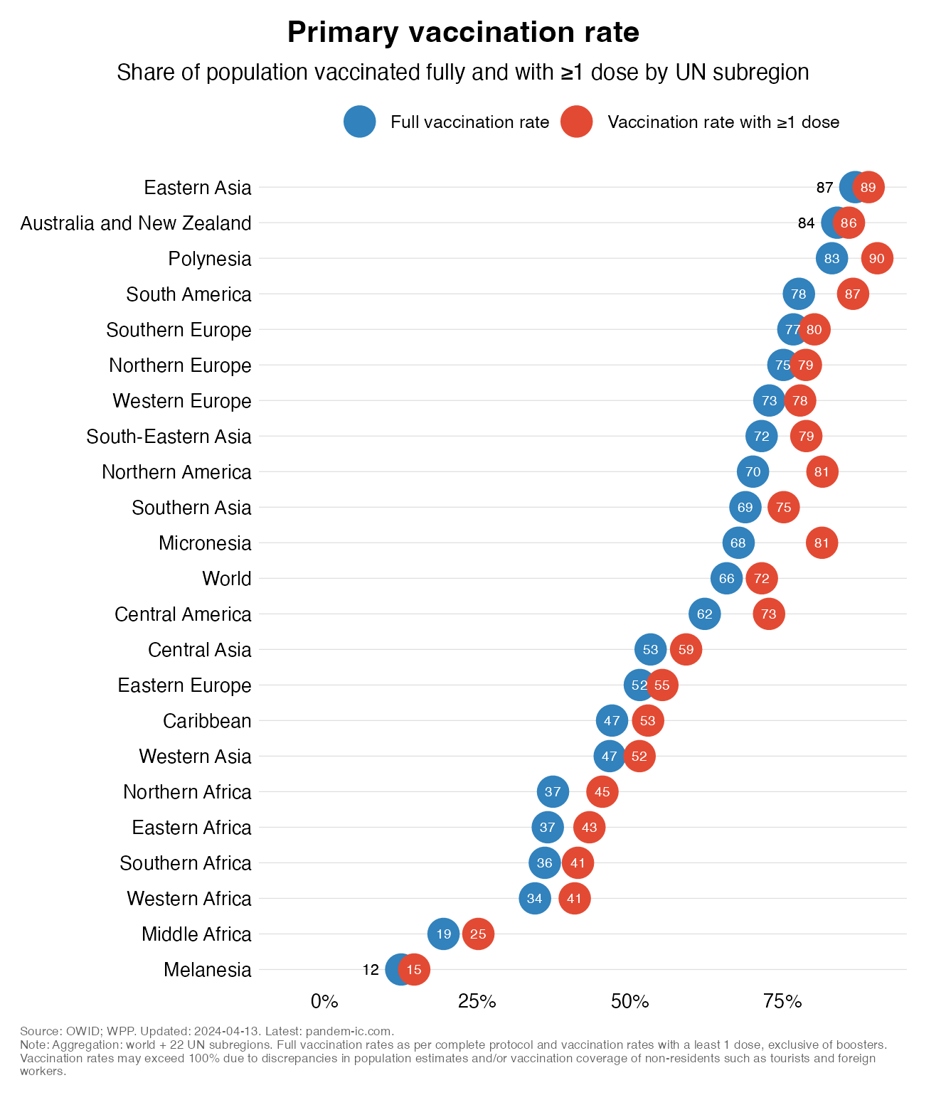
Some results:
All of Africa is at the very bottom of this chart. The African regions – Northern , Eastern, Southern, Western and Middle – are all there, joined by Melanesia.
The chart below enumerates the number of people who are unvaccinated globally as well for our four income groups.
The chart shows:
Across income groups, we see large disparities that reflect the combined effects of population size and vaccination status. HICs represent 0.2 billion, UMICs 0.5 billion, LMICs 1.1 billion, and LICs 0.5 billion among the unvaccinated population globally.
The chart below shows the share of different income groups in the global number of unvaccinated as well as in the global population. In addition to the four income groups, we also show the developing world, which is made up by UMICs, LMICs and LICs.
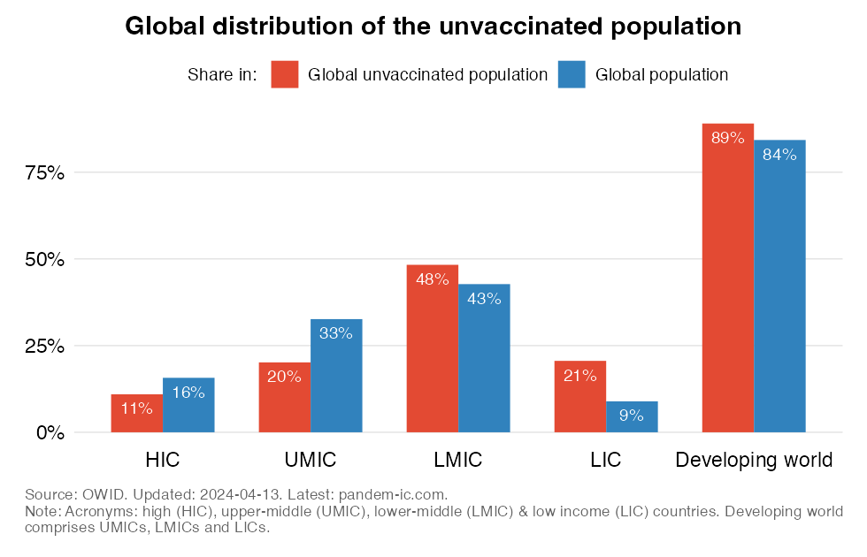
The chart shows:
The poorer half of the world, made up by LMICs and LICs, represents 69% of the world’s unvaccinated people. This is well above their population share, which suggests that they are more poorly vaccinated than the richer half of the world.
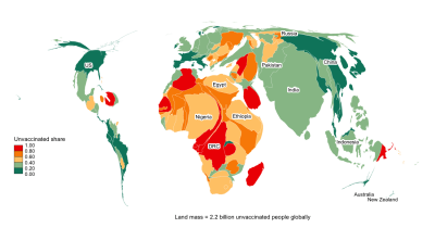
We can also visualize the dominance of the developing world with the help of a cartogram. A cartogram is a map that distorts the geographies of countries so that their land mass is proportional to the some metric, in this case the country contribution to the global number of unvaccinated people. Colors indicate World Bank income groups. The labels refer to the 10 countries with the largest number of unvaccinated people (Australia and New Zealand are not in this Top 10 but have been added to make it easier to spot them on the map).
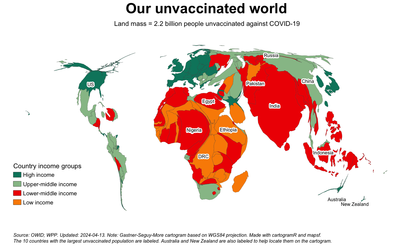
Some take-aways:
The Top 10 countries with the most unvaccinated people make up 55% of the global total. Most of the top 10 countries for the unvaccinated are LMICs and LICs.
The earlier charts on the unvaccinated have provided an “absolute” perspective on the number of unvaccinated people and how they are distributed around the world. Let us now look at the unvaccinated in relative terms: how their numbers compare to population totals.
To start, the chart below depicts the “unvaccinated rate” – or the share of the unvaccinated in total population – at the global level as well as across income groups.
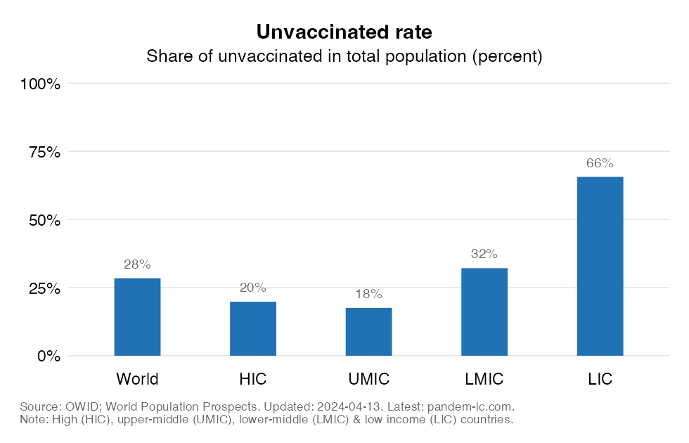
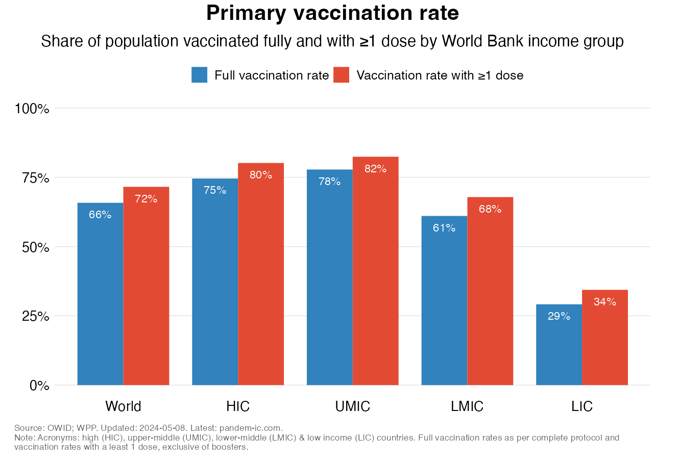
The unvaccinated rate is a bit below 1/3 at the global level. But this average masks considerable heterogeneity across income groups. The unvaccinated rates for HICs and UMICs, which are very similar, are much lower than what we see in the rest of the world. The rates are indeed a lot higher for LMICs and especially for LICs. In LICs, about 3/4 of the population is unvaccinated.
There is also considerable diversity within income groups. The beeswarm chart below plots the unvaccinated rate of each and every country by income group. The bubbles are sized by population and the short horizontal lines show the population-weighted group average for each income group.
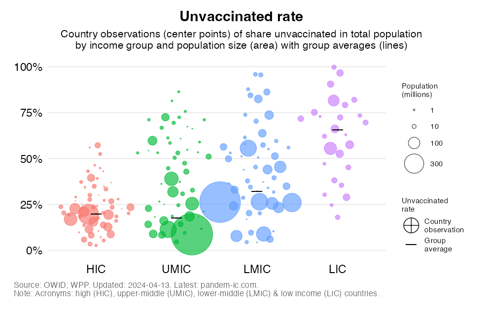
The chart shows that:
The dispersion around the average is quite limited for HICs and, to a lesser extent, LICs, whereas it is quite large for UMICs and LMICs. In other words, HICs are more uniform in having relatively low unvaccinated rates, whereas LICs are quite uniform in having very high ones.
We are now ready to introduce this country-based perspective on the unvaccinated rate into our earlier cartogram. The cartogram below is an exact repeat of the earlier one with land mass proportional to the absolute number of unvaccinated people. But there is one difference: the colors no longer denote World Bank income groups but they refer now as indicated in the legend to the unvaccinated rate (or share). Again, the labels refer to the 10 countries with the largest number of unvaccinated people (with Australia and New Zealand again added for visual clarity).
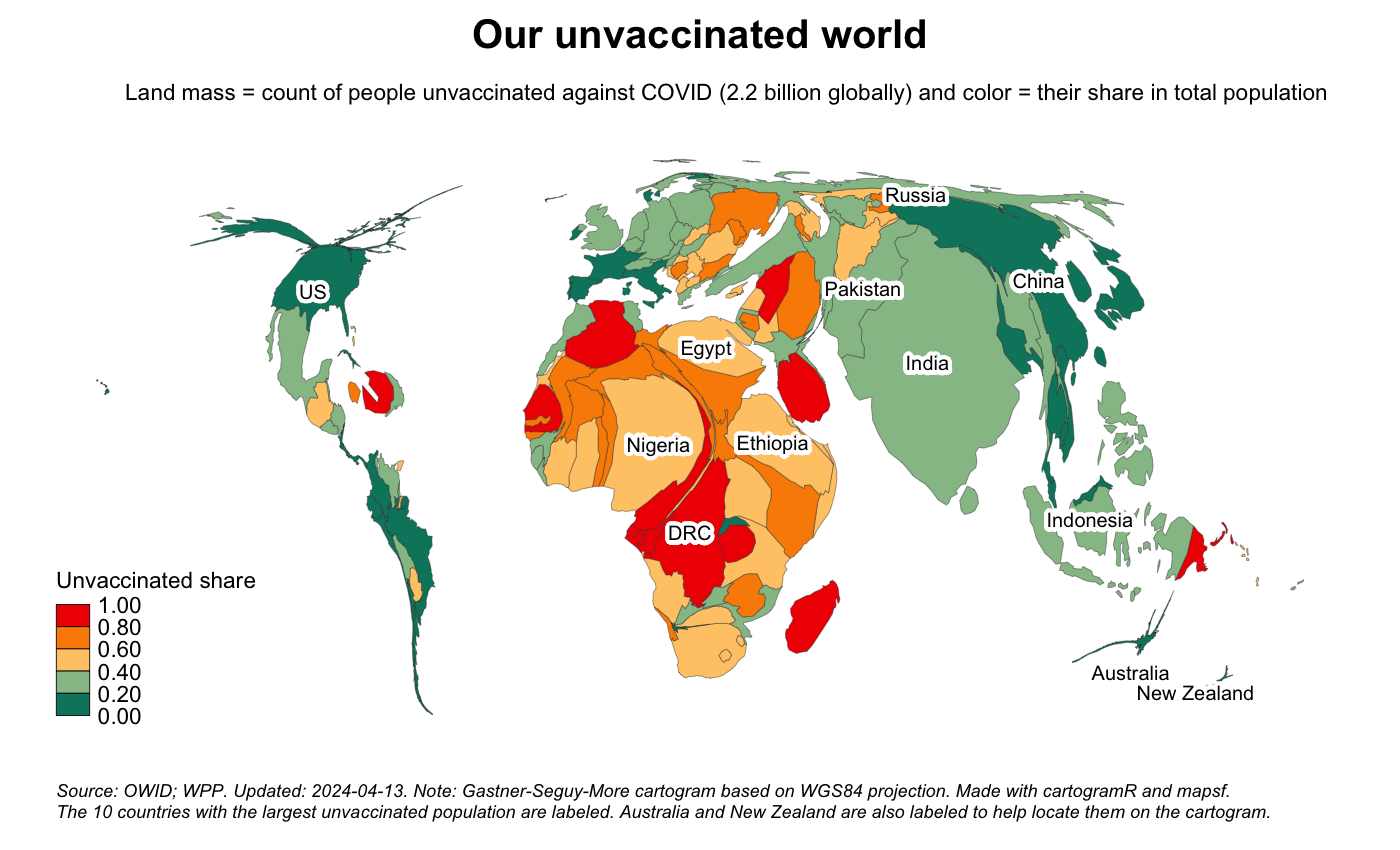
This cartogram confirms that:
In relative terms, there are important relative differences between the two main contributing regions. Relative to their population, South Asia comes out much better than Africa. The challenge of reaching the unvaccinated is much more intense in the latter region.
Let us now show a slightly different visualization, where we intersect the country-based perspective on the unvaccinated rate with the World Bank income classification and later the World Bank regional classification.
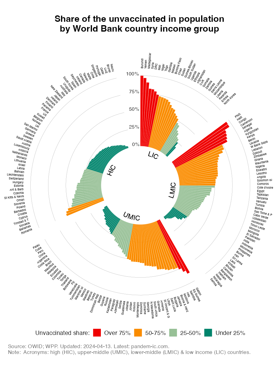
The chart confirms:
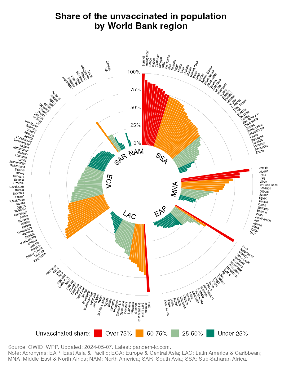
The chart shows the country observations more clearly than the cartogram (where countries with very small population sizes had less chance of representing much real estate on the chart). It shows:
East Asia & Pacific (EAP), ECA, LAC and North America (NAM) regions are the most represented in the light green (25-50%) and dark green (under 25%) buckets.
Whereas the global primary vaccination campaign has left many people behind, we are facing a similar issue with respect to the booster campaign. In what follows, we will characterize the progress made with booster vaccination. We will discuss booster coverage at the global level, highlight inequalities across and within income groups and geographies, and make comparisons with the primary vaccination campaign.
To assess booster progress, we need to move from the “people space” to the “doses space”. Unfortunately, unlike primary vaccination, we have no globally comprehensive data on how many times people have been boosted. As a result we need to lump the booster shots together and consider an indicator in the doses space. This is essentially the booster coverage ratio, which is simply measured as the number of booster doses administered per 100 people.
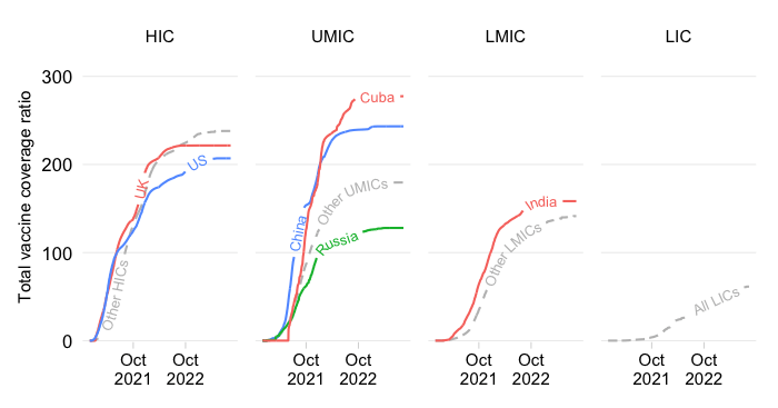
We will want to compare the booster coverage ratio with the primary vaccine coverage ratio. But there is a twist. Since primary vaccination follows different protocols in terms of the number of doses that need to be administered for the primary vaccination cycle to be completed, we need to take account of that diversity in the indicator. We calculate the the coverage ratio as “single-dose equivalent” primary doses administered per 100 people. The adjustment consists of dividing primary shots of two- and three-dose vaccines by 2 and 3, respectively, before we sum them up, so that a maximum coverage ratio obtains of 100 primary shots per 100 people.
The chart below then visualizes both the booster coverage ratio (dot) and the adjusted primary coverage ratio (bars) for the world as well as across income groups.
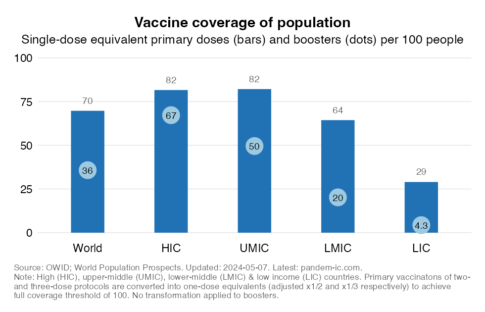
The chart shows:
The booster coverage ratio in developing countries drops dramatically as we move from UMIC to LMIC and from LMIC to LIC. The gaps with the primary coverage ratio rise as we move down the income ladder.
To provide a geographical perspective, the next two charts cut the data by UN subregion. The first one sorts the observations by the primary coverage ratio, whereas the second one sorts them by the booster coverage ratio.
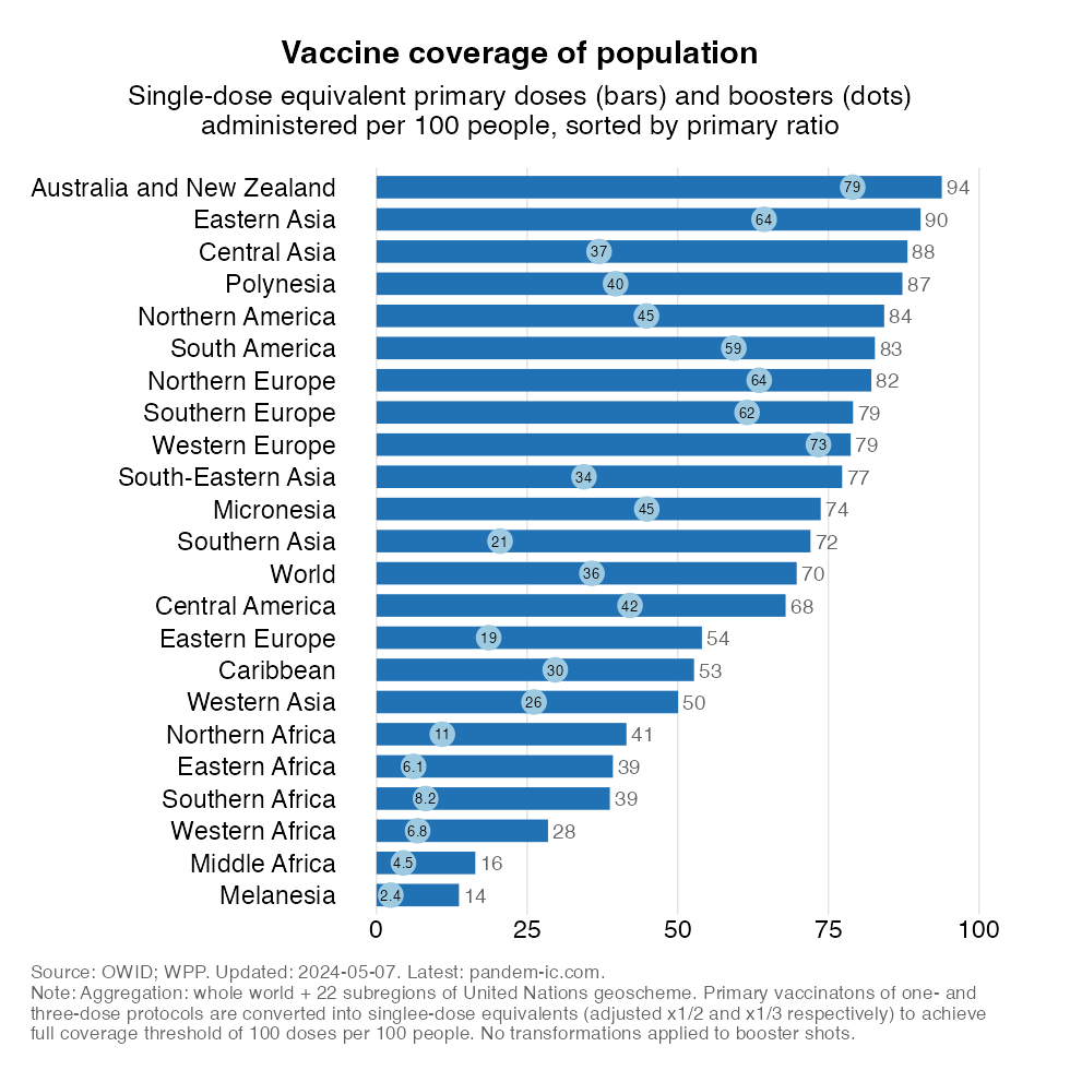
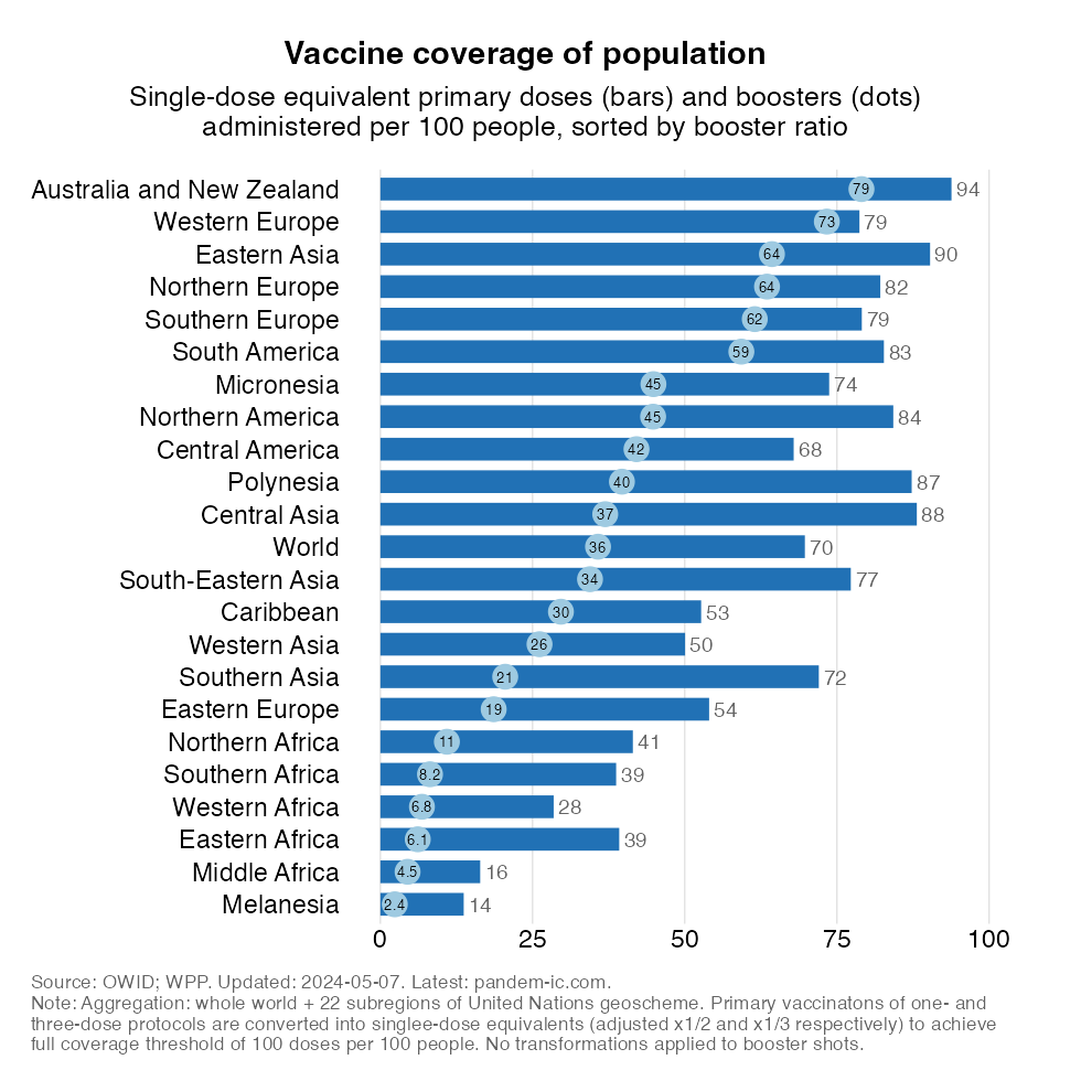
The charts illustrate the following:
All of Africa is very poorly boosted. Northern and Southern Africa have slightly better numbers than the rest of the region, but even their numbers remain very low.
Let us now take the outcome of the progress booked so far as a given and look at the distribution of the doses that have been administered across income groups for both primary and booster vaccinations. This will tell us something about the inequality (between income groups) during the primary and booster campaigns thus far. To make a fair comparison, we compare the distribution of booster doses today with the distribution of primary shots 7 months ago so that the length of the primary and booster campaigns are equalized.
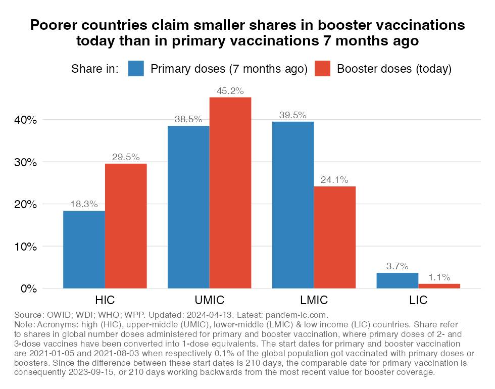
The chart shows:
Conversely, the shares of the richer half of the world are much higher for boosters than for primary doses. Interestingly, this is true for both HICs (the rich high-income countries) and UMICs (the richer developing countries). The distribution thus appears more unequal, in large part because of HICs (which have have absorbed a much larger share of the boosters) but also because of UMICs.
Moving away from group averages, let us also have a look at what has been happening at the country level. In the chart below, we group individual countries by income group and compare them with the group average for booster coverage, as indicated by the short horizontal line. To give an idea about how much a country contributes to the population-weighted group averages, we also scale the size of the bubbles by population size.
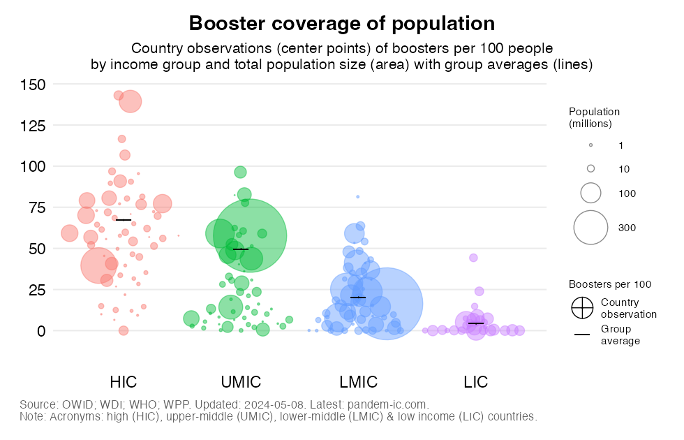
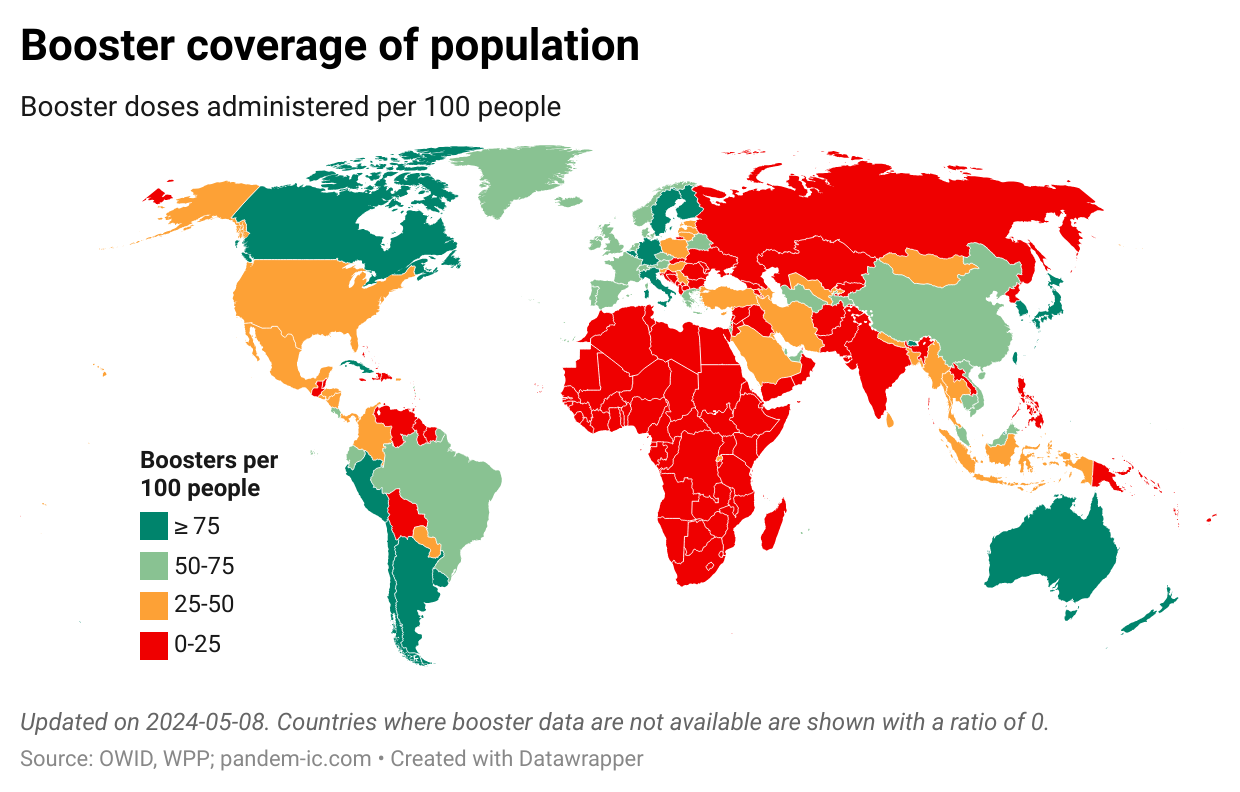
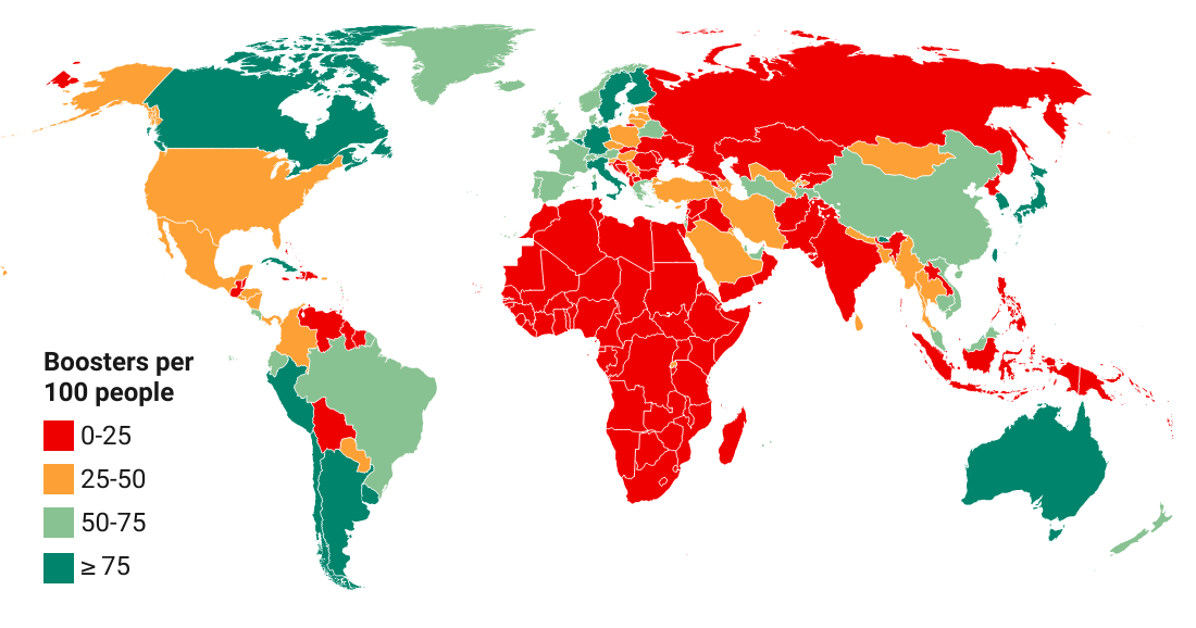
The map provides perhaps the clearest picture of how poorly the world is boosted. We see very little dark green (ratio over 75/100) on this map. There is more light green (50 to 75/100), even though booster levels in this range would still be associated with elevated vulnerabilities. Alas, most of the world is shown in red and orange, implying that booster coverage ratios are well below 50. Note that a number of high-income countries, including the US, are among this large group of poorly boosted countries.
The remaining gaps with respect to primary and booster vaccination have been well noted in the previous sections. But are we on the way of addressing them? How is vaccination momentum evolving?
Unfortunately, as this section will show, the pace of primary and booster vaccination has slowed to such levels that one might ask whether the world has given up on closing the gaps.
Check out first of all the pace of primary vaccination in the chart below. The chart plots over time the unvaccinated rate – or share of the unvaccinated in total population. The evolution is shown across the aggregates of the World Bank income classification.
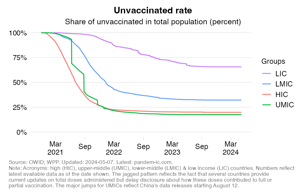
The following patterns are clear:
LICs are the only income group where momentum remains steady, even though the pace of progress remains a long way off from what the richer income groups achieved earlier.
The chart below plots the pace of booster vaccination and compares it with primary vaccination. To make a fair comparison, we again make an adjustment by enforcing a common start date (in the earlier visualization we enforced a common end date). The booster campaign started around early August 2021 (at least that’s when the booster coverage ratio reached a minimal mass of 0.1%), whereas the primary campaign started some seven months earlier around early January 2021 (again as per the 0.1% metric). To compare the two, we shift booster vaccinations seven months back in time.
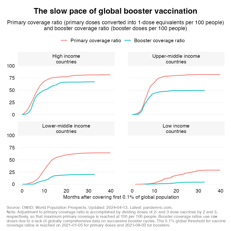
The chart tells us:
In the developing world (UMICs, LMICs and LICs), we see nearly complete stagnation. The cumulative progress we’ve seen in developing countries declines rather dramatically as we go down the income ladder (notice how the gap between the two lines becomes larger and larger in percentage terms). In terms of recent momentum, we are seeing stagnation everywhere: the lines have become completely flat for UMICs and LMICs. For LICs, booster coverage never picked up in the first place and the line stayed flat throughout.
As more and more individuals complete their primary vaccination cycle, it is only natural that the laws of diminishing returns are setting in. Finding the remaining unvaccinated is becoming more difficult. Convincing them to get vaccinated might also become more difficult as the share of those firmly against vaccination among the unvaccinated will increase.
The problem however is that the vaccination levels appear to be settling prematurely and they are doing so at levels that are by and large inadequate and leave large swaths of the global population inadequately protected.
We have unfinished business. There are at least six reasons why we should not give up now on vaccinating the world. (Note: the material here is an abbreviated version of the fuller discussion in this companion post).
Despite wishful thinking and declarations to the contrary, the pandemic is not over. The virus is still widely circulating among us and provoking outbursts that present large risks to vulnerable populations, including the un- and undervaccinated. Vaccination remains an important instrument to protect individuals from the risk of severe COVID in the present context. But vaccines also have proven to be effective in limiting the spread of the virus. The public health benefits of vaccination are considerable particularly when people are fully up-to-date on their shots. That conclusion was reached in a recent study of VE among adolescents in Singapore, which suggested that VE against infection with Omicron was 25% for primary vaccination and 56% for booster vaccination.
An often-heard argument is that vaccinating developing countries with young populations should not be a priority since the young face limited risk of mortality. That argument however seems to ignore the fact that developing countries, including the poorest ones, have been dealt a serious blow during this pandemic.
The reality is that pandemic mortality has exceeded the leading causes of death prior to the pandemic in most of the world, including many of the poorest countries. While developing countries tend to have a young age structure, many developing countries count vast absolute numbers of elderly people. This is one reason why the developing world accounts for the vast majority of the global mortality toll.
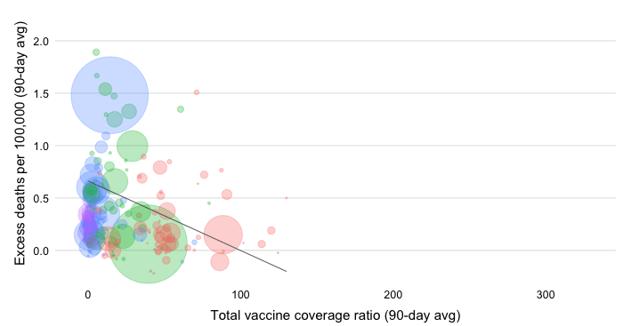
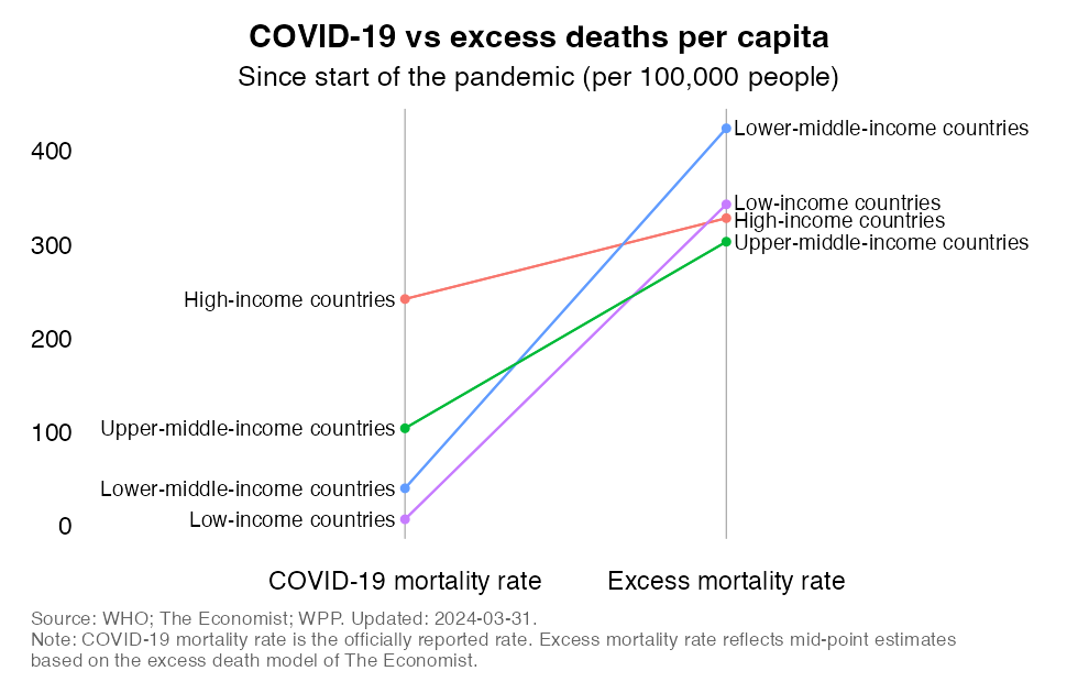
But the reality is far worse than this as developing countries have also seen far higher per capita mortality rates than their age structures would suggest. As the chart below illustrates, excess mortality rates in LMICs exceed those of HICs, with those of UMICs at high levels too. In fact, if we were to exclude China, the remaining UMICs would have the highest rates in the world. Let us also not minimize the impact of the pandemic in LICs. While lower than elsewhere, the best estimates for excess mortality rates are two orders of magnitude larger than the reported COVID-19 mortality rates.
It is often heard that low vaccination is simply the result of people not wanting to get vaccinated. And the point is often made that this applies especially to developing country populations which are thought to be more prone to vaccine hesitancy. However, the reasons why people are not unvaccinated are complex. They do not fit simple one-size-fits-all narratives.
Conceptually, we can make a distinction between supply- and demand-side factors. On the supply side, constraints such as limited access to global vaccine supplies or in-country logistical bottlenecks may be the factors inhibiting those interested in vaccination to be vaccinated. On the demand side, the reasons may be related to perceptions about the efficacy and safety of vaccines. They may also be related to broader views about the severity of COVID and the need to get vaccinated in the first place.
Demand-side factors that contribute to hesitancy play a role everywhere. But hesitancy does not offer a convincing explanation for the extremely low vaccination levels in the poorer countries. We should also keep in mind that the conceptual distinction between supply- and demand-side factors is moot in practical terms as supply and demand interact with each other in several ways.
Consumer interest may in turn be affected by supply conditions. Think of cases where vaccines were delivered that were close to their expiry date. Similarly, limited take-up may be motivated by consumer selectivity if the vaccines available are consider to be of lower efficacy than the alternatives not presently available.
It is often claimed that a renewed drive to vaccinate the unvaccinated is too late as developing country populations are already mostly infected and have built their own immune defenses.
It is true that the pandemic has spread more extensively in the developing world than one might have expected to. We can think of many structural reasons that support that conclusion. Infection prevalence has likely been fueled by environmental factors such as urban density as well as poverty and informality, which complicate physical distancing. Over 1 billion people, mostly in developing countries, live in slums. Flattening the curve will therefore be more difficult in many developing countries, meaning that preexisting health capacity constraints will become binding more quickly.
But it is one thing to say that infection prevalence is high and another to then use this as a justification against vaccination. As we recently argued in an article titled “It is not too late to achieve global COVID-19 vaccine equity” (BMJ, 2022):
While the global omicron surge led to large numbers of people worldwide getting infected and surviving, leaving them with a degree of immunity, infection-induced immunity is not as robust and durable as being up to date with vaccination; nor does it provide the same protection against future variants.
References to the evidence in support of these claims can be found here, here, here, here and here.
The final claim that is often heard is that developing countries have other pressing health needs that require prioritization. That is of course true, but the conclusion that COVID needs to be ignored does not follow naturally.
The COVID-19 pandemic has put immense pressure on national health systems. It has also disrupted the prevention and treatment of a host of other diseases. Vaccination programs against other pathogens were interrupted. Some facilities were closed. Medical workers were redeployed to battle the pandemic. Medical supplies were harder to get by. People delayed treatment for various reasons.
By the time the critical phase of the pandemic has passed, some degree of normalization should set in as these pressures recede. Yet, we already know that COVID is here to stay so resources will need to continue to flow into battling this disease. Importantly, this will involve continued efforts to make sure that those who were previously vaccinated remain up-to-date on vaccination with respect to the most prevalent variants expected to be in the community.
COVID will need to be attended to as part of a holistic strategy that must also make up for ground lost on the prevention and treatment of other diseases. But it doesn’t have to be “either-or”. Ensuring that polio vaccination is back on track need not come at the expense of promoting COVID vaccination.
Moreover, there are various things countries can do that will be beneficial across a variety of public health objectives. The crisis has for example demonstrated the importance of placing primary health care at the core of health systems, both to manage an unexpected surge of demand and to maintain continuity of care for all. Strengthening primary health care will also be to the benefit of the management of other diseases.
How about those who are not yet vaccinated – the ones that as of today have not received a single shot of any COVID-19 vaccine? Should it be the goal to reach the very last person and vaccinate the entire world, including the youngest age cohorts? Clearly, this will become progressively more difficult as diminishing returns set in. The remaining population will become ever harder-to-reach and ever harder-to-convince. The goal may reflect a laudable aspiration but implementation may stand limited chance of success.
That is true but there is also the political economy of health to consider – and this is why we keep on highlighting the regressive nature of the global vaccination campaign. The reality is this: A groundswell has been underway to push for greater global vaccine equity. Pulling the plug on the momentum right now means that the political opportunity to push this through during a time of heightened awareness will evaporate. After all, we all know that political energy cannot be so easily shifted from one issue to the next.
Yes, we need to “fix” everything else, but vaccines can be thought of as what Paul Farmer, the late American medical anthropologist and physician, calls our “battle-horse”. The vaccination campaign can be used to stoke momentum for bigger things and move the whole public health agenda forward. So again it is not “either-or”.
Finally, there is also an important forward-looking aspect to consider. The virus continues to mutate. New variants are finding ways to escape immunity of existing vaccines. No one has a crystal ball but in the spirit of better safe than sorry it would be short-sighted not to prepare against the downside risk of a more lethal pathogen.
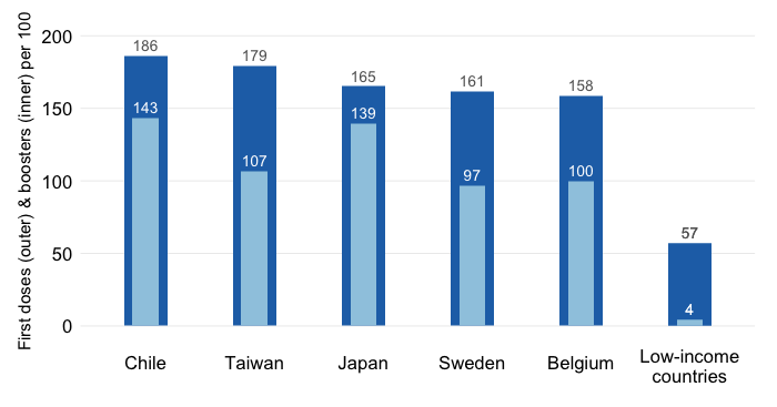
The current state of global vaccination progress however serves as a sobering reminder of what could happen in the future if a more dangerous variant were to emerge. COVID vaccines have been developed quickly and compared to vaccines for other diseases they have been rolled out comparatively fast, except for the lower-income countries.
However, the global scale of infection is unprecedented and Omicron continues to circulate and mutate. As part of our preparedness efforts, we need to invest more in efforts to address the demand- and supply-side bottlenecks to vaccine uptake, so that if a downside contingency were to occur we can respond even more rapidly and especially more inclusively with respect to the poorer countries.
Disclaimer: Posts by the Center for Global Development reflect the views of the authors, drawing on prior research and experience in their areas of expertise. CGD is a nonpartisan, independent organization and does not take institutional positions. Likewise, views expressed do not necessarily reflect those of the United Nations, the United Nations Development Programme, its programmes/projects or governments. The designations employed do not imply the expression of any opinion whatsoever concerning the legal status of any country, territory or area, or its frontiers or boundaries.