International comparisons of pandemic performance typically look at country aggregates (such as here). But aggregates tend to mask the heterogeneity at the subnational level underneath. This is no less true for the US with its wide-ranging diversity of pandemic outcomes at the subnational level. Focusing on cases per capita, this post deviates from usual practice and compares US states with the nations of the world.
Three questions are addressed: (1) how many US states are currently in the global Top 50 for daily cases per capita, (2) how many states featured in the Top 50 for daily cases per capita on April 1, 2022 (when a lull was achieved following the initial Omicron escalation), and (3) how many of them were in the Top 50 if we consider cumulative cases per capita that were confirmed between April 1 and the current date?
In what follows, we will compare US states with countries and rank them according to their performance on cases per capita. Before we proceed, it is useful to discuss the comparison itself, as a number of caveats apply. Let’s discuss them in turn:
Inequality of data quality and prevalence of testing. As with any other cross-sectional comparison, the usual caveat about measurement applies. We are comparing places of different levels of development with different statistical capabilities to track cases. This inequality in data quality biases the Top 50 towards inclusion of richer countries that measure better. In addition, testing regimens differ wildly across space and over time.
We start off with a snapshot of the most recent data points for newly confirmed cases per capita. The indicator measures cases as a daily 7-day trailing average (that means that the latest daily number is a daily average of the preceding week including the last day). The chart will plot the global Top 50 among a universe of US states and 195 countries, where the federal District of Columbia and the unincorporated territory of Puerto Rico are lumped together with US states.
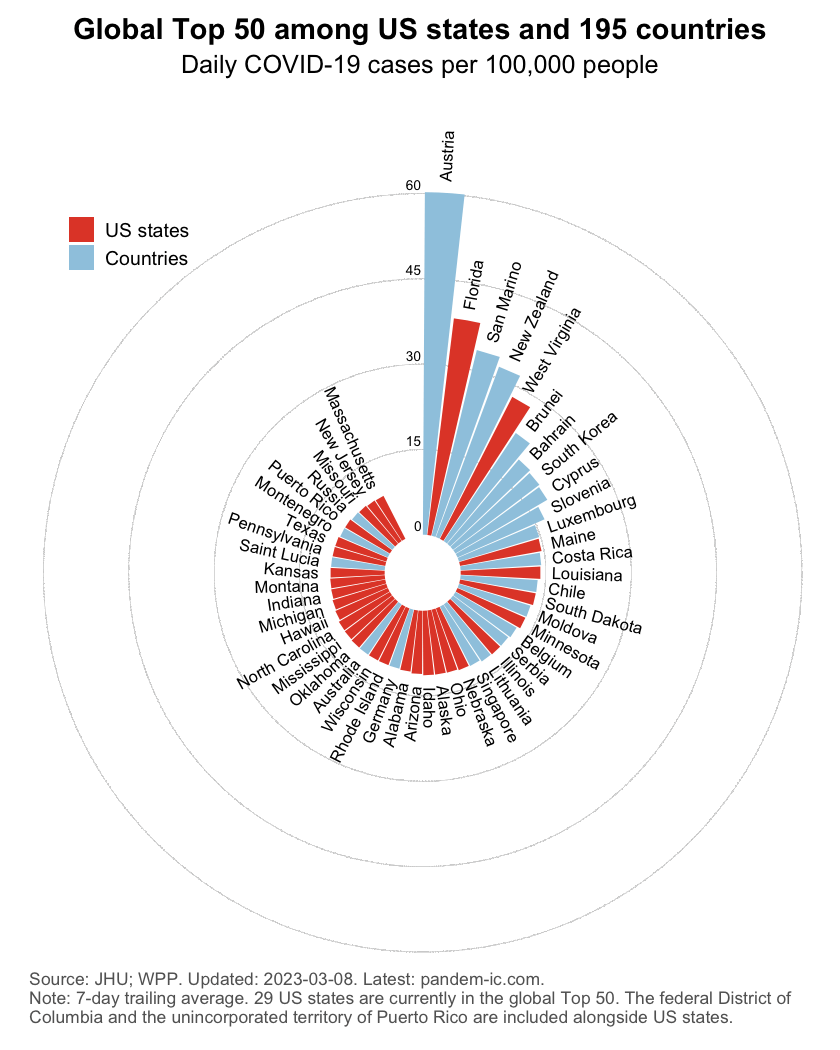
As the chart shows, we currently have a total of 0 states that would be counted among the world’s Top 50 for newly confirmed cases per capita. The states in question are highlighted in red. This is of course just a snapshot as of the most recent date available and may therefore not be representative of earlier developments. Let us look at that next.
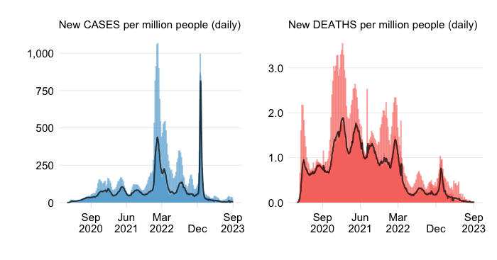
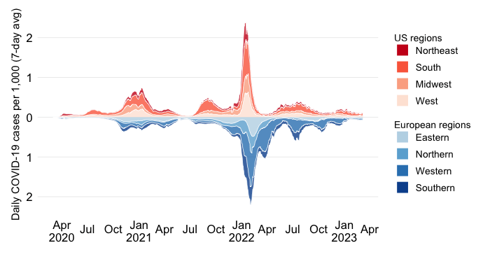
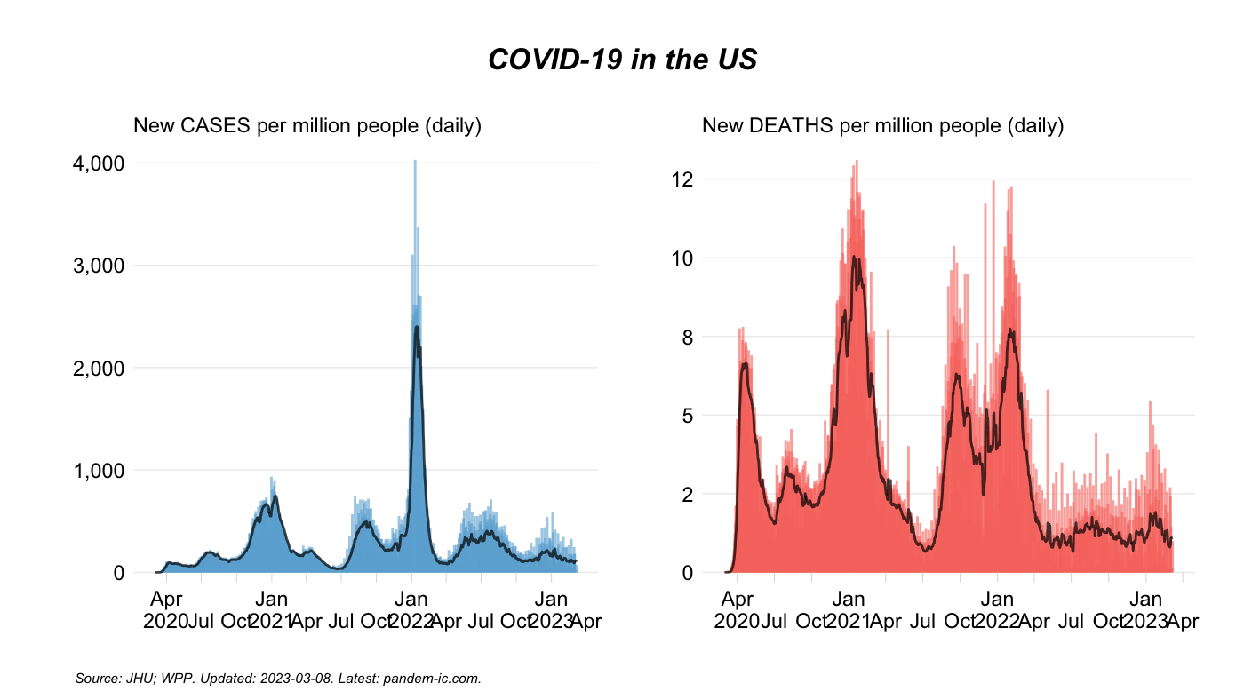
The US has seen considerable fluctuations in case rates especially since the arrival of the Omicron family. The chart below illustrates the evolution in daily case rates (left panel) and daily mortality rates (right panel). We can clearly see the effect of the different waves, where the Omicron-related waves were far more transmissive (higher peaks on the left) as well as less lethal (lower peaks on the right). We also see that the US as a whole registered a lull in cases in April, 2022.
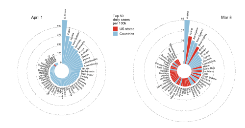
What did the subnational comparison look like during this lull? The chart plots in the left panel the global Top 50 for daily newly confirmed cases as of April 1, 2022. The right panel repeats the earlier chart which was calculated as of the most recent observation.
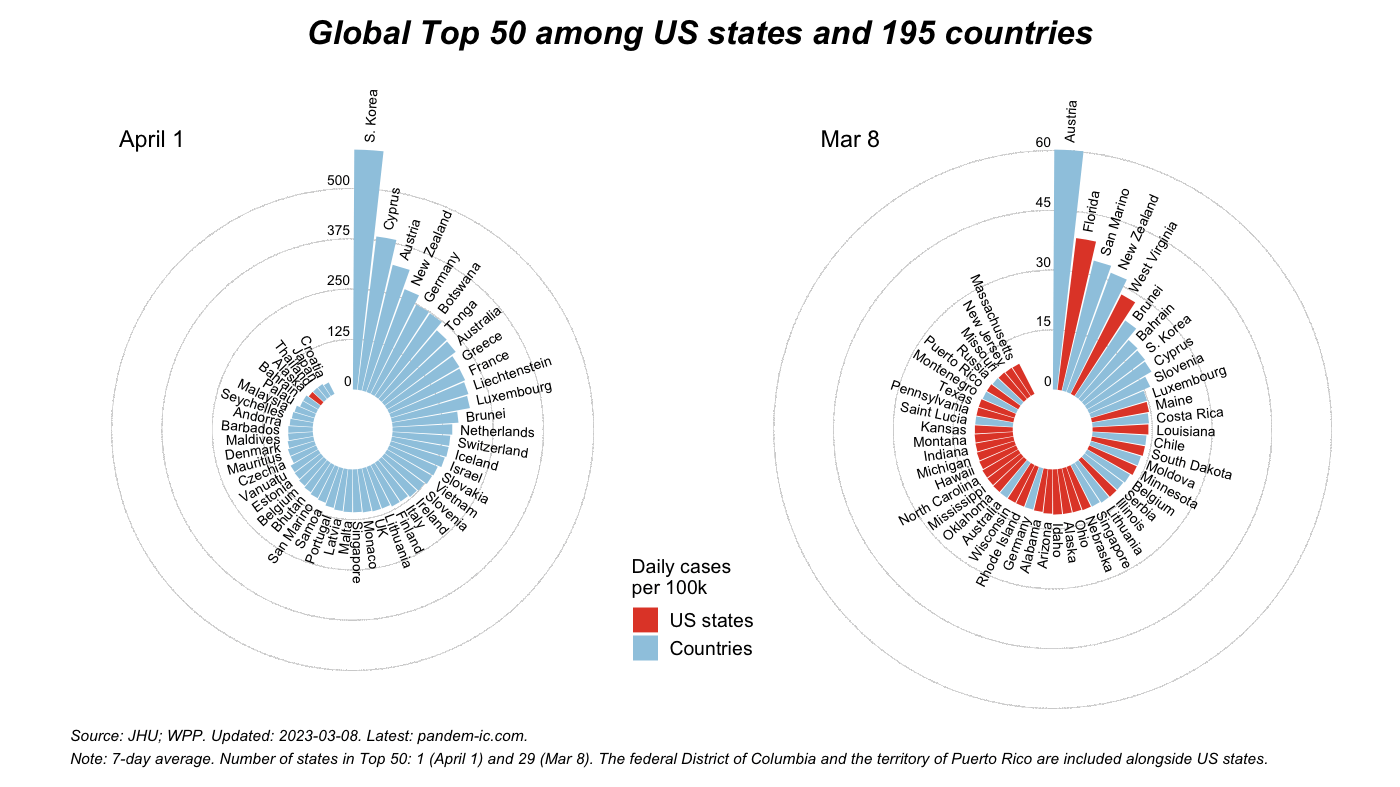
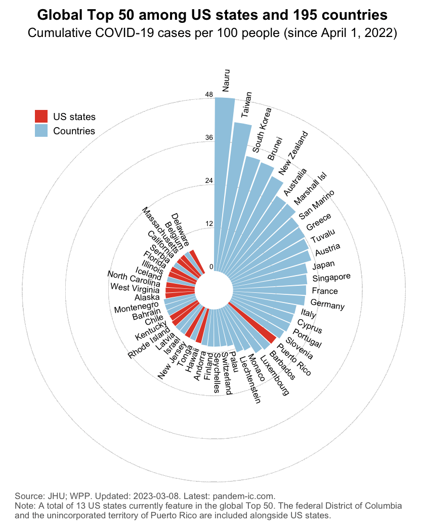
The comparison between April 1 and today suggests a considerable intensification in the US relative to countries in the rest of the world. Of course, these are just snapshots. So let us also look at the results in cumulative terms in the chart below, which cumulates confirmed cases between April 1 and the present date.
Following the initial Omicron escalation in the beginning of 2022, cases reached a low in the US around early April. At the time, just 1 US state featured in the global Top 50 when we compare the US subnational performance with that of nations of the rest of the world.
Since then however there’s been considerable continued spread of the virus, with many US states climbing back into the global Top 50. As of today, we count 0 of them. In cumulative terms, considering the period starting April 1 up through the current date, a total of 13 states feature in the Top 50.
Disclaimer: Posts by the Center for Global Development reflect the views of the authors, drawing on prior research and experience in their areas of expertise. CGD is a nonpartisan, independent organization and does not take institutional positions. Likewise, views expressed do not necessarily reflect those of the United Nations, the United Nations Development Programme, its programmes/projects or governments. The designations employed do not imply the expression of any opinion whatsoever concerning the legal status of any country, territory or area, or its frontiers or boundaries.