Excess deaths reflect the gap between the total number of deaths that occur for any reason and the amount that would be expected under normal circumstances.
Given the massive undercounting of the mortality toll both directly and indirectly attributed to COVID-19, excess mortality provides a useful way to get a glimpse of the true mortality toll.
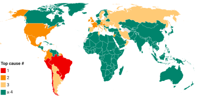
Unfortunately, data on excess mortality are sparsely available: as of September 2021, only 84 countries release some sort of data (national or subnational; regular or one-off) on excess deaths.
This is where the excess deaths model of The Economist comes in. It represents a comprehensive attempt to fill the gaps with estimates based on the information that IS available: over 100 indicators that associate with and help predict excess deaths.
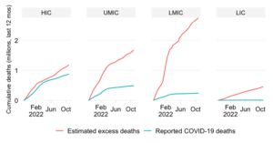
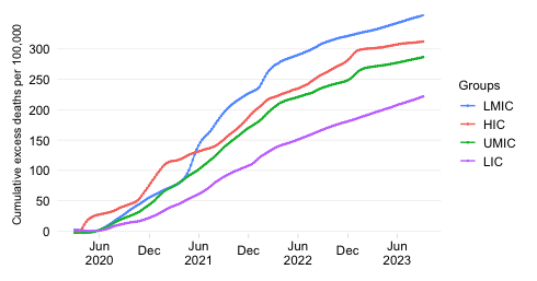
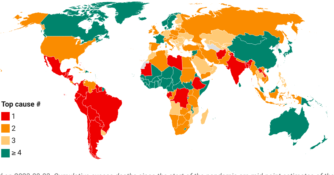
Below we show the mid-point estimates that derive from this model for the cumulative excess death rate: the total number of people who have died due to COVID-19 since the start of the pandemic normalized by population. We show the results first by World Bank income classification and then by World Bank region.
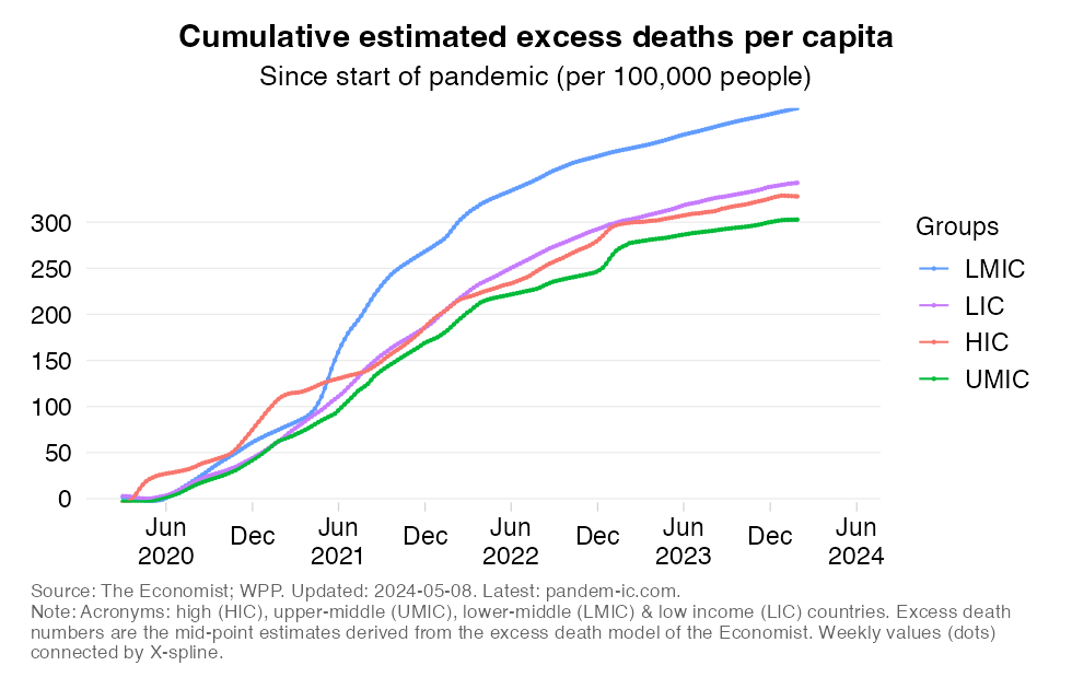
The first set of results in the above chart are astonishing (they formed the basis of an earlier blog):
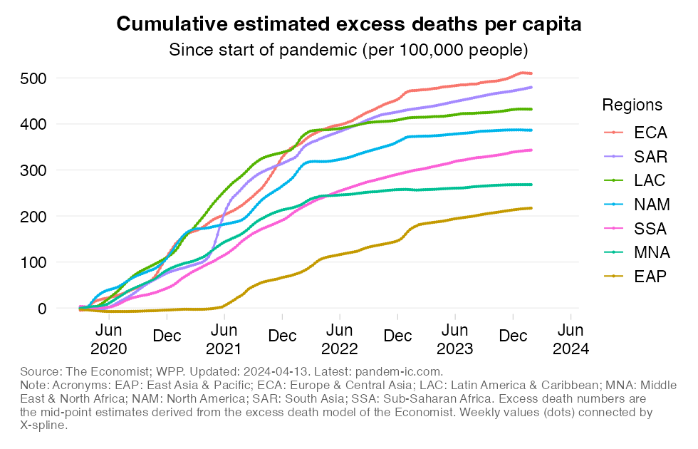
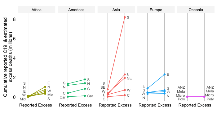
The results by World Bank region are as follows:
Interestingly, EAP and SSA rates are very similar despite SSA’s much-younger population structure.
The above estimates are presented as mid-points and considerable uncertainty surrounds them. Even so, if we can accept that they provide a roughly accurate approximation of the true order of magnitude of the suffering this health emergency has brought, then it is clear that the developing world has been severely hit – in fact, much more severely than what reported statistics would suggest.
Such conclusion also implies that the unequal distribution of vaccines is all the more untenable.
While not the simplest to interpret at first glance, the visualizations below capture that notion. They are based on the concept of revealed comparative advantage in trade, except that in this case we turn it around and depict the comparative disadvantage. Specifically, we show for each income group or region the share of that entity in the global total for excess deaths and vaccines. We then divide the excess death share by the vaccine share.
If vaccines were distributed somewhat in line with the likely suffering of countries, we would expect that these ratios equalize at roughly 1. In other words, the distribution of vaccines more or less matches that of excess deaths.
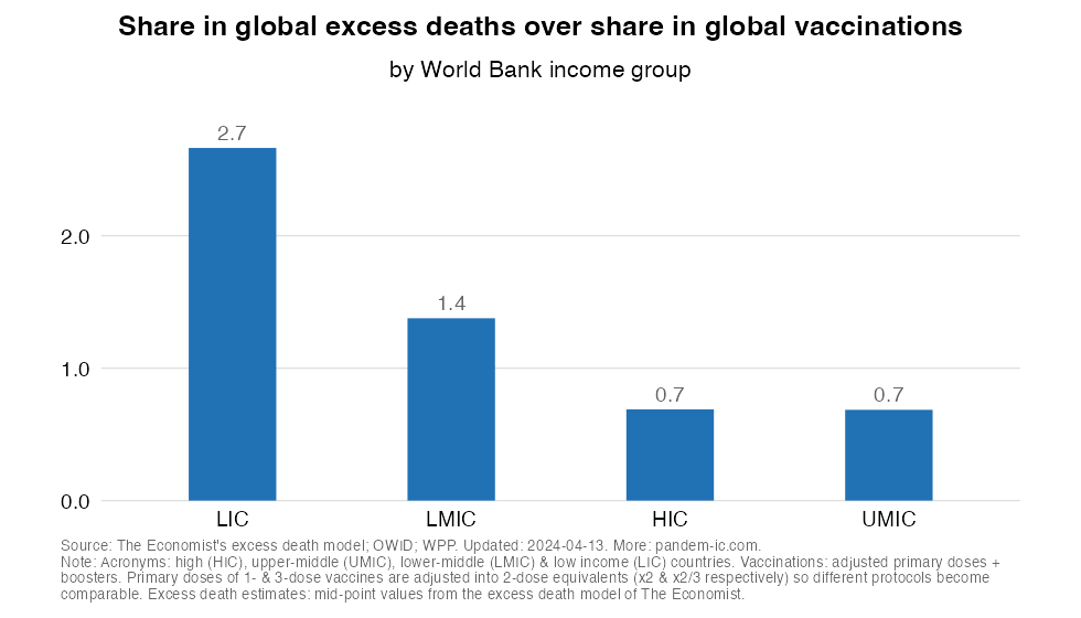
The chart above (which cuts the data by World Bank income classification) shows that the very different distributions of excess deaths and vaccines lead to a large inequality in the ratio across income groups:
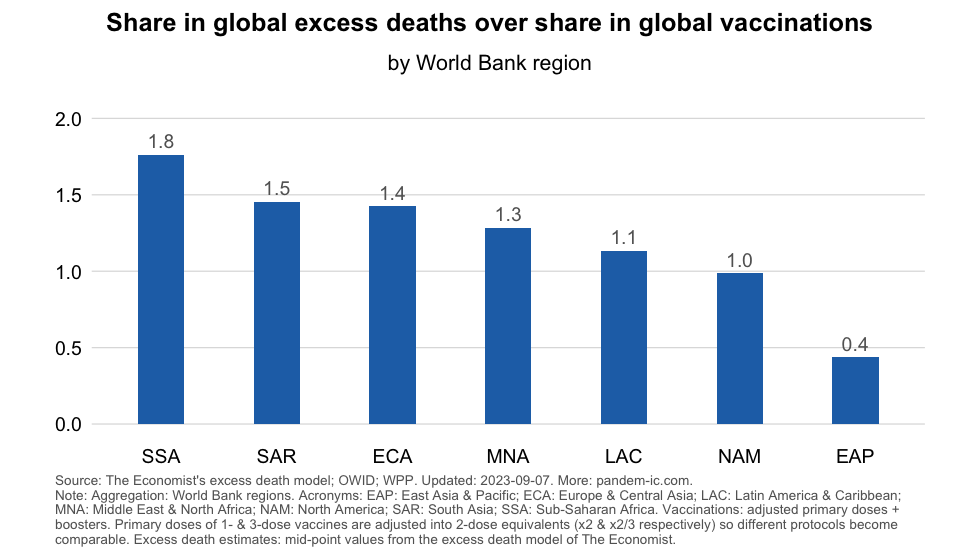
The results by World Bank region provide further granularity. ECA and SSA’s shares in excess deaths is much higher than their share in global vaccines. We also see imbalances in other developing regions: MNA (Middle East and North Africa) and SAR. EAP has an extremely low value which is the result from its generally low excess death rate and its overall stellar performance on the vaccination front. Other regions are in the middle.
The above results remind us that (1) the impact of the pandemic on the developing world has been far more severe than suggested by the officially reported data and (2) the inequity associated with the international distribution of vaccines turns out a lot worse once we take into account the joint distribution of excess deaths and vaccines.
Disclaimer: Posts by the Center for Global Development reflect the views of the authors, drawing on prior research and experience in their areas of expertise. CGD is a nonpartisan, independent organization and does not take institutional positions. Likewise, views expressed do not necessarily reflect those of the United Nations, the United Nations Development Programme, its programmes/projects or governments. The designations employed do not imply the expression of any opinion whatsoever concerning the legal status of any country, territory or area, or its frontiers or boundaries.