Share in cumulative confirmed COVID-19 deaths since start of the pandemic
EXPLAINER
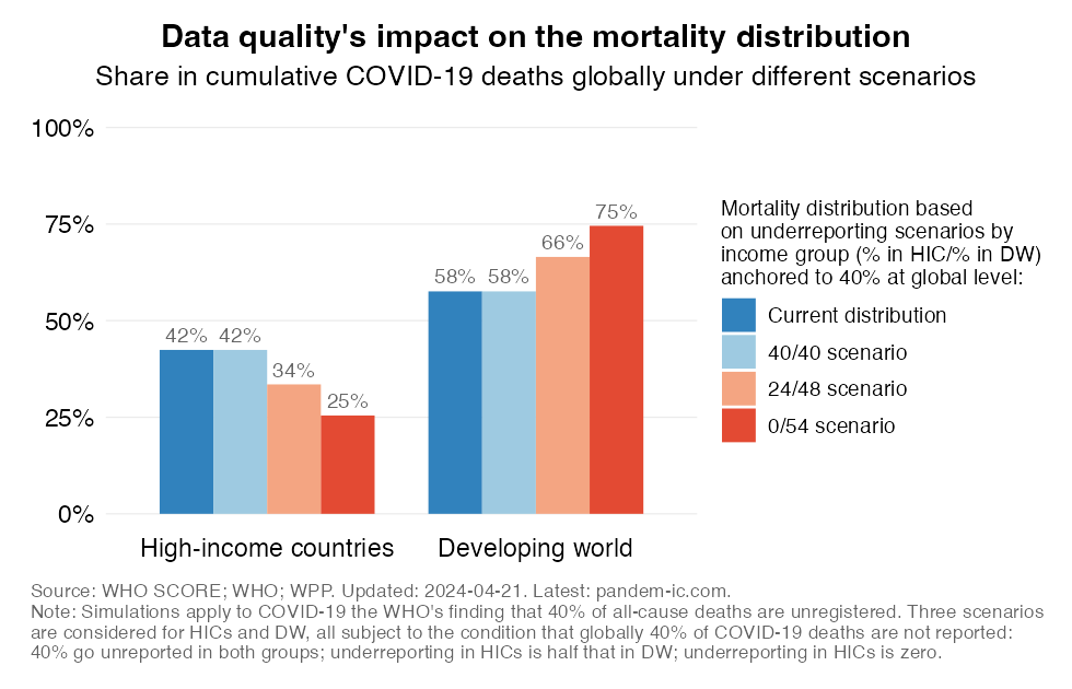
This chart illustrates what the global mortality distribution of COVID-19 fatalities could look like if 40% of global COVID-19 deaths were unreported under different scenarios of underreporting for high-income and developing countries. The scenarios are anchored to the WHO’s finding that for all-cause mortality roughly 40% of global deaths are unregistered (see here for a comprehensive assessment of data quality on a country basis). Assuming that a similar order of magnitude is likely for COVID-19, the 40% estimate is applied to the analysis of mortality during the current pandemic.
The current distribution in mortality across high-income and developing countries is shown in the blue bar on the left of each income group. The second bar illustrates that the distribution will not be affected if the same degree of underreporting were to apply to both income groups (with the average of the two leading to a 40% global average). The third bar illustrates the mortality distribution if the degree of underreporting in developing countries is double the degree observed in high-income countries (while yielding again the 40% global average). The fourth bar makes the (unrealistic) assumption that there is no underreporting in high-income countries, only in developing countries, subject again to the condition that we obtain a 40% global average.
The latter scenario would raise the developing country share in the global death toll to levels that are similar to the counterfactual demography scenario that isolates the effect of demography (population size and age structure) keeping all other factors constant. The estimates in this chart therefore suggest that data quality likely plays an important role in explaining the difference between the current distribution of mortality and the counterfactual one indicated by demography.