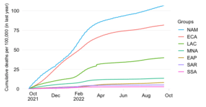
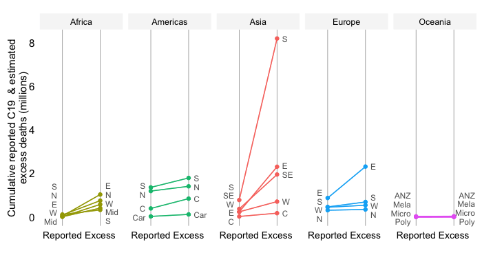
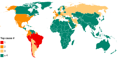
Share in cumulative confirmed COVID-19 deaths since start of the pandemic
EXPLAINER
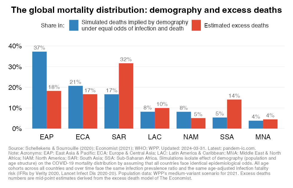
This chart offers two different perspectives on the global distribution of cumulative mortality since the start of this pandemic.
The first bar shows “post-pandemic” estimates of the mortality distribution that isolate the effect of demography (the combination of population size and age structure). The simulation reflects a counterfactual where we allow variation in demographic variables to impact on the distribution of cumulative COVID-19 mortality while keeping all other variables constant and identical across countries.
That means everyone faces the same epidemiological odds in terms of getting infected and facing death once infected. In other words, infection prevalence rates (IPRs) are constant and identical across countries, age cohort and over time; age-adjusted infection fatality rates (IFRs) vary across age cohorts but are the same across countries and over time.
The second bar shows the mortality distribution through the lens of excess death estimates. These concern estimates of all-cause mortality over and beyond what one would expect in “normal times”. They do capture more broadly the effect of the pandemic as the estimates are not purely limited to COVID-19 mortality. More details on the methodology can be found in the note below.
The comparison fo the two bars provides an insight about the progression of the pandemic and the extent to which mortality outcomes compare to what one might expect due to variation in demography. The fact that the excess death share of the developing world is a lot higher than what is implied by the simulation implies that its assumptions of identical IPRs and IFRs across the world are clearly violated and have in combination driven up the mortality toll.
Note that the counterfactual simulations are a thought experiment to interpret the role of demography. They should not be interpreted as forecasts as there are many other confounding factors that affect mortality. More details on the methodology underpinning this chart can be found in our paper.