The WHO has just released new estimates of excess mortality over the course of the calendar years 2020 and 2021. These are not the first estimates of excess mortality, but what sets them apart is their level of granularity. The estimates differentiate by age cohort and sex and the insights we can develop based on them are astonishing.
This post will discuss the new excess death estimates by age distribution and it will do so through the lens of the World Bank income classification. It will highlight the expansion of excess mortality between 2020 and 2021 and examine how much of that has been carried by an intensification and broadening of the mortality toll in the developing world.
Excess mortality – the deviation of all-cause mortality from what one could have reasonably expected – is the best method available to us to capture the true and total impact of the pandemic. It is able to capture misattributed COVID-19 deaths and account for other deaths indirectly caused or prevented during the pandemic.
Unfortunately, many countries lack the data. Out of 194 countries, only 73 provide full national all-cause mortality data to the WHO. This is where the excess death model comes in and fills in the blanks on the basis of co-variates that are meaningful predictors of excess mortality. The technical note has the full details and the actual estimates can be downloaded here.
WHO’s mid-point estimate of excess mortality during the 24 months of 2020 and 2021 is 14.9 million people. The 95% confidence interval around this estimate ranges from 13.3 to 16.6 million. The estimate is mid-point estimate is conservative, but in the ballpark of other estimates. For example, The Economist estimated, using an entirely different method, a number of 17.8 million at the end of 2021 (95% CI: 12.3-21.0 million), which has since grown to 21.1 million as of May 7, 2022 (95% CI: 14.7-25 million).
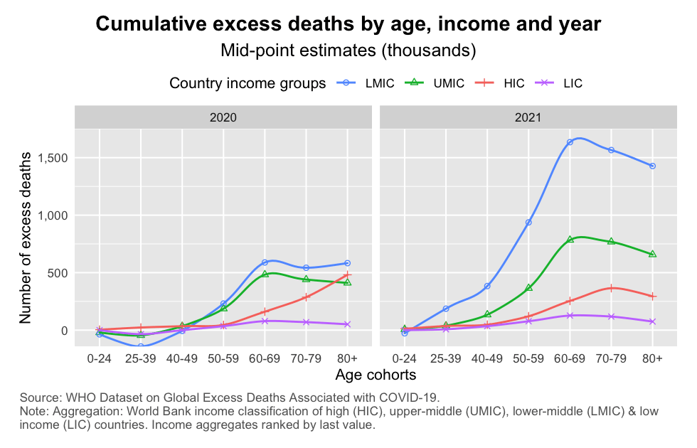
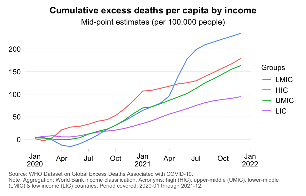
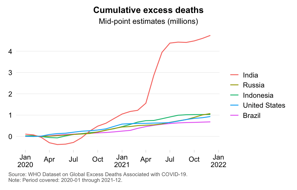
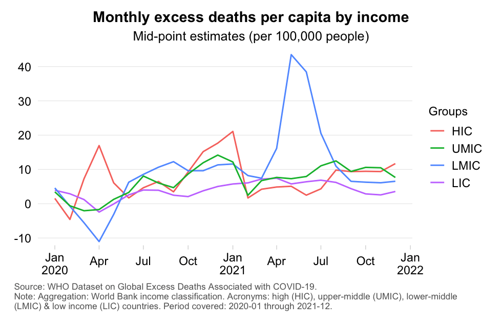
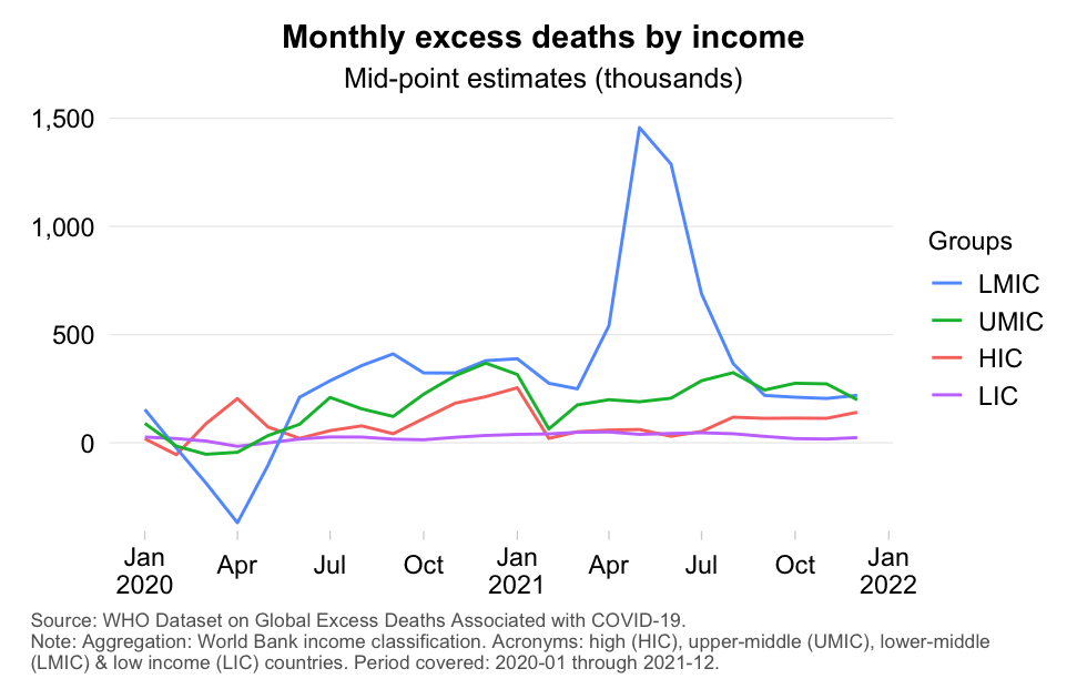
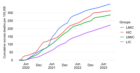
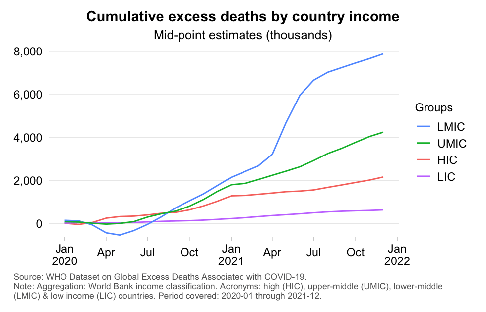
Let us first have a look at the big picture in the aggregate (i.e. without disaggregating the data by age cohorts). That big picture appears to be one of inequality between rich and poor countries and one of escalation between 2020 and 2021. Check out the media carrousel below, which has four charts offering alternating views of the excess death toll (absolute vs per capita; and monthly vs cumulative). Throughout we refer to the World Bank income classification, which divides the world into high-income (HIC), upper-middle-income (UMIC), lower-middle-income (LMIC) and low-income (LIC) countries. Note also that the developing world comprises UMICs, LMICs and LICs.
Here’s a few eye-catching results:
Unlike the high-income countries, excess mortality in the developing world expanded a lot between 2020 and 2021. LMICs saw excess mortality grow by 247%, LICs by 120% and UMICs by 85%. HICs, however, saw a much more modest rise of just 9%. This inequality across income groups reflects among other factors: (1) the time it took for the virus to spread globally in 2020, (2) the substantially negative excess mortality early on in 2020, (3) the arrival of hyper-contagious and more lethal Delta in population-dense developing countries and (4) the unequal roll-out of vaccines.
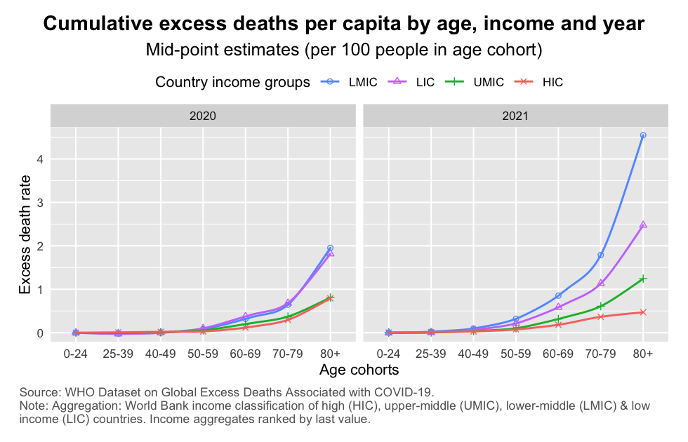
As to excess mortality rates (the first chart), it is immediately obvious that age-specific mortality rates rise exponentially as we progress along the age distribution. That conforms with the fact that COVID-19 is more risky for the elderly (of course, along with infection fatality risk, infection prevalence should be considered also when assessing how mortality among the elderly has been affected). Note the following:
When it comes to absolute excess mortality (the second chart), we see the following patterns:
2021 was entirely different, with HICs fading into the background in relative terms. The contributions from LMICs and UMICs became disproportionate. HICs did not increase by that much, in part because of the prioritized roll-out of vaccines to the elderly.
Let’s now look at the cumulative totals in some greater detail. The chart below shows again cumulative excess deaths by age bucket but this time it stacks the excess death data, which helps visualize developments at the global scale.
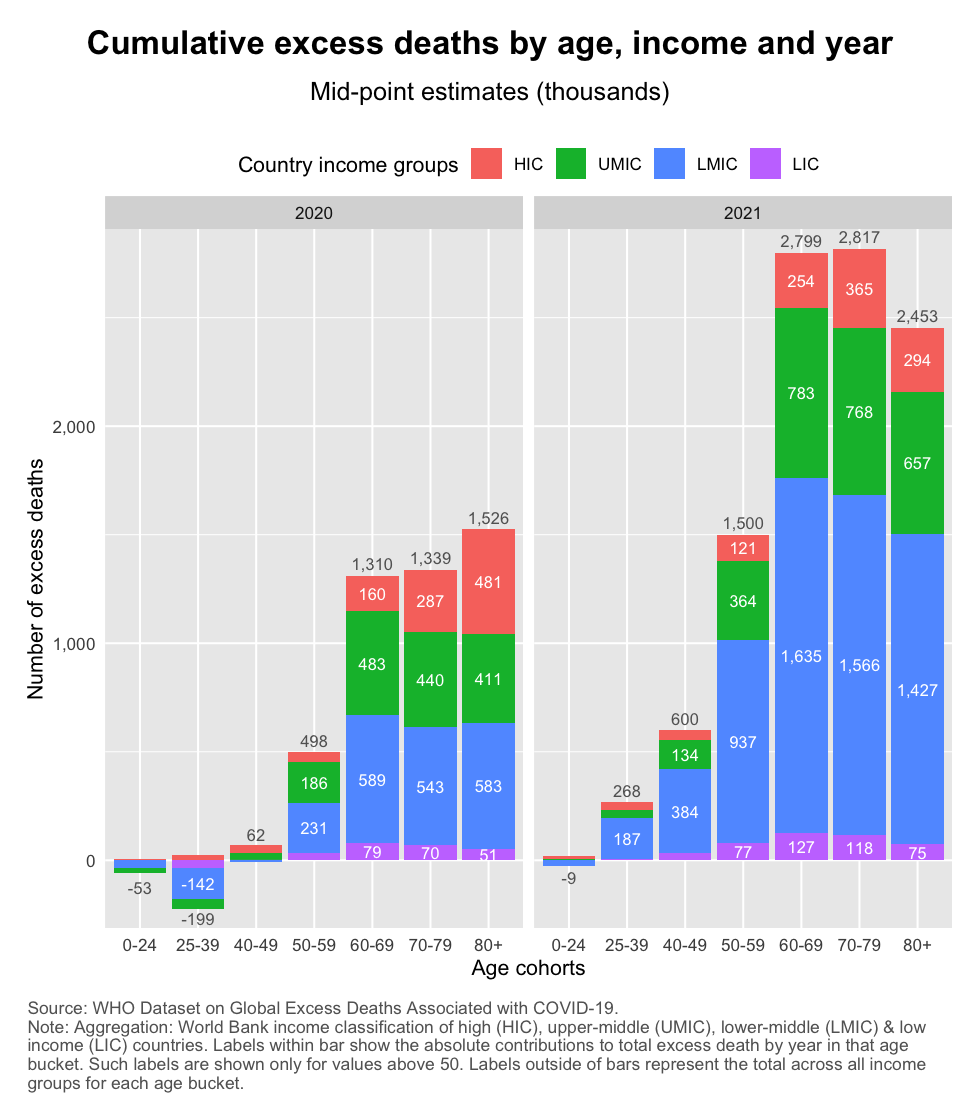
The chart shows:
Finally, let us dig a little deeper into the observed broadening of excess mortality and focus on the non-elderly age cohorts (the 60- group). The two charts below show the distribution of excess deaths by age and year. The first chart looks at the global level and shows how much each age cohort contributed to the total excess mortality of that year. The second chart shows the results by income group, meaning that the shares represent how much each age cohort contributed to total excess mortality during a given year for that income group.
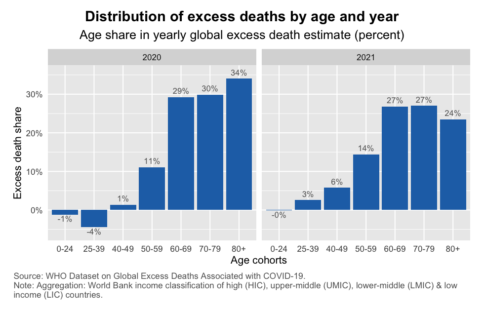
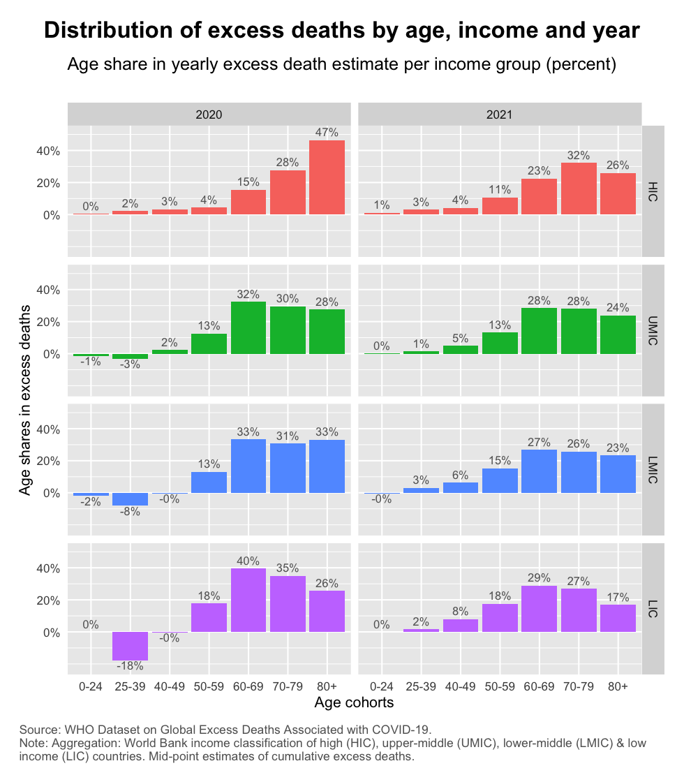
The following patterns emerge:
Within income groups, the broadening of excess mortality is happening especially in LMICs and LICs. As the second chart shows, the share of non-elderly age groups rise from 10% to 19% in HICs and 10% to 20% in UMICs and from 3% to 24% in LMICs and close to 0% to 27% in LICs. These are percentage shares within each income group. The absolute increases of course differ as mentioned earlier.
The excess death estimates released by the WHO shed light on the true and total impact of the pandemic. Some of the big picture patterns and trends are not new – as discussed here, here and here on the basis of alternative estimates. But it is encouraging that the WHO’s excess death estimates confirm these results and thereby adds further credibility to them.
The greatest value added of the dataset, however, lies in its granularity. Covering the distribution of excess deaths by age and income group, this post has highlighted the considerable expansion of excess mortality. This has happened due to a concurrent intensification of excess mortality within age buckets and a broadening across them. And it has emphasized that both trends have been carried mostly by the developing world.
These are important findings. All too often the public discourse dismisses the severity of the impact in developing countries on the basis of the mistaken belief that their populations are mostly young and therefore shielded from impact. Such a conclusion is entirely unwarranted. This post has mentioned two reasons why:
The excess mortality toll has very considerably broadened into the non-elderly age cohorts of developing countries. This is particularly visible in the 50-59 and 40-49 buckets but is also observed in the reversal of negative into positive excess mortality among younger buckets.
The above is all the more reason to fully take into account the cause of the developing world, especially the poorer countries among them, as we seek solutions to the pandemic in terms of diagnostics, , therapeutics and vaccines.
Disclaimer: Posts by the Center for Global Development reflect the views of the authors, drawing on prior research and experience in their areas of expertise. CGD is a nonpartisan, independent organization and does not take institutional positions. Likewise, views expressed do not necessarily reflect those of the United Nations, the United Nations Development Programme, its programmes/projects or governments. The designations employed do not imply the expression of any opinion whatsoever concerning the legal status of any country, territory or area, or its frontiers or boundaries.