The global booster rollout is progressing far more slowly than primary vaccination over an equivalent period of time. Booster vaccination is also turning out to be far more unequal. Given that the pandemic is not over, the slowness and inequality of the global booster campaign is a cause for concern.
As of today, the world has administered over 13.6 billion primary doses and 2.8 billion boosters have been administered. How fast has vaccination progress been? How did progress differ across countries of different income levels? And how is booster vaccination different?
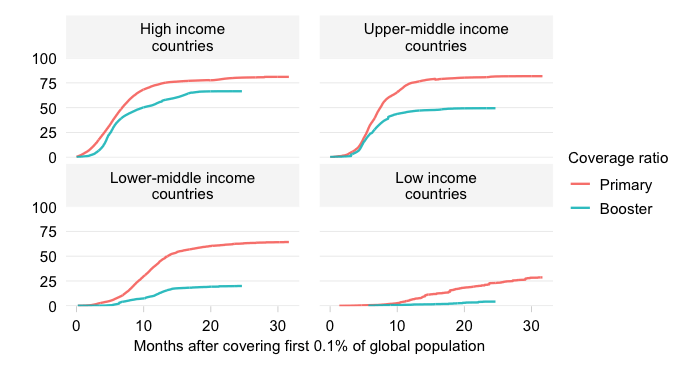
The chart below characterizes primary and booster vaccination progress across the World Bank income classification. This divides the world into high, upper-middle, lower-middle and low income countries and allows us to address questions of cross-country inequality and global vaccine equity.
We plot the evolution over time of primary and booster coverage ratios.
The booster coverage ratio is simply the number of booster doses administered per 100 people. Ideally, we would like to differentiate between successive booster cycles but we unfortunately lack data that is globally comprehensive. As a result, we are comparing progress under the primary cycle with the progress made under potentially multiple booster cycles.
We need to be careful to choose our periods of comparison. The booster campaign started around early August 2021 (at least that’s when the booster coverage ratio reached a minimal mass of 0.1%), whereas the primary campaign started some seven months earlier around early January 2021 (again as per the 0.1% metric). We shift booster vaccinations seven months back in time so we can compare directly.
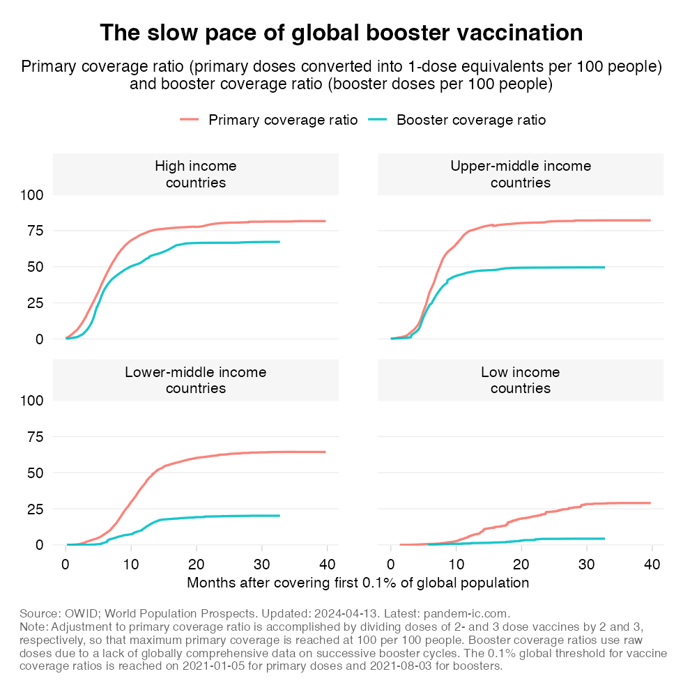
The chart tells us that the global booster rollout is indeed progressing at a much slower pace than primary vaccination. This applies across the income classification even though – as will be elaborated in the next section – progress among the HICs an UMICs has been much greater than among the LMICs and especially the LICs.
The previous chart characterizes the pace of progress and how that compares with primary vaccination some time ago. Let us now take the outcome of the progress booked so far as a given and look at the distribution of the doses that have been administered across income groups for both primary and booster vaccinations.
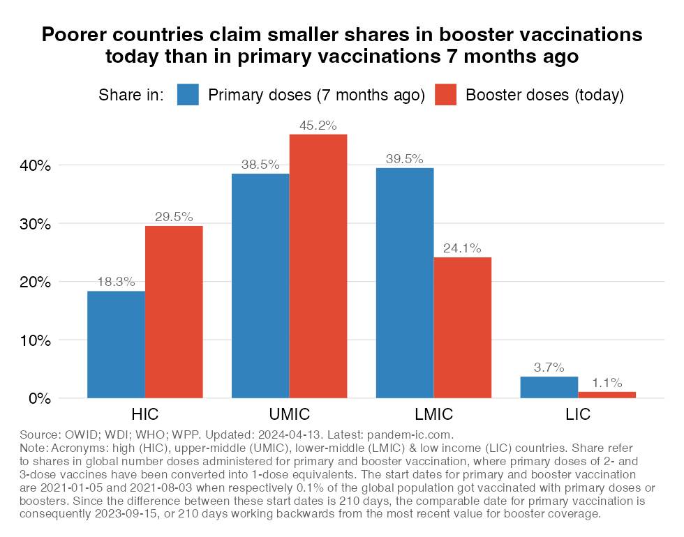
Look now at the lower-income countries in this chart. These are the LMICs and LICs that make up just over 50% of the global population. The chart shows that their shares in boosters administered globally are much lower than their shares in primary doses some time ago. Conversely, the shares of the richer half of the world are much higher for boosters than for primary doses. Interestingly, this is true for both HICs (the rich countries) and UMICs (the richer developing countries). The distribution thus appears more unequal, but it is not just because of the HICs absorbing all the boosters.
We can also look at this dynamically and compare the distribution of boosters with the distribution of vaccines. This is the concept of “revealed vaccine inequity” (RVI). The RVI measure is a ratio of the share in global vaccines to the share in global population and we can calculate that measure for both primary and booster doses. We can also trace it over time. If the RVI equals 1, then that means that the share in vaccines corresponds to the population share. If it exceeds one, then the country has managed to administer more doses in the global total than its population share; and vice-versa.
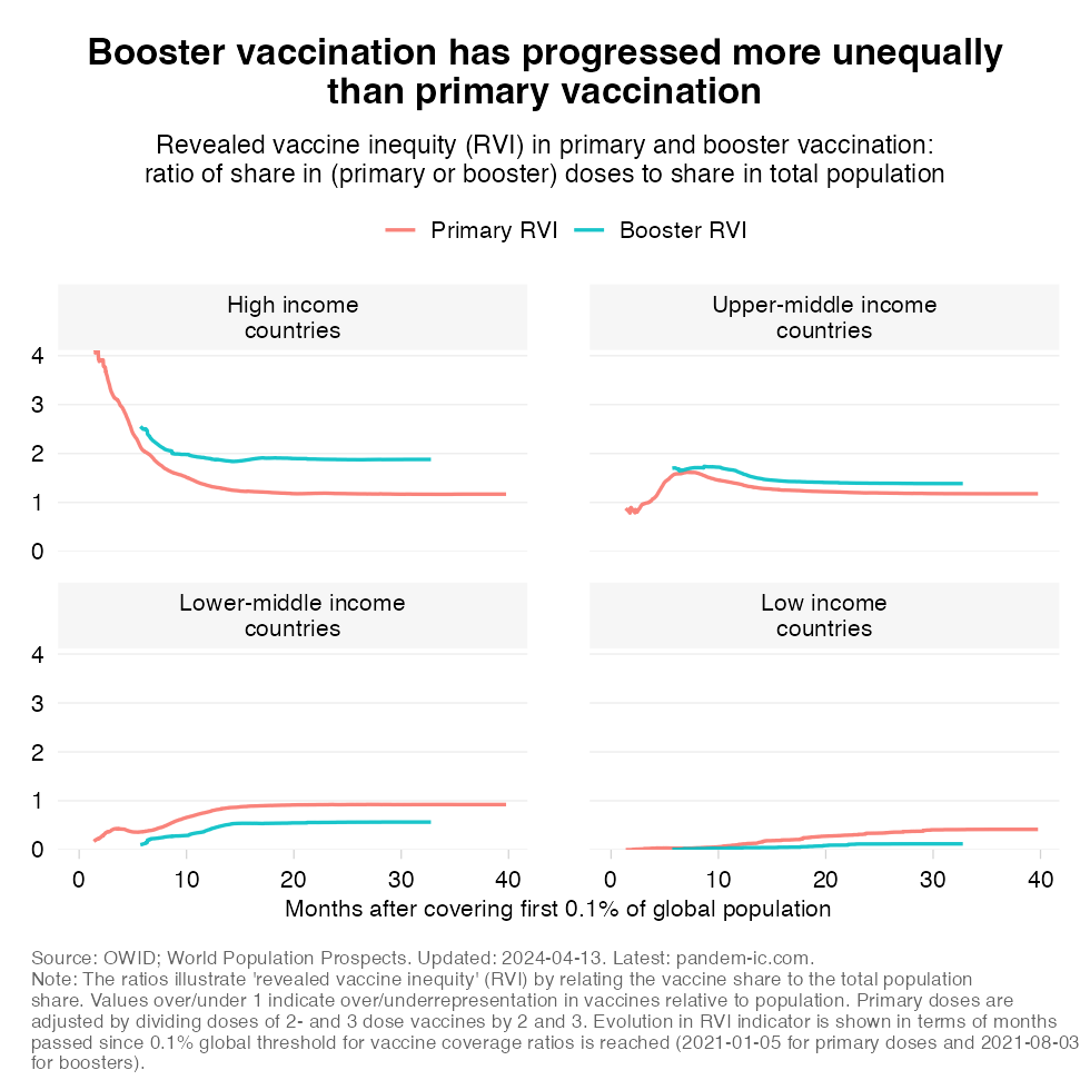
The chart confirms a number of patterns. As to the primary campaign, we see that especially HICs but also UMICs generally have an RVI over 1. Over time it tends to converge to 1 as UMICs and LICs catch up. History is repeating itself, but note how the booster RVI has generally exceeded the primary RVI for the richer half of the world (the HICs and UMICs) and how the opposite has been true for the poorer half (LMICs and LICs). Again, a demonstration of inequality.
We have characterized patterns at the level of the World Bank income classification so far and will now delve a bit more deeply in what is happening at the country level. In what follows, we will first make a comparison between primary and booster vaccination outcomes at equivalent periods across countries that are grouped, again, by World Bank income group.
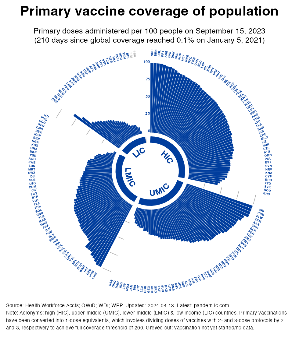
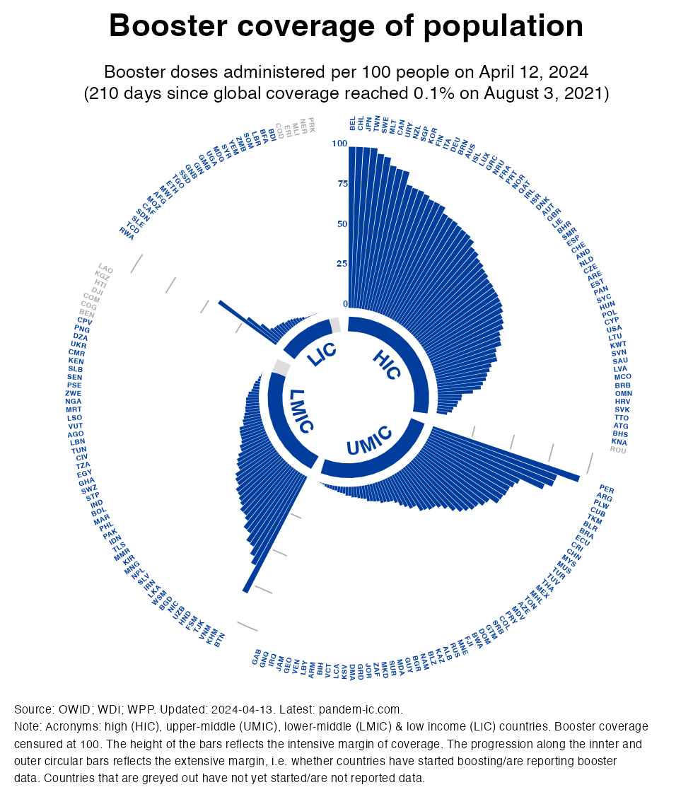
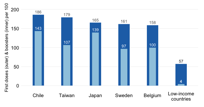
The visualization below combines many elements which will be discussed in detail. It cycles between two charts (which can be dowloaded individually if you click on them). The first chart shows primary vaccine coverage of the population and the second one shows booster coverage, where both cover an equivalent period of days anchored to the length of the booster vaccination campaign thus far. Primary coverage uses the concept of 1-dose equivalents so that we achieve the same threshold of 100 doses per 100 people as we have with booster vaccination (and the fixed axis across charts allows us to cycle them and assess the relative progress).
The above visualization cycles through the charts for primary and booster vaccination (downloadable individually here and here). A quick word on the components of the charts:
Countries are sorted by intensive margin, which has the effect of shifting countries continuously around but conveys strongly the progress made across each income group. Note that this progress is not population-weighted (unlike the previous section and also here and here): countries are given equal weight in the visualization regardless of population size.
The visualization tells us that the global booster rollout has been much slower than the rollout of primary vaccinations not just across income groups but also within them. Similarly, the pattern of inequality observed during the primary vaccination campaign repeats itself: the poorest countries have registered the least progress. But also within income groups, we see considerable inequality. Among the poorer countries, we see the pattern of a number of front-runners followed by many more countries that are lagging. Interestingly, we see less dispersion among HICs and also LICs than among UMICs and LMICs.
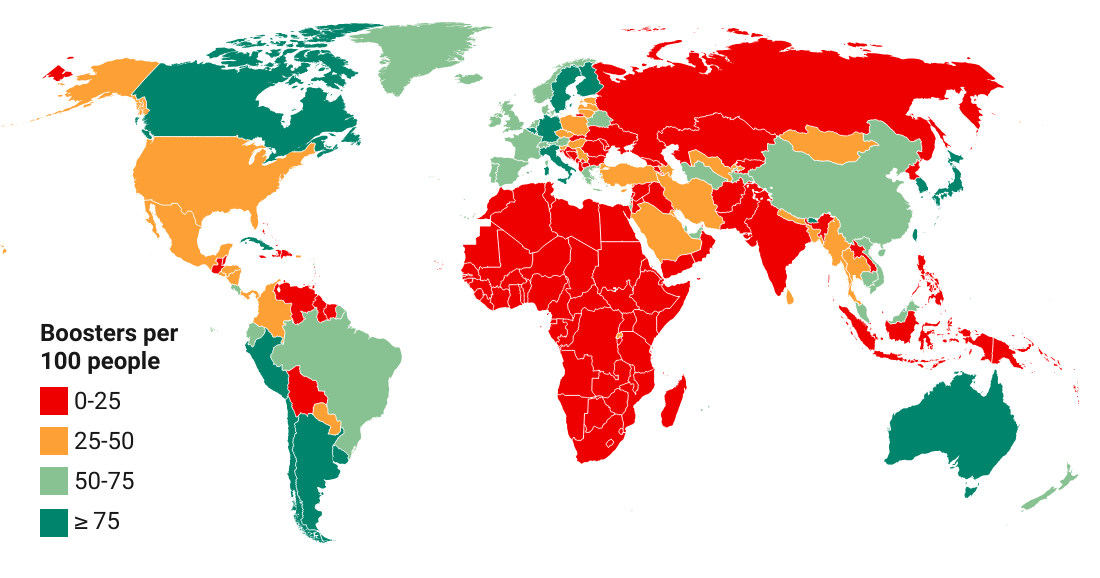
This post has shown that the global booster rollout has been progressing at a slower pace than primary vaccination. Once again the poorer countries are showing the largest gap and their progress has been more limited. Moreover, relative to the patterns of primary vaccination it appears that the booster campaign is associated with more inequality towards the poorer half of the world of LMICs and LICs.
Did we expect this? To some extent yes, because the slower progress on the booster front reflects the delays in primary vaccination. After all, one wouldn’t qualify for a booster if the primary cycle hasn’t been completed. But it is clear that other factors are slowing the booster campaign, ranging from regulatory delay to fatigue and hesitancy.
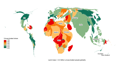
The outcome is that poorer countries suffer a double whammy: a large gap in primary vaccination that still needs to be filled and an even larger gap in booster vaccination. Together, these gaps compound the vulnerability of the poorer countries in the face of waning immunity and the possibility of new variants.
Disclaimer: Posts by the Center for Global Development reflect the views of the authors, drawing on prior research and experience in their areas of expertise. CGD is a nonpartisan, independent organization and does not take institutional positions. Likewise, views expressed do not necessarily reflect those of the United Nations, the United Nations Development Programme, its programmes/projects or governments. The designations employed do not imply the expression of any opinion whatsoever concerning the legal status of any country, territory or area, or its frontiers or boundaries.