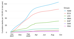
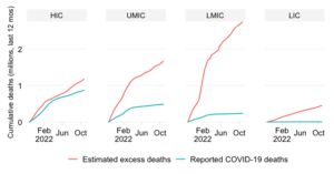
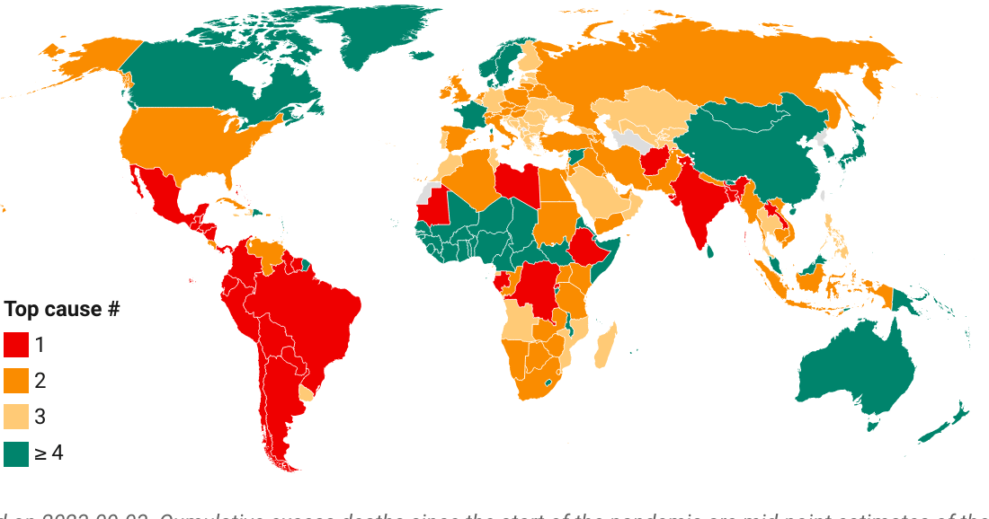
COVID-19 mortality compared with pre-pandemic mortality patterns
EXPLAINER
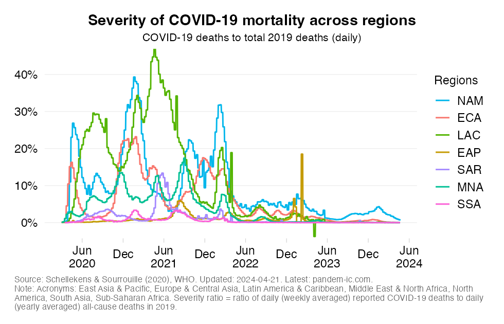
This chart shows the evolution over time of the ‘relative severity ratio’ across World Bank regions.
The relative severity ratio relates COVID-19 mortality to the level and profile of pre-pandemic mortality. The ratio itself is defined simply as the ratio between (1) the total weekly number of deaths with COVID-19 as the underlying cause and (2) the total number of all-cause deaths in 2019 during a similar length of time. In light of data constraints and to foster global comprehensiveness, we take total all-cause mortality for 2019 and scale it down to the period of a week for the comparison under (2).
The severity ratio thus involves a comparison with the level of 2019 mortality. We compare COVID-19 mortality during the pandemic with all-cause mortality in 2019 over the same interval of time. If the ratio is, say, 10% then we COVID-19 deaths mortality is similar in magnitude to about a 10th of the dying that happened in 2019 over a similar interval of time.
In the above chart, we focus purely on the evolution of weekly relative severity across income groups and don’t make any comparisons with the top cause of death in 2019. See the related charts below for such comparisons.
Note that the expression of mortality in relative terms is a useful way to communicate the severity of the pandemic. Countries will have adapted to their specific patterns of mortality. Deviations from this pattern may create pressure points, such as on the health system. Comparisons with previous patterns give a country-specific and intuitive flavor of the severity of the COVID-19 pandemic. A statement such as “COVID-19 is claiming more lives than the top cause of death did in 2019” may convey a better feel for the severity of the pandemic than a reference to a mortality rate (total deaths per 100k people).