Comparing pandemic fatalities with typical top cause of death worldwide isn’t simple, especially during an ongoing crisis. To tackle this, this post matches excess deaths during the pandemic with pre-pandemic death rates over the same period. The startling conclusion? In most countries, the pandemic’s death toll has outpaced their usual leading causes of death, highlighting its sweeping global impact.
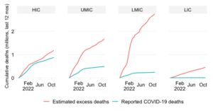
Ranking the top causes of death during an ongoing pandemic is not easy. First of all, we cannot rely on the officially reported COVID-19 mortality statistics as these grossly understate the true picture. Excess mortality numbers provide a remedy but these need to be estimated given the unavailability of timely all-cause mortality data in most countries. Second, and relatedly, the causes of death data themselves are generally not available on a timely basis and therefore do not allow us to make contemporaneous comparisons with excess deaths. So we need to take a different approach, which consists of the following three elements.
Since the officially reported data on COVID-19 mortality are unreliable, we use the excess death estimates by The Economist. While currently best-in-class. they are not without limitations themselves – see details in Annex 1 below – but they represent a significant improvement over the officially reported picture. They are also notable for their transparent disclosure of assumptions, methods and standard errors around the results.
In what follows, we will rely on the mid-point estimates provided by the model, realizing full well that the 95% confidence interval around these mid-points can be large for some countries. See this companion post for a comparison of how the results change when we deviate from the mid-points.
As noted, data on top causes of death by country are generally not contemporaneously available. To remedy this, we calculate the top causes as of 2019, selecting for each country the Top 3 leading causes using the Global Burden of Disease dataset (the selection is made out of 123 disease families at level 3 of the aggregation in GBD).
This is useful for a number of reasons. The main one is that the comparison with pre-pandemic mortality patterns provides an intuitive reference point about pandemic severity. Statements such as “the pandemic is claiming more lives than heart attack or stroke before the pandemic” may foster a better appreciation of the severity of the pandemic than “the excess death ratio is X per 100,000”.
The drawback of course is that the year 2019 may not be completely representative. It may not be representative of the present. And it may not be representative of earlier years. These are caveats we should keep in mind, even though the greater source for potential error is the uncertainty that surrounds the excess death estimates.
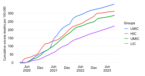
Excess mortality encompasses different sources of mortality. It includes of course COVID-19 mortality, but there are also indirect sources of mortality. Other diseases have been unmanaged or undermanaged given the burden on health systems or the perception of risk of going to a hospital. The economic implications of the pandemic within and across countries may have contributed indirectly too. And then there the opposite effects in terms of deaths avoided thanks to less road traffic and masking.
So why compare the composite measure of excess mortality with the more specific top causes of mortality? The answer is simply that the objective here is to provide a country-specific impression of how severe the overall outcome of the pandemic has been. And that impression is easily conveyed by relating the overall mortality burden to the pre-pandemic patterns of mortality that people are accustomed to. The comparison is not an exercise in disease advocacy. No, it is an attempt to provide intuitive context to the global impact in a country-specific way.
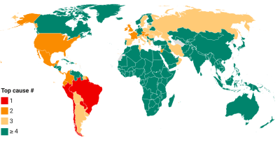
Proceeding now to the results, we will show a map of where the top causes of death have been exceeded. This provides an indication of relative severity (relative to the pre-pandemic causes of death). After that, we will provide numbers on the distribution of countries according to which cause of death was exceeded.
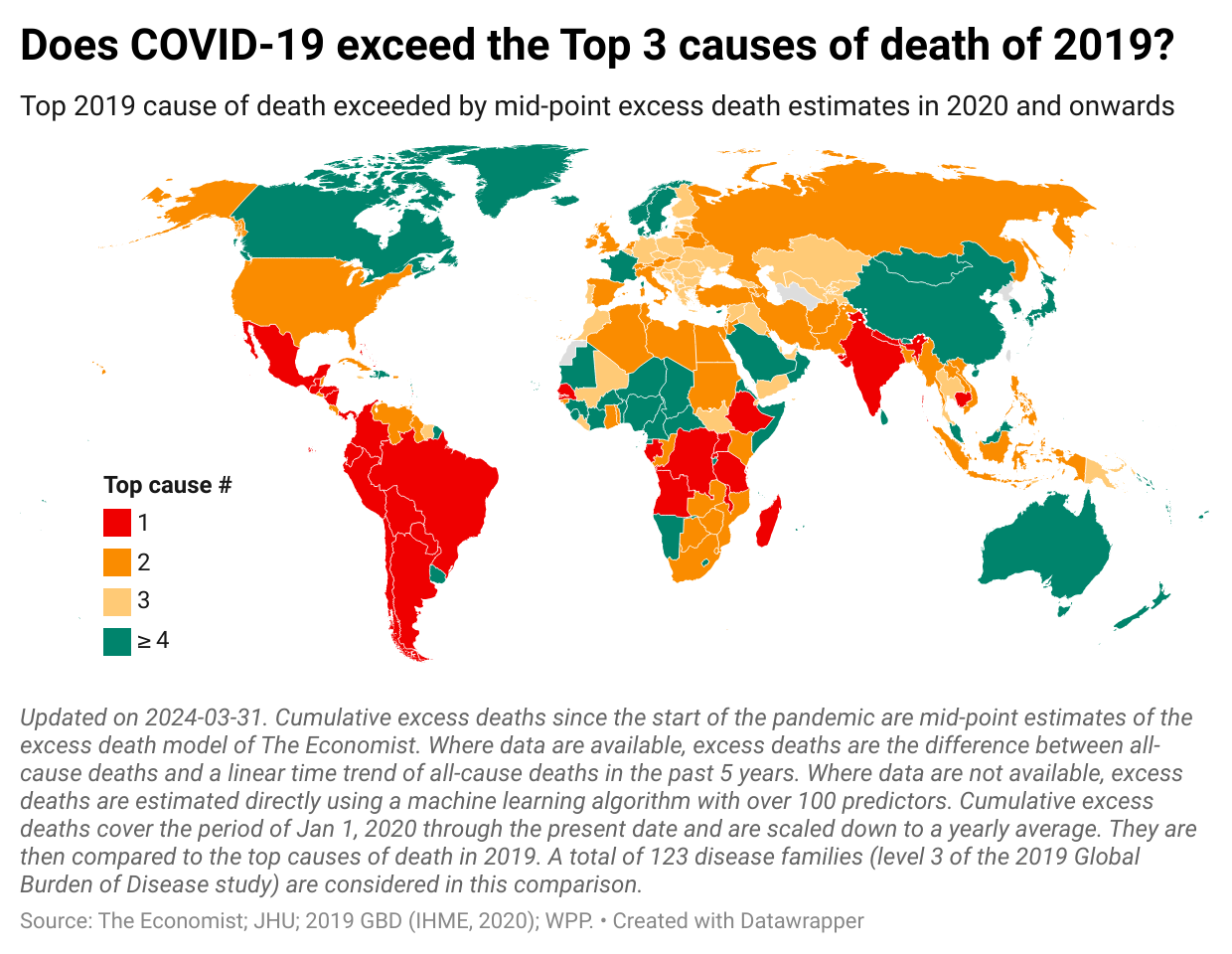
The map below presents a summary of the main result. The colors show which top cause of death is exceeded by our measure of excess mortality. So when a country is colored red, that means that excess deaths have exceeded the #1 cause of death in 2019. The different shades of orange apply this logic to causes of death #2 and #3, whereas green refers to countries where excess deaths do not exceed the top 3 causes.
To avoid apple-and-orange comparisons, we need to make sure we make comparisons over equivalent periods. Since causes of death are anchored to the yearly frequency, we convert the estimate of cumulative excess mortality (over the full course of the pandemic up through the present date) into a yearly average.
In what follows, we will discuss the results across continents (and making references to distinct UN subregions within each continent):
In Oceania, we see green in the two largest countries: Australia and New Zealand.
As an aside, note that the full details of the methodology are available in Annex 2. Note also that this is a clickable map. The tooltips provide a step-by-step guide for each country on how the results were derived. For a non-interactive version of the map, click on “download image” within the map or here.
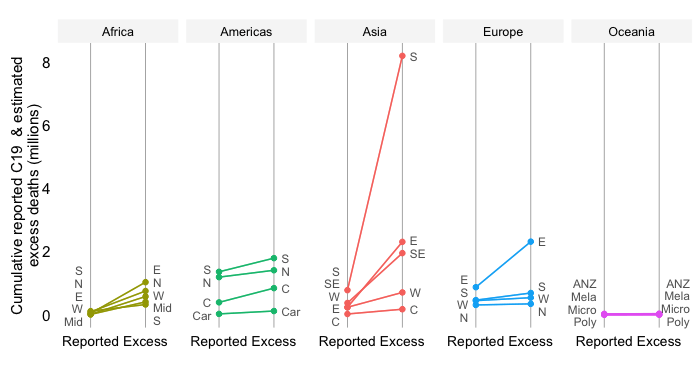
Next, let us characterize the distribution of countries by the ranking observed in the previous map.
The map provides a strong visual impression confirming that pandemic mortality exceeded the top causes of death of 2019 in a vast majority of countries. Let us now provide some more quantitative detail on the distribution of countries by cause of death exceeded. Again, we refer here to “relative severity” because these are comparisons relative to country-specific causes of death.
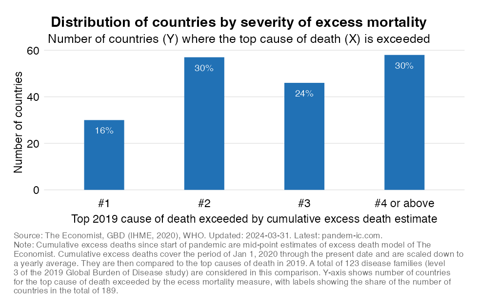
The first bar in the chart above shows the number of countries on the Y axis for which the Top #1 cause of death is exceeded by the measure of excess mortality. Note that while the Y axis shows the number of countries, the label shows the share of countries in the global total of 189 in our dataset). The second and third bars show the same for the Top #2 and #3 causes of death, respectively. The final bar show the remainder of countries, i.e. those places where none of the Top 3 causes of death were exceeded and therefore the cause of death that has been exceeded must be #4 or above.
These results suggest for the vast majority of countries the pandemic has claimed more lives than the top causes of death did in 2019.
Data limitations limit our ability to make on-the-fly comparisons with typical mortality patterns while we are in the middle of an ongoing pandemic. But that is perhaps not even a bad thing since one will be interested in relating how mortality compares to the period before the pandemic. We have pursued the approach of comparing appropriately scaled cumulative excess deaths to pre-pandemic mortality patterns of 2019.
The comparisons emerging from this are country-specific, but relative the specific mortality patterns of each country one pattern is common: the global impact of the COVID-19 pandemic is nothing to be “sneezed” at. Indeed, relative to country experiences, we see that in most countries the common top causes of death were exceeded.
Once again, note that these are relative comparisons to country-specific mortality patterns and should not be interpreted otherwise. So when country X has a red color and country Y an orange one, that need not imply that the excess mortality rate in X is higher than Y. No, it merely signifies that with reference to each country’s causes of death, the pandemic has been “relatively” more severe in country X than in country Y.
Finally, we should caveat these results by repeating the limitations of the analysis. First, excess death estimates are surrounded by considerable uncertainty which means that the reality may be better for some and worse for others. Second, the anchor year of 2019 may not be representative with respect to the future and with respect to the past.
A number of caveats apply to the excess death estimates used.
First, the standard errors of the estimates. The two visualization immediately above illustrate the sometimes large confidence intervals around the mid-point estimates of excess deaths. The first map shows the country distribution by top causes of death if we were to take the upper-bound estimates of the 95% confidence interval around the mid-points. The second map shows the same for the lower-bound estimates of that confidence interval.
Second, the possibility of bias. Not only are the excess death measures estimated with a considerable degree of imprecision in especially the poorer countries, there are also reasons why the estimates may be biased (i.e. misrepresentative of reality). The Economist acknowledges two main reasons why and it turns out these are not just some after-thought but important qualifiers:
“Because most countries that report excess deaths are rich or middle-income, the bulk of the data used to train our model comes from such places. The patterns that the model detects in these areas could thus be an inaccurate guide to the dynamics of the pandemic in poor countries. A similar caveat applies to our estimates for countries that have suffered lots of excess deaths for reasons other than the pandemic, such as war or natural disasters.”
The second bullet point on bias is especially important.
The estimates may be well-calibrated against the available observations but we cannot tell with much confidence how well they hold up for those countries where information is sparse or not available. Should additional information be published in the future, the estimates can be checked and improved. But until then we have to accept that not only the margins of uncertainty are large, but also there may be an element of bias in the results.
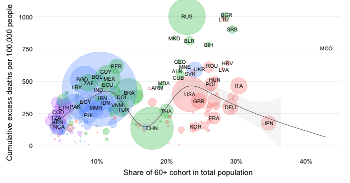
The direction of bias is likely upward since reports on the ground in especially lower-income countries do not suggest a very considerable excess death toll. If we were to simplistically divide the world into groups of lower- and higher-income countries which are respectively characterized by data environments that are poor and rich, then structural differences between these groups could easily lead to an upward bias. Let’s focus on four structural differences:
For all of the above these reasons, we should approach the estimates as tentative and treat the results shown here as preliminary. We should also use complementary information at the country level to assess the true severity of the pandemic. Having said that, the estimates and results represent the best possible effort to convey a globally consistent picture of the impact of the pandemic and remain a good starting point.
In what follows, we expand on the extensive footnote of the map shown in this post.
The excess death estimates. As noted, we take the cumulative excess death estimates by The Economist, which start for each and every country on Jan 1, 2020. Please note:
We will compare the excess death estimates with pre-pandemic mortality data on a yearly basis. For this reason, we need to adjust the excess death estimates into yearly averages by scaling them down by 365 / the number of days passed since Jan 1, 2020.
The “excess severity” ratio. We express cumulative excess deaths as a ratio to pre-pandemic mortality (and not a proportion since it is a merely a comparison and not a share, i.e. the numerator is not part of the denominator). A few points on this:
Comparing “excess severity” with top causes of death. The next step in the analysis is to compare the ratio of cumulative excess deaths (adjusted and mid-points) to the proportionate mortality rates of the top causes of deaths. Let’s break this down:
Why compare excess deaths (which is an all-cause mortality concept) with specific causes of death? The intent is to convey a feel about the severity of the pandemic in terms of the total direct and indirect mortality impact it has caused by making comparisons with top causes of death. These are easily understood comparisons that are meant to dimension the severity of the current episode we’re going through.
Disclaimer: Posts by the Center for Global Development reflect the views of the authors, drawing on prior research and experience in their areas of expertise. CGD is a nonpartisan, independent organization and does not take institutional positions. Likewise, views expressed do not necessarily reflect those of the United Nations, the United Nations Development Programme, its programmes/projects or governments. The designations employed do not imply the expression of any opinion whatsoever concerning the legal status of any country, territory or area, or its frontiers or boundaries.