To compare vaccination across countries, we often rely on vaccination rates (the share of people vaccinated) and vaccine coverage ratios (the ratio of doses administered to population). Both metrics however suffer from important drawbacks, such as the absence of contemporaneous data and the failure to take into account the diversity of vaccine protocols. We propose a new indicator in the doses space that avoids these pitfalls.
Ever since the start of the global vaccination campaign there has been in keen interest in tracking and comparing the pace of vaccination progress across countries. The various trackers that have been developed typically rely on vaccination rates (such a the share of people vaccinated with at least 1 dose in the total population) and vaccine coverage ratios (such as the ratio of primary doses administered to the total population). Yet, all the indicators that have been used so far suffer from a number of drawbacks. We highlight four of them.
Vaccination rates require data that are not always contemporaneously available, including for some of the largest countries in the world. Vaccination rates are indicators in the people space, such as the share of people fully vaccinated, partially vaccinated, with at least 1 dose or exactly 1 dose, 2 doses or even 3 doses. These indicators provide detail and, unsurprisingly, also require detail to construct them: they require a comparison of vaccination progress against established vaccine protocols at the level of each individual and each protocol.
Several countries however do not regularly publish information on the split between full and partial vaccination. Some countries have yet to produce any data at all. Others do publish the data but only irregularly. This complicates individual country comparison. It also complicates the aggregation of data into global totals, regional totals or totals by income group. This can be particularly problematic if the country is large, as is the case of China.
Let’s zoom into the Chinese data to illustrate this, even though the issue arises in many other countries too (check this post for additional detail):
The first datapoint on the full vaccination rate in China was made public only on August 12, 2021 (777 million). Before then, we did not have any information, even though 1.8 billion doses had already been administered. We could call these doses “undocumented” in the sense that they lack documentation on whether the doses administered contributed to full or partial vaccination.
The second datapoint was made available two weeks later on August 26, 2011 (889 million), which means that a total of 171 million doses were “undocumented” in the interim .
The sheer size of these numbers affects the more aggregated picture of vaccination progress. For example, looking at vaccination progress by World Bank income group, the data availability issues in China produce a jagged pattern in the reported data for upper-middle-income countries (to which China belongs). This renders the aggregate not useful for comparison.
Similar issues apply to other vaccination rates for China (e.g. vaccination rate with at least 1 dose).
Data issues aside, vaccination rates by themselves offer a partial view of vaccination progress. They’re detailed and that means they only capture the detail being measured. Take for example countries A and B that are respectively 5 and 10% fully vaccinated and 80% and 10% vaccinated with at least 1 dose. Most would agree that A is ahead of B thanks to the progress on partial vaccination. But such a conclusion would only be possible by examining both indicators. If we had just looked at the full vaccination rate we would have concluded that B is better off.
Vaccine coverage ratios almost always lead to incorrect comparisons across countries because they do not control for the type of vaccine protocols in place (1, 2 vs 3 doses). Vaccine coverage ratios are indicators in the dose space. They’re ratios because the numerator is not part of the denominator. For example, the ratio of total doses administered relative to the size of the total population. This indicator is commonly used for cross-country comparison, but almost always incorrectly for two reasons:
Doses per capita cannot be readily compared across countries as a measure of vaccination progress due to differences in vaccine protocols. Suppose two countries A and B have administered both 50 doses per 100 people. But in country A the 50 doses are all single-dose protocol, whereas in country B they are all two-dose protocol. Clearly, the vaccination effort in country A would be more advanced than in country B. But comparison of unadjusted doses would not capture that.
The full-vaccination milestone varies from country to country depending on the mix of vaccines in use. That complicates comparison across countries. It also means we lack a common measure of the distance that remains to be travelled towards full vaccination. If we’re at 50 doses per 100 people, will we reach full population-level vaccination at 100, 200, 300 or somewhere in between? The answer depends on the mix of vaccines used. If we only use 1-dose protocols, 100 would be the goal post, but it would be 200 or 300 if we only used 2- or 3-dose protocols and somewhere in the middle if we used a mix.
Many make comparisons in the dose space by lumping together primary vaccinations and booster doses, which distorts the measurement of progress. There are two issues here:
Consider country A that has administered 200 primary doses of AstraZeneca (a 2-dose protocol) per 100 people and 0 boosters and country B that has administered 100 primary doses of AZ and 100 booster doses per 100 people. Which country is better vaccinated? If we amalgamate primary vaccinations and boosters into one indicator, we can’t tell these situations apart.
A large share of the global population has yet to get a first shot and an even-larger share has yet to complete the primary vaccination cycle. By lumping primary vaccinations and boosters, we can’t measure the degree of inequity accurately. Having a well-vaccinated population that starts boosting certainly enlarges vaccine inequity if other countries remain poorly vaccinated on their primary cycle. But it is often necessary to make comparisons based on primary vaccinations only if we are to assess the extent to which countries lag behind on these primary cycles.
The typical response is that we can skirt around the issues by using multiple indicators simultaneously, but that’s not really a solution. While complementing eg the full vaccination rate with a partial vaccination concept provides a more complete picture, it does not resolve the data availability issues. And it does not resolve the other weaknesses mentioned earlier that affect individual indicators. On top of that, considering multiple indicators simultaneously also creates an additional problem: confusion. Individual indicators move in different directions and tell different stories.
We need an alternative approach. One that is less onerous in terms of data requirements, yields accurate comparisons and, ideally, combines sufficient information in a single indicator.
Here’s a proposed solution: “Primary doses administered converted into double-dose vaccine equivalents per 100 people”.
The indicator combines features of the vaccination rate (which embeds information about the protocol used) and the vaccine coverage ratio (which uses doses that are available easily). What distinguishes it from the simple doses per capita measure is that doses have been adjusted. They’ve been converted into double-dose equivalents (DDEs).
What are DDEs?
Converting into DDEs means that we multiply the number of single doses administered by 2 for a single-dose protocol and 2/3 for a three-dose protocol. So if a country had administered 100 doses under a single-dose protocol, we would count it as 200 adjusted doses. Conversely, if a country had administered 300 doses under a three-dose protocol, the number of adjusted doses would be 200. In both cases, we achieve full population coverage at 200 DDE-adjusted doses per 100 people.
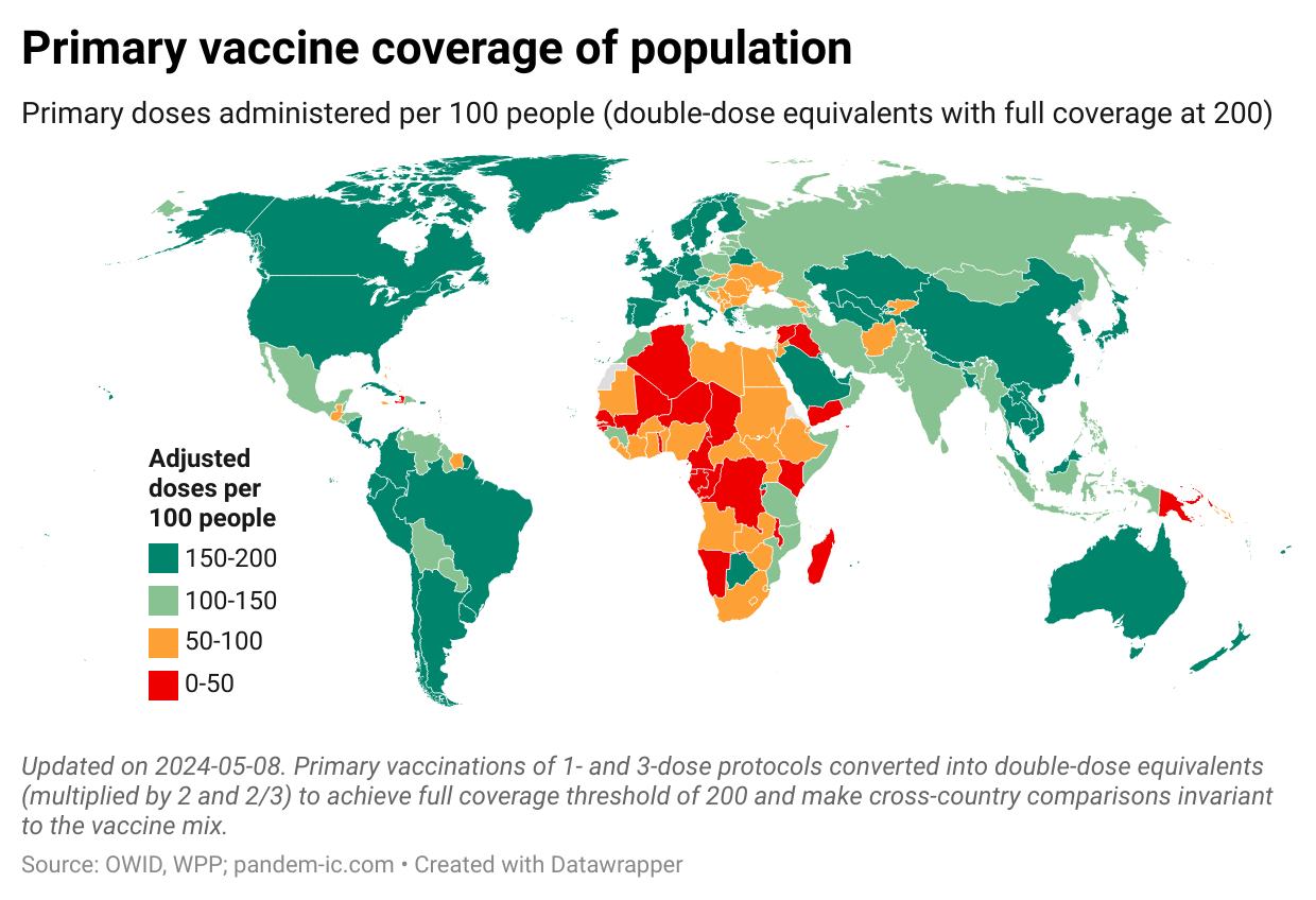
Below is an example of primary vaccine coverage of the global population when we use the adjusted doses.
This approach is less demanding in terms of the data that is required. It requires data about single versus multiple dose vaccinations, but it is agnostic and therefore less demanding about whether a dose of a multiple-dose vaccine represents full or partial vaccination. That helps as for several countries such data are not available on a timely basis.
Another advantage is that the indicator combines information about vaccination progress towards full coverage in a single number. With it, we can show a single map (as above) and don’t have to show two different maps to cover eg full and partial vaccination.
With the adjustment, we can finally accurately compare countries’ progress in the dose space regardless of the vaccine mix being used. We also have a common threshold of full coverage at 200 doses per 100 people. This threshold is invariant across countries and over time. It is a steady milestone against which progress can be evaluated.
So let’s consider changing, or at least complementing, the way we compare vaccination progress across countries. The DDE indicator is not perfect in that it does require information on different protocols (which is not always available everywhere). But it does considerably improve over vaccine coverage ratios in terms of the accuracy of comparison, can be less onerous data-wise than vaccination rates, and is much simpler communication-wise than using a slew of indicators each covering a partial aspect of the full picture.
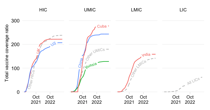
Cuba is notable for its impressive vaccination record thus far, but also for the fact that it has developed several vaccines of its own. The vaccines it has developed consist of different protocols. Cuba currently administers three types of protocols: Abdala (3-dose vaccine), Soberana 2 combined with Soberana Plus (considered a 3-dose vaccine for children) and Soberana Plus stand-alone (considered a 1-dose vaccine for those with prior COVID). Note that in the data Cuba publishes, Soberana Plus when combined with Soberana 2 is treated as the third dose of a three-dose vaccination protocol and not as a booster.
How do we take into account this diversity of vaccines in the DDE indicator? First we scrape the data from the Cuban health authorities. We require: (1) total doses administered, (2) people vaccinated with three doses and (3) people fully vaccinated (data which is presently not available at Our World in Data). Total doses administered under the 1-dose protocol (Soberana Plus stand-alone) then equal (3) – (2), whereas total doses under 3-dose protocols (Abdala and the Soberana 2 and Plus mix) equal (1) – (3) + (2) . The next step is to multiply the single-dose protocol doses by 2 and the three-dose protocol doses by 2/3. Add everything up and we are done.
The Cuban case illustrates the value of the indicator. Let’s pick an arbitrary date – October 29, 2021. If we were to use unadjusted doses per capita, Cuba’s vaccine coverage rate would stand at 225 doses per 100 people – the highest in the world among 196 countries. The adjusted coverage ratio on the other hand would be 154 doses per 100 people – a lot lower than the unadjusted number because about 99% of Cuban vaccine doses administered require three shots. Even so, late October 2021, Cuba ranked at the top of the developing world, surpassed only by Cambodia and China, and globally it was the 16th most-vaccinated place.
Disclaimer: Posts by the Center for Global Development reflect the views of the authors, drawing on prior research and experience in their areas of expertise. CGD is a nonpartisan, independent organization and does not take institutional positions. Likewise, views expressed do not necessarily reflect those of the United Nations, the United Nations Development Programme, its programmes/projects or governments. The designations employed do not imply the expression of any opinion whatsoever concerning the legal status of any country, territory or area, or its frontiers or boundaries.