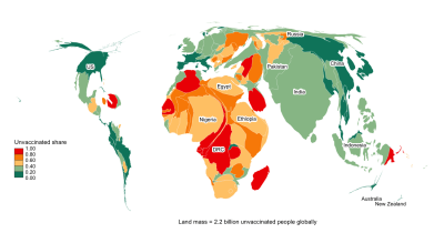
Countries with low life expectancy at birth are generally those that have booked the least progress during the global vaccination drive against the coronavirus. This is the Matthew effect at work, summarized by the adage “the rich get richer and the poor get poorer”. The strongly positive association between life expectancy and vaccination progress illustrates how regressive the global vaccination campaign has turned out to be. Once again, it has become clear that during times of crisis the initially disadvantaged are the least able to protect themselves and become more disadvantaged, which in and by itself is a mechanism that perpetuates poverty and inequality.
Let us explore the association between these two variables in the chart below.
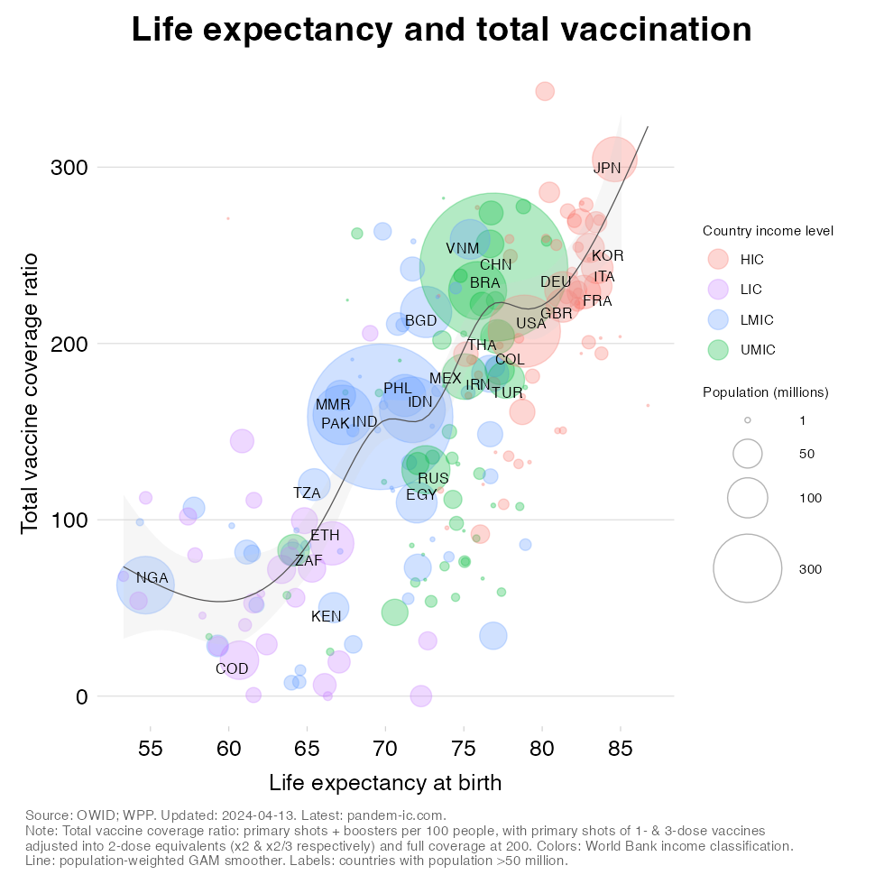
What does the chart tell us?
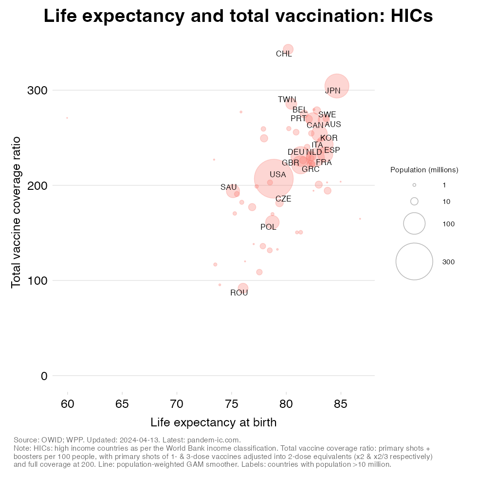
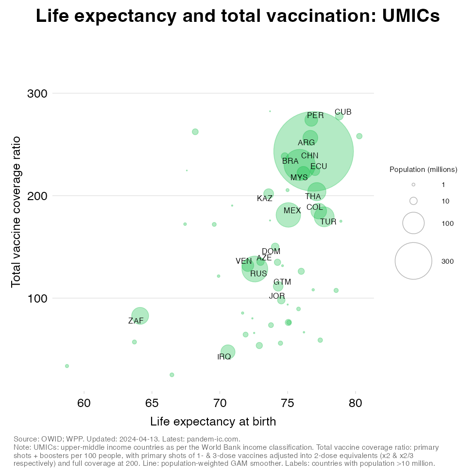
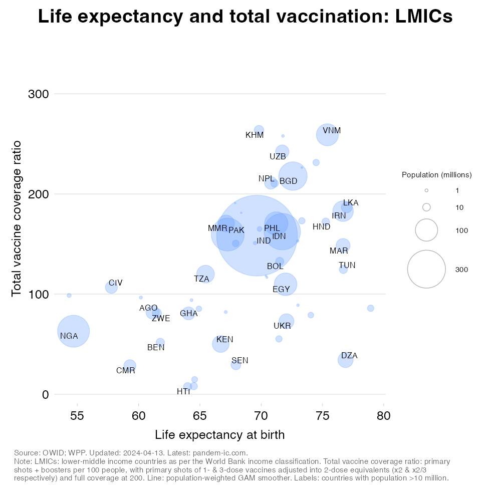
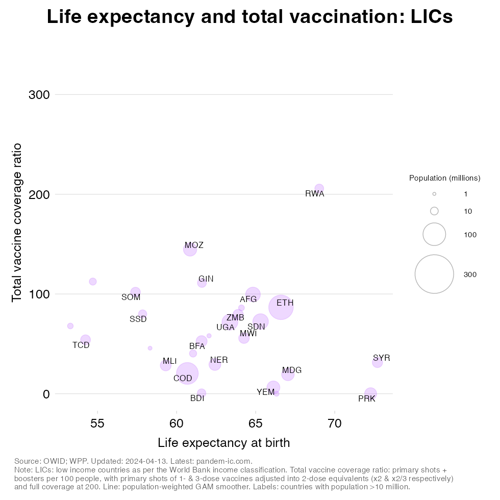
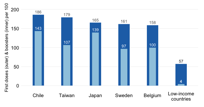
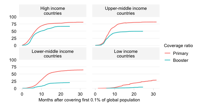
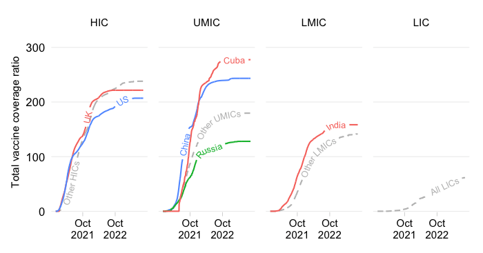
Much of the positive association at the country level is due to the variation in income levels. HICs are at the very top, followed closely by UMICs even though these are characterized by much-greater dispersion in both the vaccination and the life expectancy variables. A similar pattern holds true for the LMICs. LICs universally have suffered both low life expectancy and low vaccination rates. (More details are provided in the charts at the bottom of this post, which show the results by income group.)
We can also show the evolution in the association between the two variables over time. To do so, we start at the beginning of the vaccination campaign (Dec 2020) and let the dataviz run through the present date.
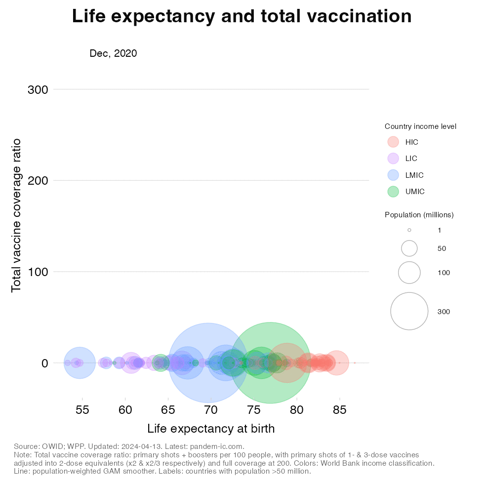
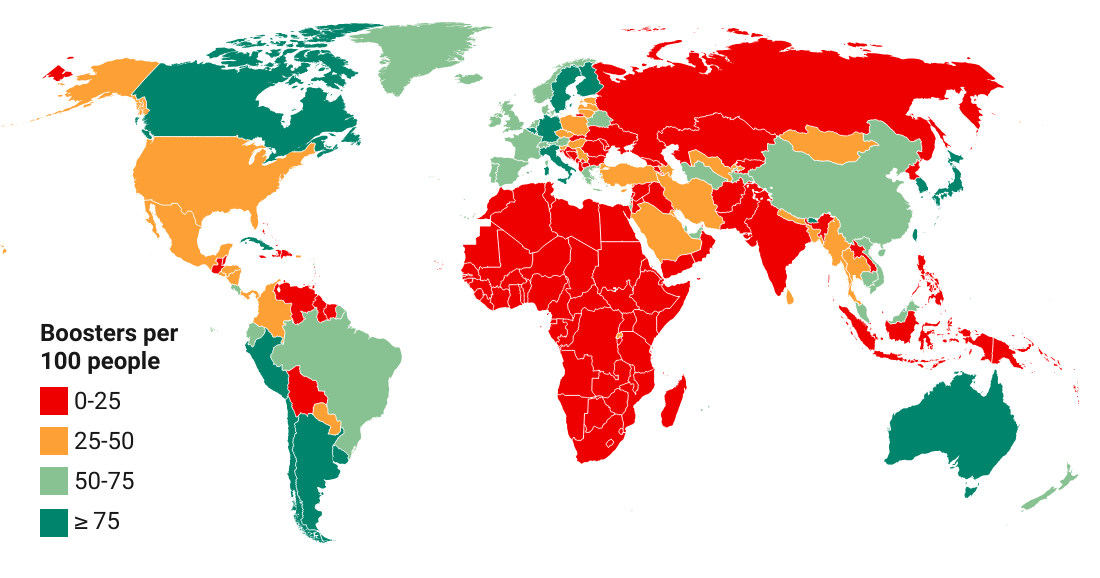
The dynamic version conveys an even starker picture of how the countries with the lowest life expectancies at birth are left behind on the vaccination front. Countries with longer longevity (typically the richer countries in the income classification) have a head start on the primary vaccination front. Later, into the summer and especially the fall of 2021, booster vaccinations start to pick up, which widen the gap with lagging countries even further.
Based on the chart above we derive that the Matthew effect appears to be at work. It refers to the effect of accumulated advantages among the better off and exacerbated disadvantages among the worse off, thus contributing to the persistence of poverty and inequality.
Life expectancy at birth is a synthetic measure that captures the overall ability of society to prevent death during a certain period and as such is a proxy for the quality of public health among other factors. As the chart has shown, there is a strongly positive association between life expectancy and vaccination progress. And vaccination outcomes in turn affect health outcomes and, at its starkest, life and death.
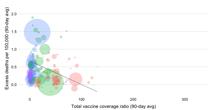
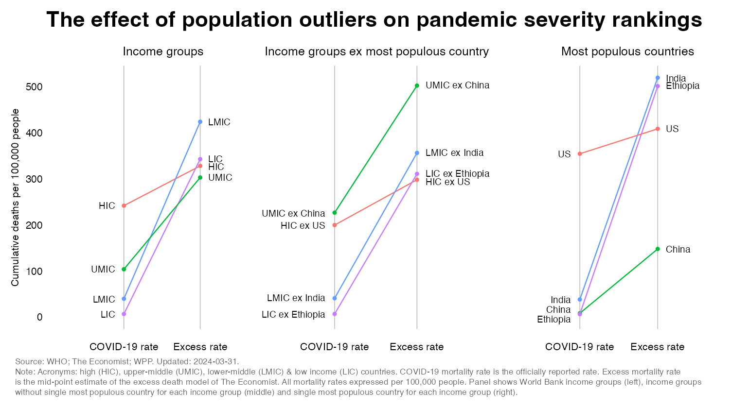
When it comes to the mortality impact of the pandemic, the developing countries have suffered a much more intense blow than is commonly thought. The available excess death estimates suggest that LMICs were affected the most, followed by very similar effects for HICs, UMICs and LICs (see left panel of chart below). If we were to exclude population outliers, we would in fact have the result that excess death rates in the HICs were the lowest.
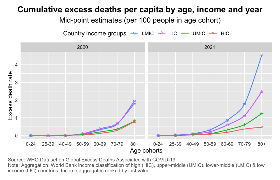
The result that excess mortality rates in developing countries were generally higher than those in the rich countries (HICs) is obtained using population-level measures. But if we look at the mortality rates of specific age categories, the sheer tragedy of the pandemic in the developing world comes out even more clearly.
The WHO’s excess death estimates for 2020 and 2021 provide a granular reminder of how individual age cohorts have been affected. Given the age-discriminating nature of COVID we know that the elderly cohorts were generally the worst affected. But it is interesting to see how that result varies across income groups. In fact, the estimates suggest that the older cohorts in developing countries were far more affected on a per capita basis than those in the rich countries (HICs).
The poorer countries are worse off in both dimensions: life expectancy at birth and total vaccination progress. The pandemic has also shown that the poorer countries have suffered a far more intense impact than commonly acknowledged in the official statistics. Putting one and two together, one could argue that it is precisely those countries who underperform on longevity that are the least able to protect their vulnerable populations at a time of crisis. And it is crises like the pandemic that reinforce the perpetuation of poverty and inequality.
For completeness, we provide visualizations by individual World Bank income groups, with a larger set of countries identified with their country codes.
Disclaimer: Posts by the Center for Global Development reflect the views of the authors, drawing on prior research and experience in their areas of expertise. CGD is a nonpartisan, independent organization and does not take institutional positions. Likewise, views expressed do not necessarily reflect those of the United Nations, the United Nations Development Programme, its programmes/projects or governments. The designations employed do not imply the expression of any opinion whatsoever concerning the legal status of any country, territory or area, or its frontiers or boundaries.