Countries with large populations have the potential to significantly distort how we see the severity of the pandemic around the world. Considering the pandemic performance of the US, China, India and Ethiopia, we assess how these population outliers affect average mortality rates by World Bank income group. As it turns out, the rankings of pandemic severity are completely upset. The outcomes for upper-middle and lower-middle income countries completely change, whereas those of high- and low-income countries converge to each other.
Even into this third year of the pandemic, it remains necessary to dispel the persistent perception that the pandemic has left the developing world largely unscathed. Nothing could be further from the truth. The pandemic has dealt the developing world a very serious blow and it has been the purpose of this data analytics resource to call attention to that fact.
Demographic structure and poor data make it hard to eradicate the mistaken perception of a mild developing country pandemic. Developing countries tend to have proportionately younger populations, which after all should reduce, all else equal, population-wide mortality risk. Officially reported COVID-19 mortality rates aid in reinforcing this perception since they tend to be a lot lower in the developing world than in high-income countries.
Unfortunately, as we have argued in this companion post, not all else is equal. For one, in many poorer countries, the demographic advantage of having a young population is reduced, if not offset, by other factors, such as limited availability of and access to quality health care. Furthermore, weaknesses in civil registration and vital statistics systems mean that we cannot rely on officially reported COVID-19 mortality statistics. We also need to cast our net more broadly to account for the various indirect effects on mortality to be able to account for the total impact of the pandemic, which means that a narrow focus on COVID-19 deaths is insufficient.
In this post, we examine one further factor that contributes to distorting the perception of how severely the developing world has been affected: the role of population outliers. We examine how countries with very large populations affect population-weighted mortality rates and how the rankings of pandemic severity across World Bank income groups are altered if we were to exclude these large countries. The effects turn out to be very considerable.
The World Bank’s income classification splits the world into four groups of countries according to average per capita income levels: high income countries (HICs), upper-middle income countries (UMICs), lower-middle income countries (LMICs) and low income countries (LICs). This classification allows us to make statements about pandemic severity in rich and poor countries, where UMICs, LMICs and LICs traditionally refer to the heterogenous group of the developing world.
We select one population outlier for each income group, i.e. the country with the largest population size relative to its income peers. That gives us the following four countries: the United States within the group of HICs, China among UMICs, India as part of the LMICs and Ethiopia among LICs.
Should we assess pandemic outcomes with or without these population outliers? At some level, we should include them by all means. The selected countries represent after all a large, if not humongous, share in their group totals. The US represents about 27% of the HIC population, China 56% of the UMIC group, India 41% of the LMICs and Ethiopia 17% of LICs. Collectively, they represent 42% of the world population. If we are interested in assessing pandemic performance across income buckets, we should include them into the population-weighted average. A life lost is a life lost, regardless of borders, so let us consider the full income classification when assessing the severity of the pandemic.
At the same time, we are also interested in assessing how pandemic severity manifests itself unequally within each income group. As it turns out, China, India and the US are not only the three largest countries in the world population-wise, but they are also notable for the vastly different mortality impacts relative to their respective peers (the exception here is Ethiopia, whose performance was more in line with its low-income country peers). Given that pandemic performance is to a significant extent the result of sovereign actions, it is useful to see how the four income groups have performed without the outliers. This provides us with an insight into how robust statements about pandemic severity based on population-weighted group averages have been.
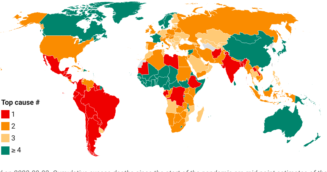
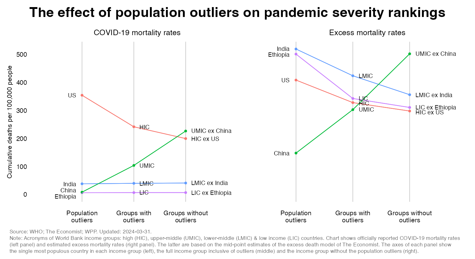
The chart below shows the main results. It depicts the cumulative COVID-19 mortality rate and the cumulative estimated excess mortality rate, where both measures count back to the start of the pandemic and are expressed per 100,000 people. The excess mortality estimate represents the mid-point estimate of the excess death model by The Economist, where it should be mentioned that this estimate is subject to a margin of error that is larger for the poorer countries.
The chart has three panels:
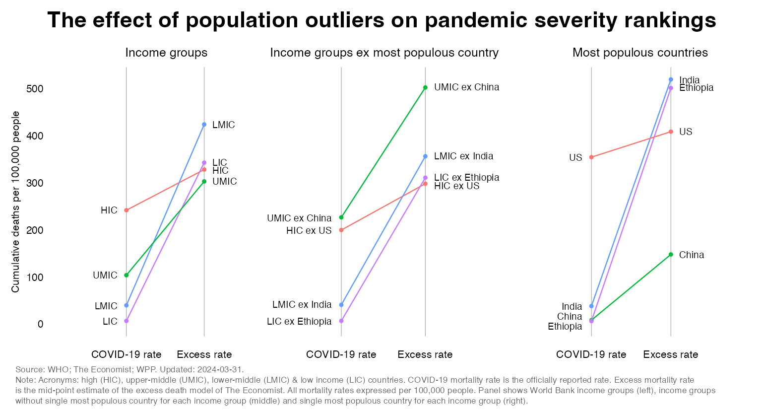
Let’s look first at the officially reported COVID-19 mortality rates with and without population outliers (the left axis in each of the panels). We obtain the following results:
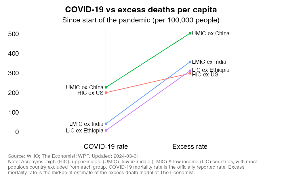
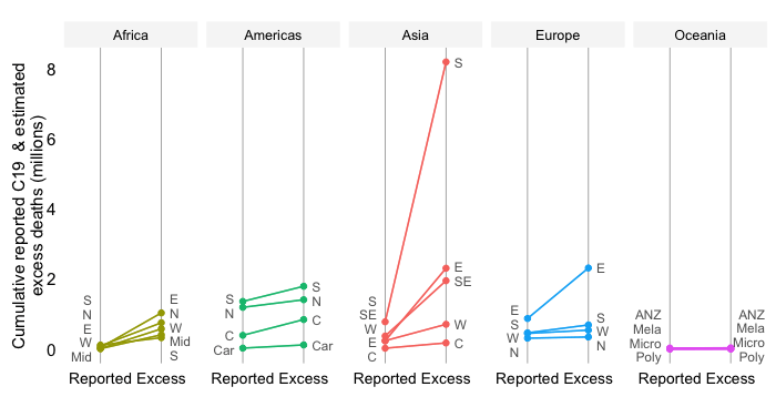
The chart below repeats the above analysis with a somewhat different presentation. The panels now represent the two mortality concepts (before they represented country aggregates): reported COVID-19 mortality rates on the left and estimated excess mortality rates on the right. Each panel now has three axes: on the left we have the individual country outliers, in the middle the income aggregate inclusive of population outliers and on the right the income aggregate without the outliers.
The following patterns are clear:
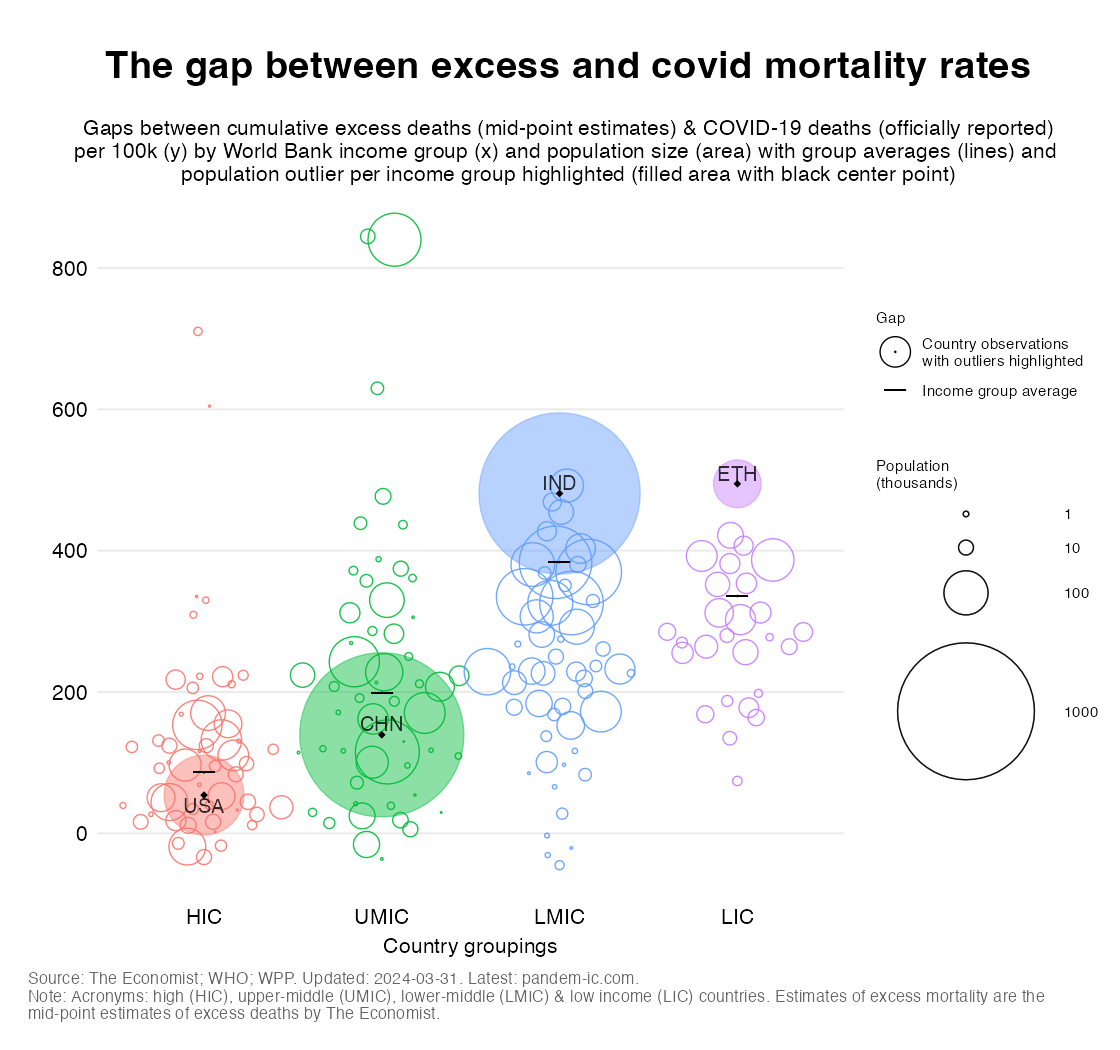
The differential effect of population outliers on COVID and excess mortality rates can be quite clearly seen in the chart above. It shows a beeswarm of the gap between excess and covid mortality rates on the Y axis with World Bank income groups on the X axis. The bubbles are country observations sized by the cumulative excess death tally (in the absolute), whereas the short horizontal lines are the average gaps for the income group. The observations of the four population outliers are filled in color and their value is marked by a black dot.
As we can see, the gap for USA (center dot of red bubble) is quite close to the HIC average (horizontal bar in the HIC column). The gap for China (CHN) on the other hand is well below the UMIC average, whereas the one for Ethiopia (ETH) and India (IND) are well above the LIC and LMIC averages, respectively. Note also how the distribution of the gap is much more dispersed for UMICs and LMICs than for HICs and LICs. The reason why HICs have less dispersion is likely that statistical systems are uniformly more adept at capturing COVID mortality correctly, where the opposite is likely to be uniformly true for the LICs.
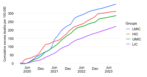
Population outliers carry a large weight in their group averages and because of their differences in pandemic performance they tend to have a large influence on the rankings of pandemic severity across World Bank income groups. With outliers included, HICs, UMICs and LMICs tend to have very similar excess mortality rates. But without outliers, UMICs ex China have suffered the most by far.
Note: Thanks to Vincent Rajkumar for insightful exchanges on the topic and inspiring me to write this post.
Disclaimer: Posts by the Center for Global Development reflect the views of the authors, drawing on prior research and experience in their areas of expertise. CGD is a nonpartisan, independent organization and does not take institutional positions. Likewise, views expressed do not necessarily reflect those of the United Nations, the United Nations Development Programme, its programmes/projects or governments. The designations employed do not imply the expression of any opinion whatsoever concerning the legal status of any country, territory or area, or its frontiers or boundaries.