Pandemic severity is assessed in this post by comparing the top causes of death before the pandemic with various notions of mortality, including officially reported COVID-19 deaths and estimated ranges of excess mortality. The comparisons yield four different perspectives on how severe the pandemic has actually been so far.
The severity of the pandemic’s mortality impact can be usefully assessed in different ways. Based on the data and estimates available, this post focuses on four different metrics:
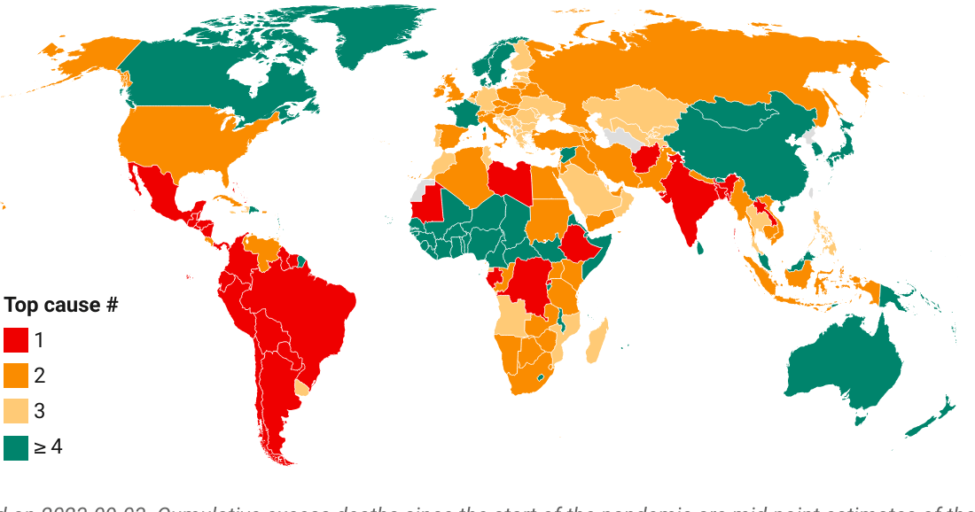
Upper-bound estimates of all-cause excess deaths as per again the same confidence interval.
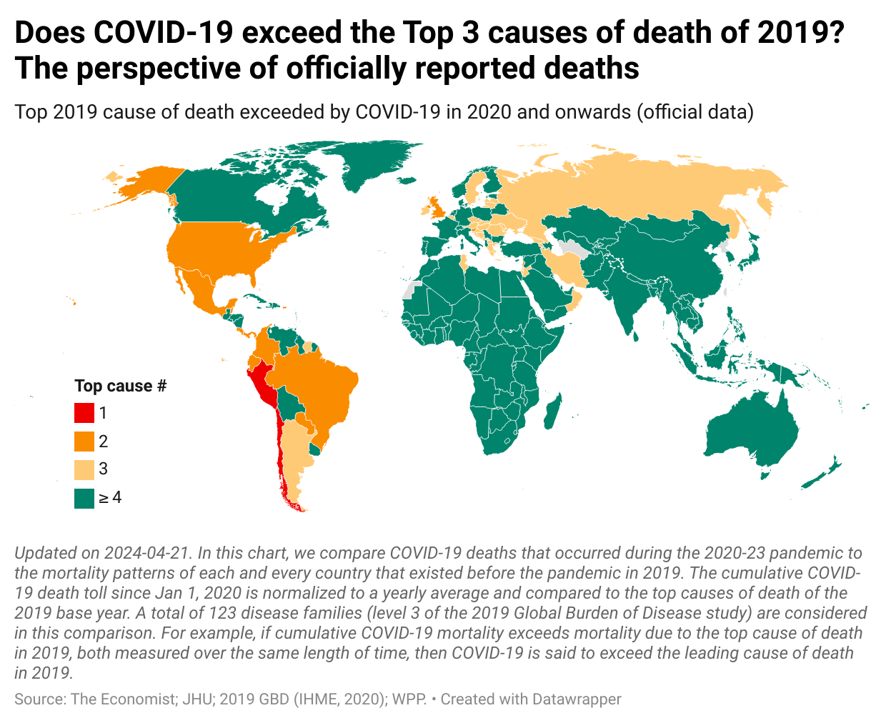
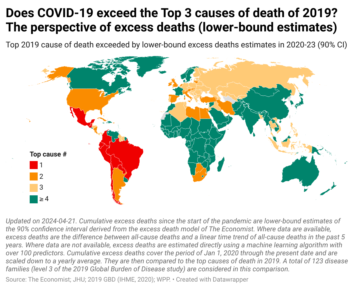
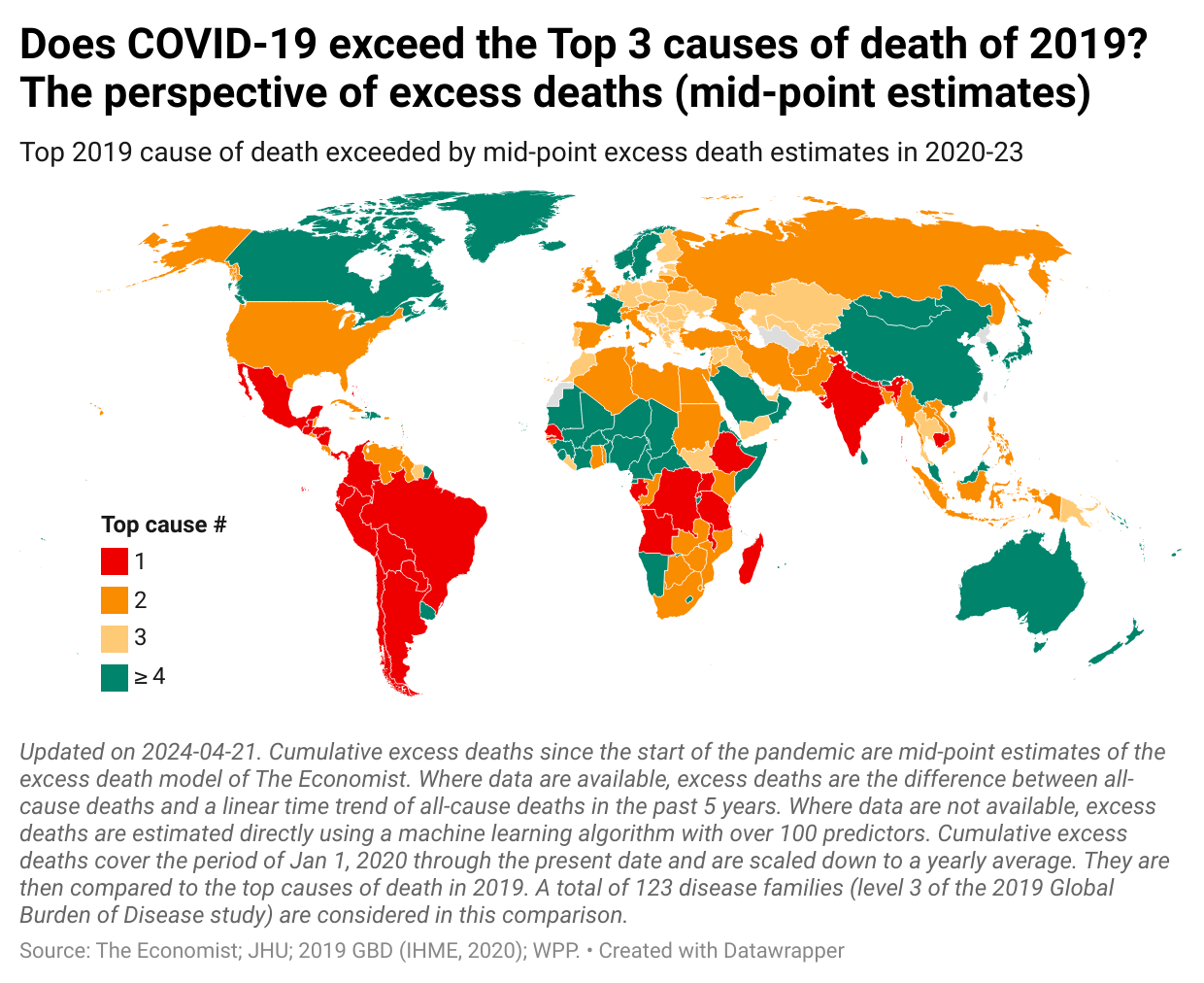
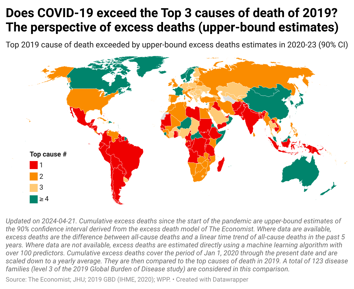
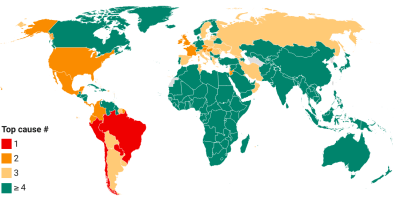
These metrics are converted into a measure of pandemic severity by comparing them with the top causes of death prior the pandemic. Specifically, we compare the cumulative COVID-19 and estimated excess mortality tolls with the Top 3 causes of death for each country in 2019.
This provides us with a way to make a relative assessment of pandemic severity in the following two ways. First, for each country, we obtain the ranking of the top cause of death that is exceeded by the mortality measure. This is thus a comparison within each country with the pre-pandemic mortality patterns. Second, across countries, we then analyze how these rankings compare and whether there are any systematic differences across country aggregates. For a discussion of methods and caveats, check out the earlier companion post.
The image gallery above sums up the analysis. As one scrolls through the different concepts, we get a progressively more severe picture of the pandemic. The overarching result is that the pandemic has been anything but mild in most parts of the world. Yet, there are some stark differences across the different perspectives.
Let us now discuss these results.
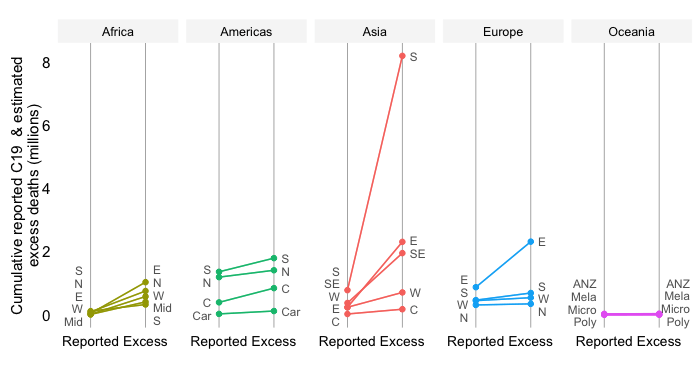
In what follows, we examine the results by World Bank region:
Latin America & Caribbean (LAC) is by far the most severely affected throughout the comparisons. The official death toll exceeds in most countries the #1 cause of death that was registered before the pandemic. This reflects the severity of the pandemic in this region, but also the practice in several countries to conform the official data to excess death tallies (as in Ecuador and Peru for example).
North America (NAM), which includes Canada and the United States, also portrays a consistent picture across the alternative measurements. There is however a huge difference between Canada and the US, with the former outperforming the latter by a considerable margin.
Europe and Central Asia (ECA) show different patterns. Most parts of Europe however see progressively worse assessments and the upper-bound excess estimates put pretty much everyone in a more dire position. Note also that the picture for Central Asia follows that of Eastern Europe.
Sub-Saharan Africa (SSA) is the big puzzle. The reported COVID-19 mortality toll is not comparable to the top-3 leading causes of deaths in the region, except for South Africa. That picture remains pretty robust once we move to lower-bound estimates for excess deaths. However, once we get into the mid-points and beyond, the picture becomes much more severe – a result which largely reflects the large error bands around the mid-point estimates.
Middle East & North Africa (MNA) show a pattern of turning from largely green (including in some large countries in the Middle East such as Saudi Arabia) when it comes to the official statistics on COVID-19 deaths into different shades of red using excess death estimates.
South Asia (SAR) progresses to dark orange and red quickly once we transition from reported COVID-19 stats to excess death estimates. Not only does South Asia have a high excess death rate, the high rates translate into large absolute numbers given the huge population in this region.
East Asia & Pacific (EAP) is homogeneously green when it comes to official mortality stats, but highly diverse when we compare with the various excess death estimates. Southeast Asia follows the typical pattern of becoming progressively red. The rest of this region, however, remains entirely green even under the upper-bound estimates. This includes upper-middle-income China and Malaysia and high-income Australia, Japan and New Zealand.
The comparisons of pandemic severity across countries suggest that the COVID-19 pandemic has been anything but mild. Unfortunately, the official estimates seriously distort the likely true extent of the impact. While the rankings based on excess mortality vary considerably in view of the sometimes large confidence intervals around the mid-points, the most likely scenario suggested by these mid-points represents a considerable departure from the official perspective.
We know that in all likelihood the official perspective is wrong. At the same time, we also know that the excess mortality perspectives are subject to considerably uncertainty and therefore, individually, are likely to be wrong too (in fact, by definition, the chance of any scenario within a given confidence interval is approximately zero). But looking at the range of outcomes probabilistically, the preponderance of the evidence suggests that the excess mortality perspectives should carry more weight if we are interested in an accurate and comprehensive assessment of pandemic severity.
Regardless, we need to remain mindful of the fact that the excess mortality estimates are estimates subject to considerable standard error and the possibility of bias – issues which are discussed at length in this companion post.
Below we provide the maps for the different concepts of mortality in interactive format, so country details and calculations can be retrieved (click on the tooltips for details). These maps also include sources and notes. Non-interactive versions of these maps can be downloaded here:
Disclaimer: Posts by the Center for Global Development reflect the views of the authors, drawing on prior research and experience in their areas of expertise. CGD is a nonpartisan, independent organization and does not take institutional positions. Likewise, views expressed do not necessarily reflect those of the United Nations, the United Nations Development Programme, its programmes/projects or governments. The designations employed do not imply the expression of any opinion whatsoever concerning the legal status of any country, territory or area, or its frontiers or boundaries.