How well are the world’s elderly vaccinated? We don’t know for sure. Primary vaccination data disaggregated by age reported to WHO only cover 55% of countries and 29% of the global elderly count. Booster data are even more sparse. But the data that are available suggest that vaccination progress among the elderly – those ages 60 and above – has been a mixed bag. Elderly vaccination levels have been regressive across countries: they’re much lower in lower-income countries. And while elderly vaccination rates generally exceed those for the general population, they could and should have been a lot higher. The global pattern is that the priority group of the elderly has been poorly prioritized.
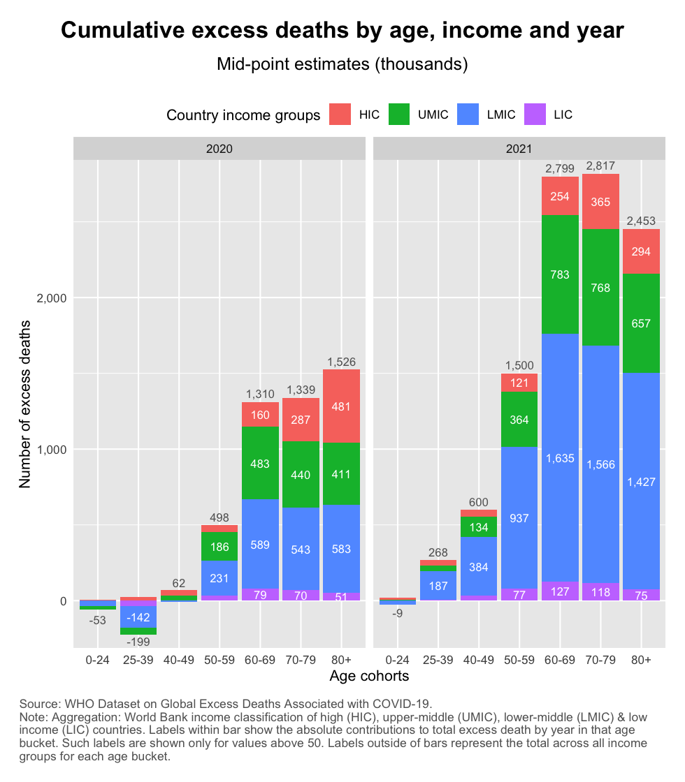
The recent release of WHO estimates of excess mortality by age distribution is a wake-up call for anyone interested in how the elderly have been affected during this age-discriminating pandemic. Their estimates suggest that a whopping 12.2 million elderly (60+) have died during 2020 and 2021. They made up 82% of the global excess death tally of 14.9 million.
This heavy toll is a multiple of what the officially published data indicate. Officially reported COVID-19 deaths end 2021 totaled 5.4 million, which is 3x the WHO’s excess mortality estimate. Excess mortality captures the broader effects of the pandemic – both positive and negative, with the former outweighing the latter. But the sheer magnitude of the difference between COVID and excess mortality goes beyond indirect effects; it is suggestive of massive undercounting.
Let’s look at the data in the chart below. Using the World Bank income classification, we divide the world into high income, upper-middle income, lower-middle income and low income (HICs, UMICs, LMICs and LICs). Notice how much UMICs and LMICs contribute to the global death toll. That’s not only because they count many elderly people in the absolute, but also because the elderly mortality rates have been high among these groups (check out this post for the details).
One potential reason why so many elderly died is that they were poorly targeted in the vaccination efforts of countries. We know that vaccines are highly effective in preventing severe outcomes. To the extent that deaths occurred after vaccines were introduced globally, undervaccination offers one explanation for the high elderly mortality count.
For the elderly to be well vaccinated, they need to be targeted well at both the global and the domestic level. Globally, so that the elderly cohorts worldwide are prioritized in terms of the allocation of vaccines in times of global scarcity (global vaccine equity). And domestically, so that within countries the elderly are first in line (along with other parts of the priority group) to receive protection.
Lack of global targeting is one major reason for elderly undervaccination. As soon as vaccines became available, a benevolent social planner would have targeted the global priority group irrespective of borders. To put it more bluntly, a benevolent planner would not have allowed American teenagers who are completely healthy to jump the global queue ahead of Nigerian grandfathers with diabetes. Unfortunately, this is what happened when vaccine nationalism came to define the early stages of the global vaccination campaign. The elderly in poor countries had to wait the longest turn.
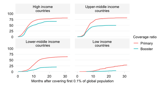
The chart below visualizes the sheer insufficiency of vaccine supplies to be able to cover the elderly. It traces the evolution by World Bank income group of the “vaccine sufficiency ratio“, which equals the total number of adjusted primary doses administered to the total population relative to the size of the priority group.
What does this mean?
The vaccine sufficiency ratio thus captures the extent to which supply can cover demand. It does not measure whether it has. No, this is a way to establish whether based on the vaccines available, countries had the ability to vaccinate the priority group assuming that it receives absolute priority domestically.
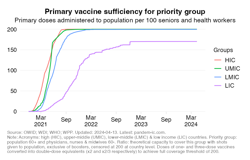
Turning to the results now, the chart shows that vaccine sufficiency has been inadequate for long periods of time.
The concept of vaccine sufficiency at the global level offered us a glimpse into how binding have been the constraints to global supply. The indicator showed us how well the priority group could have been covered with the supplies available assuming that they had been prioritized domestically as the first recipients of any vaccines that became available.
Unfortunately, elderly vaccine coverage is typically much lower than what the sufficiency ratios suggest. There may be many reasons for that. One is that the priority group may have many more constituents than just the elderly. Indeed, in the above, we included health workers, but in fact many other groups could be considered including those at younger ages who are moderately or severely immunocompromised or have other underlying conditions.
But another, more important reason is simply that governments do not always target the elderly well enough. That may actually be intentional as some countries have opted for an approach of vaccinating first the non-elderly cohorts given their higher contact rates. But it may also be unintentional and reflect broader constraints both on the supply side (such as poor logistics) and demand side (hesitancy, consumer selectivity).
What then does the data tell us about the actual state of elderly vaccination around the world? In what follows, we will show the latest numbers on elderly vaccination for both the primary and the booster series. The data this section is based on are taken from the WHO’s database on vaccine uptake by age. This is provides details on vaccination status (at least 1 dose, full per primary protocol and booster) by age bucket.
It should be mentioned upfront, however, that the database, which relies on the reporting of WHO member countries, has many gaps across countries, age cohorts and time. As of the date of this post, only 55% of all countries had reported primary vaccination data disaggregated by age. Together these countries represent only 29% of the global elderly (60+) age cohort. Major countries that omitted are China, India and Indonesia. The picture for booster vaccination is even slightly worse.
But let us present what we have. We will start by showing in the chart below the full vaccination rate as of the latest date for the elderly group of the 60+. Full vaccination refers to having received the final shot of the primary protocol (this could be the 1st, 2nd or 3rd depending on the vaccine). The country observations are grouped by World Bank income classification and scaled by the size of the 60+ cohort. The horizontal lines represent the average vaccination rate of the country income group.
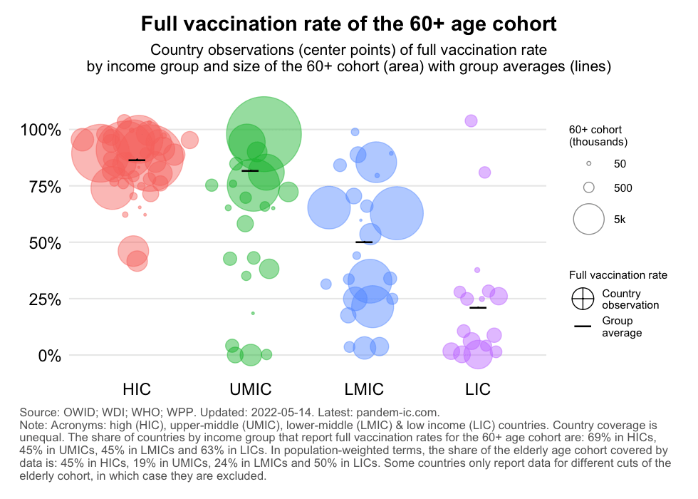
The chart clearly shows that primary vaccination of the 60+ has been highly regressive. HICs and UMICs achieved high 60+ vaccination rates, but the rates are much lower for LMICs and LICs. The dispersion around the population-weighted average is large too especially for the non-HICs, i.e. the developing countries.
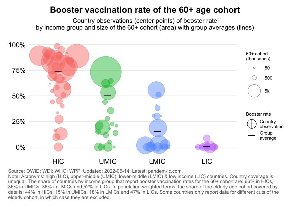
A similar picture emerges when we look at booster vaccination of the 60+ cohort, except that the disparity is even greater with LICs having made virtually no progress. Indeed the booster vaccination campaign is progressing at a much slower and more unequal pace than the primary campaign. We can see that even as of today the values for LMICs and LICs – the poorer half of the world – are pretty dismal.
To gain further insight about how well the elderly were targeted, let us compare the vaccination rates of two age cohorts: the elderly cohort of ages 60+ and the non-elderly cohort of ages 60-. We would like to see high elderly vaccination rates throughout. And where elderly vaccination rates have not reached high levels yet, we would like to see large gaps between elderly and non-elderly vaccination rates, which would suggest that governments are doing everything they can to prioritize the elderly.
The results below need to be interpreted with caution. Not only because our sample is limited (as discussed before), but also because the data are far from perfect. For some countries, we have had to truncate the 60+ rate because it exceeded 100%. This could be explained by inclusion of non-residents in the elderly vaccination drive, undercounting of the elderly cohort, errors in the reported data or other data discrepancies related to the population numbers. Conversely, some countries showed 0% vaccination among the 60+ despite despite reporting substantial vaccination of the 60- population (e.g. Azerbaijan and Kazakhstan).
The chart below plots the primary vaccination rate of the 60- (x axis) against the 60+ (y axis), with the diagonal line representing the 45-degree line at which the vaccination rate of both age cohorts is equal. We show all countries of the sample but facet the visualization by World Bank income group, so we can detect differential patterns between richer and poorer countries. The three-letter labels are country codes.
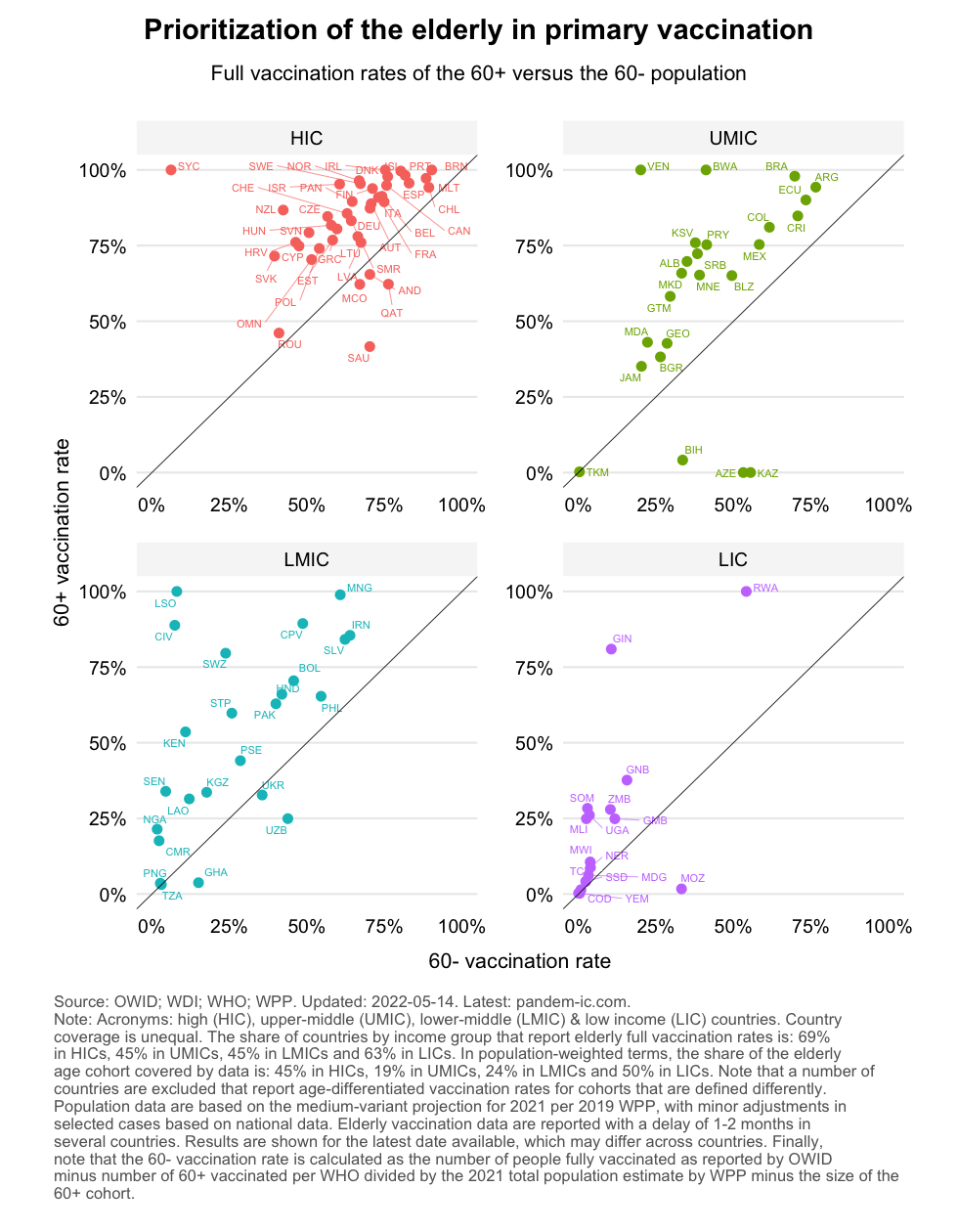
This chart tells us a number of things:
In many countries, elderly vaccination remains low despite significant non-elderly vaccination, which suggests limited targeting. This is where the distance from the 45-degree line comes in, which measures the gap between 60+ an 60- vaccination rates. Ideally, we would like to see that the gap is positive and large when 60+ vaccination rates are still low. Compare for example Uzbekistan with Nigeria (both are LMICs with an elderly vaccination rate at about 25%, but non-elderly vaccination is much lower in Nigeria than Uzbekistan).
The targeting of elderly vaccination in the primary series can also be visualized by plotting the elderly vaccination rate against the ratio of elderly versus total population vaccination rates. If the latter turns out greater than 1, it means that the elderly have been vaccinated better on average than the full population. It doesn’t mean that they’re necessarily well vaccinated, but they are better vaccinated than the rest. The chart below plots exactly that, with the dashed line at 1 showing where elderly and total vaccination rates have equalized.
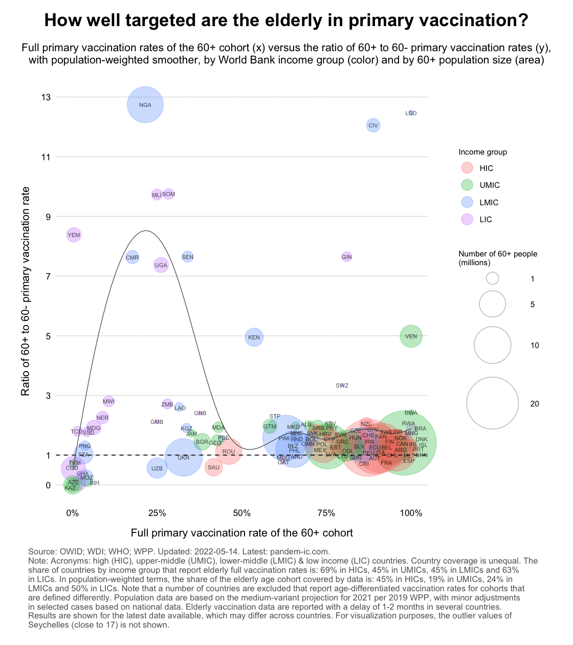
The chart illustrates the wide range of experiences around the world and across the World Bank income classification. High-income countries are huddled together (with exception of a few) and have generally high full vaccination rates for the 60+. This corresponds to generally high vaccination rates for the full population which is why the ratios are close to 1. For many developing countries that is not the case. In fact, we see that a number of them have ratios below 1. We also see the for a given rate for the 60+ a wide range of outcomes is possible (again notice the difference between Nigeria and Uzbekistan).
Let us now present the results for boosters. Before we do, a brief note on data as there is a new issues that requires attention. Information on boosters for the total population and just the elderly population is not always available contemporaneously. In what follows, we will “fill the data up and down” over time. In other words, we pick the closest date with total population booster data available and match that with whatever we have on elderly booster vaccination. This inevitably introduces an inaccuracy, especially where the pace of vaccination has been rapid. Luckily (from the angle of tackling this problem), most countries that lack contemporaneous data are also the ones where booster progress has been slow.
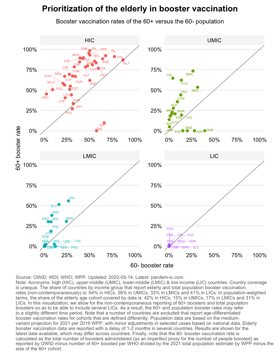
As the chart shows, the big picture on booster vaccination is quite different from the earlier one on primary vaccination. The levels are a lot lower for both variables, which conforms with the fact that a large share of the global population remains unboosted. Several countries are below the 45-degree line. Many countries face positive gaps but much more progress is needed. That will require a better targeting of the elderly group vaccination.
Let us now repeat the same exercise comparing the level of booster vaccination for the 60+ with the ratio of 60+ vs 60- booster vaccination rates.
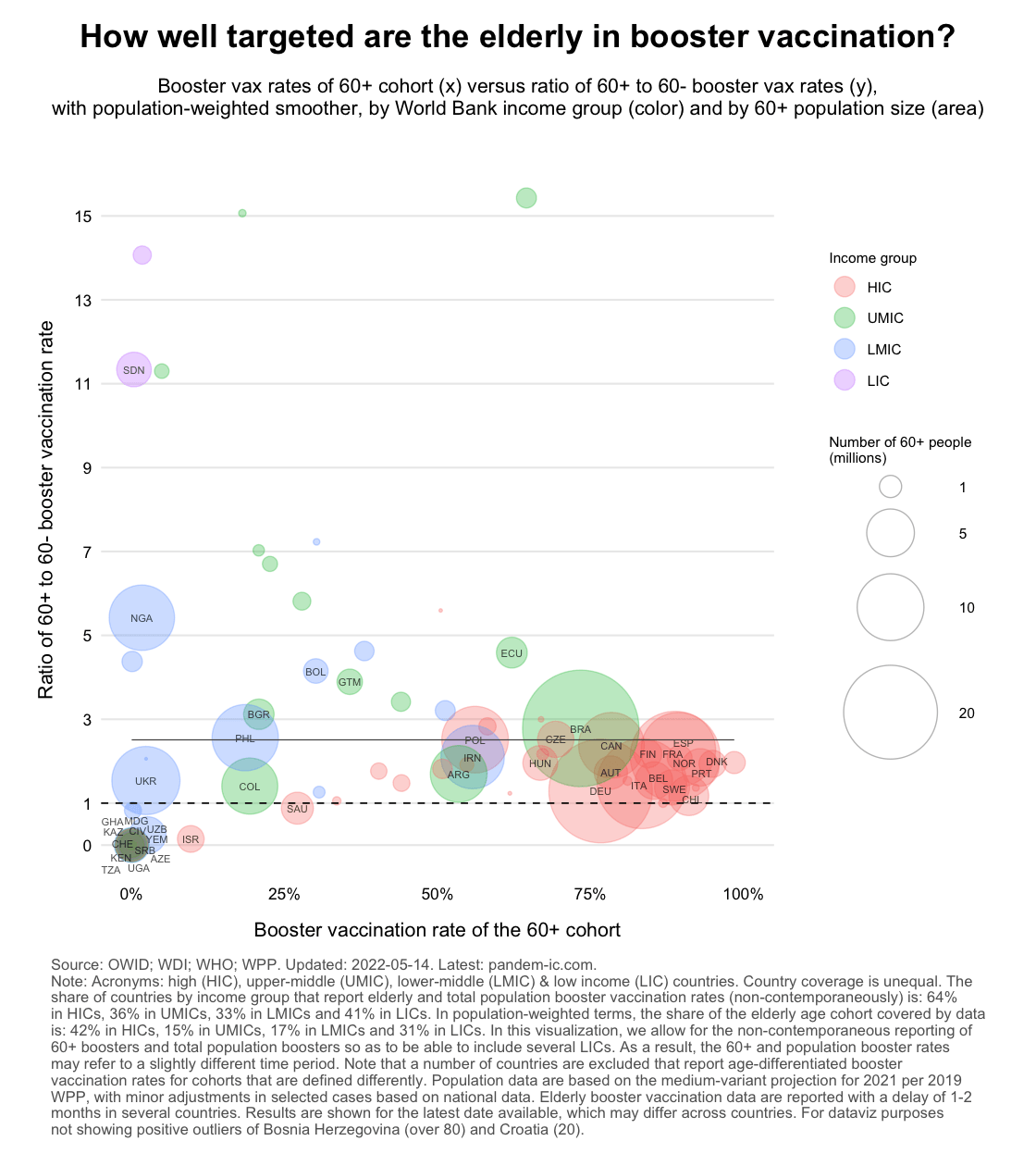
The chart shows that generally speaking the 60+ are better prioritized than the 60- in booster vaccination (note that the population-weighted regression line lies well above the vertical intercept of 1). Interestingly, countries with poorer 60+ coverage don’t have a larger discrepancy with 60- vaccination as we saw before.
Three points have emerged from this analysis:
Data availability and quality issues on elderly vaccination are a blind spot. The discrepancies we have highlighted do not further the cause of global vaccine equity. They also don’t help domestic efforts to address demand-side and local supply-side issues to get protection levels up for the elderly.
From a public policy point of view, availability of high-quality, timely and comprehensive data is and should be the starting point of any targeting effort to better protect the elderly. We are facing however a shortage of information on how well the global priority group is being protected. Data coverage on vaccination by age is far from comprehensive.
The data coverage statistics below refer to those that are reported to WHO on an age-disaggregated basis. It is thus possible that actual data coverage is more comprehensive to the extent that countries did not decide to report such data to WHO and the information can be retrieved elsewhere. In what follows, however, we focus on what is available in the central database produced by WHO.
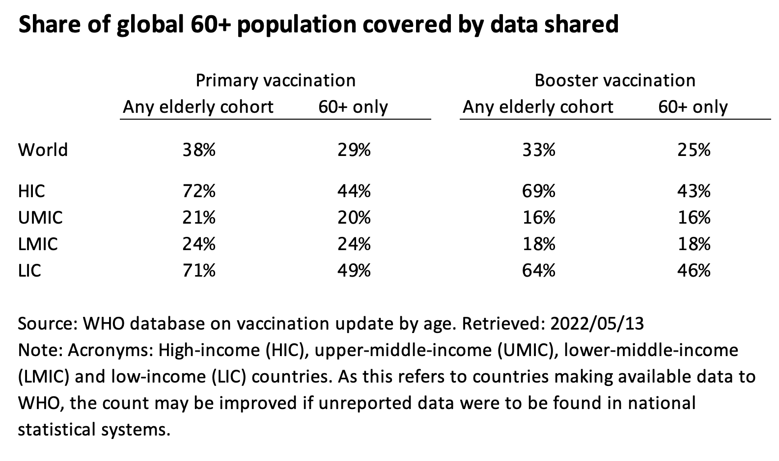
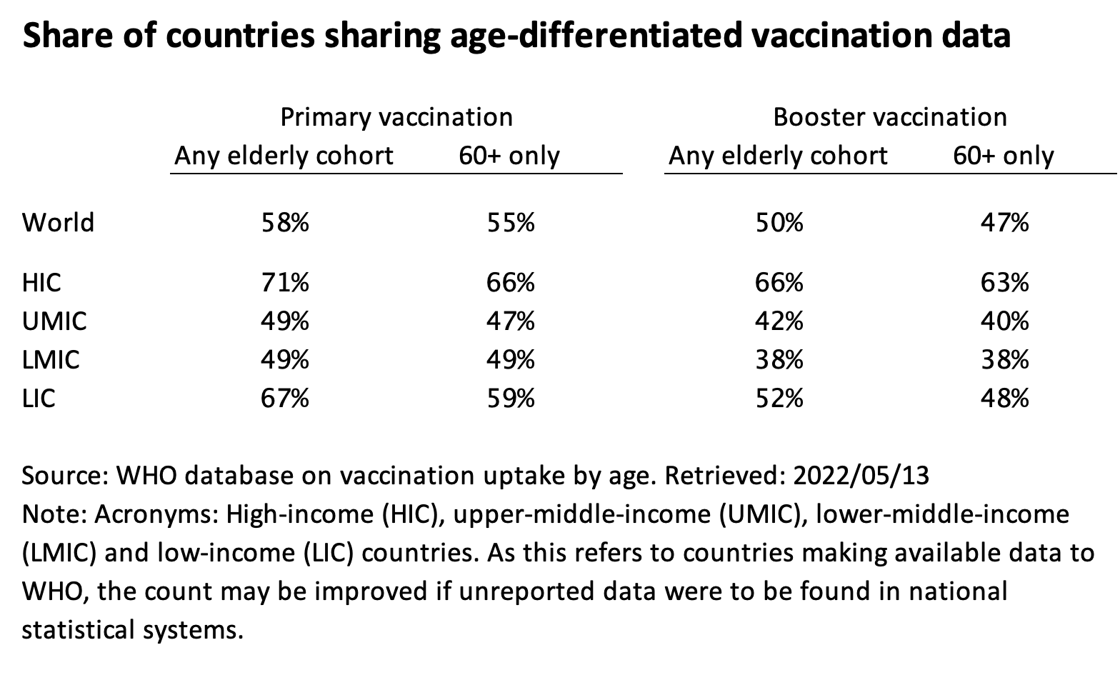
At the global level only 58% of countries report some data to WHO on primary vaccination by elderly cohort and 50% for boosters, as shown in the first table below. However, major countries such as China, India and Indonesia are excluded, so in terms of coverage of the elderly priority group by those countries that do report data, we are only at 38% for primary vaccination and 33% for boosters.
HICs and LICs (high-income and low-income countries) report far better than the UMICs and LMICs (upper-middle-income and lower-middle-income countries). That’s reflected in both the count of countries and the number of elderly covered. It is likely due to the enhanced focus of the international community on LICs and the sheer size of giant non-reporters within the middle-income categories.
The above statistics refer to any cut of the elderly cohort. That means that we include countries that report, as their only source of information, the 65+ cohort (as Ethiopia, Uruguay and United States do), the 55+ cohort (Syria) or the 50+ cohort (Australia and Iraq). Most countries, however, provide data on the elderly population in the form of a 60+ bucket or a more granular combination of the 60-69, 70-79 and 80+ cohorts, which can be easily transformed into 60+.
To wrap up, the charts below the show share of countries that have age-differentiated data (first chart) and the share of the elderly population of such countries in the global elderly population (second chart). These two variables are shown for primary and booster vaccination, for a broad definition of the elderly cohort and a narrow 60+ one, by World Bank income classification and for the world as a whole.
Disclaimer: Posts by the Center for Global Development reflect the views of the authors, drawing on prior research and experience in their areas of expertise. CGD is a nonpartisan, independent organization and does not take institutional positions. Likewise, views expressed do not necessarily reflect those of the United Nations, the United Nations Development Programme, its programmes/projects or governments. The designations employed do not imply the expression of any opinion whatsoever concerning the legal status of any country, territory or area, or its frontiers or boundaries.