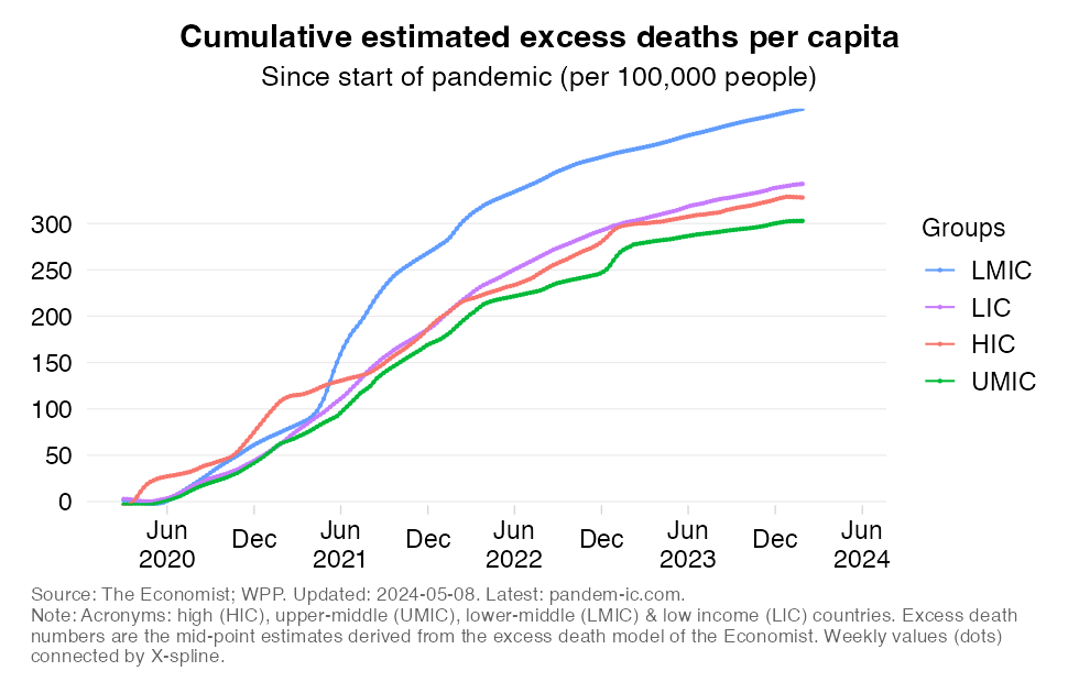
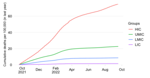
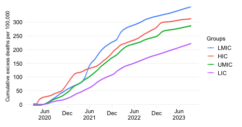
Cumulative estimated excess deaths per 100,000 people since start of the pandemic
EXPLAINER
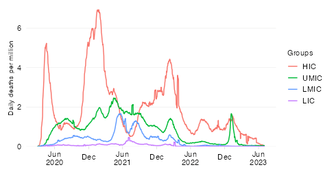
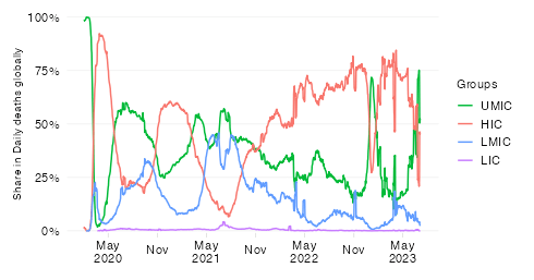
This chart shows the evolution over time of the estimated cumulative excess mortality rate across World Bank income groups.
The excess death estimates are the mid-point estimates derived from excess death model of The Economist, which fills data gaps on the basis of a machine-learning algorithm that learns from official excess mortality date, where available, and over 100 other statistical indicators. The indicator is available on a weekly frequency and its values are converted into a smoothed average. For more details on methods and sources, check out the excess mortality entry in the list of background notes below.
The excess mortality rate expresses all-cause excess deaths relative to the size of the population. By relating excess mortality to population size, we get a measure of the burden of disease. In contrast to the absolute mortality toll, the mortality rate provides an indication of the performance of country or group of countries in terms of protecting its population against death in the context of this pandemic.
It should be noted that the different income groups shown here are of very different population size dimensions. The global population as per the 2021 medium-variant projection of World Population Prospects is 7,866 million people,which is distributed as follows:
High-income countries (HICs): 1,236 million
Upper-middle-income countries (UMICs): 2,567 million
Lower-middle-income countries (LMICs): 3,361 million
Low-income countries (LICs): 702 million
In light of these differences in population size, absolute excess mortality numbers will be quite different given the differences in rates.