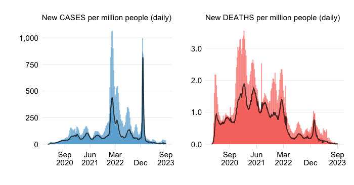
Europe and US have gone through several waves of COVID. How closely did they synchronize? And what about their impacts? This post compares COVID waves across and within Europe and US. It dissects the patterns across the four Census Bureau regions of the US and the four continental regions of Europe. A look underneath the aggregate picture reveals that while cases are relatively synchronized, mortality impacts have been anything but similar across regions and over time.
COVID waves across Europe and US have been roughly synchronized. That is hardly surprising given the various common factors at play:
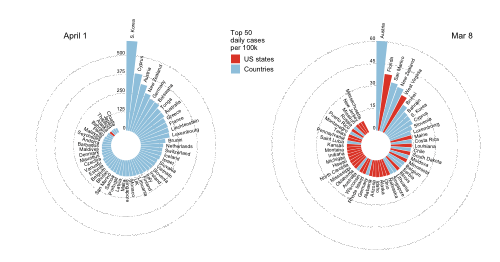
Testing. Differences in testing also help explain things. A key reason for low case rates in both the US and Europe during the first wave was limited testing. A key reason for low case rates in recent months is…. limited testing.
But the association is far from perfect and there is much variation among the underlying regional drivers of the aggregate case rate. In the US, the South and West regions seem to be contributing the most. In Europe, Western Europe appears to be the main driver. Of course, contributions may be large not only when regional case rates are high, but also when the population share of the region in the country/continent is high (a point explored in more detail later on).
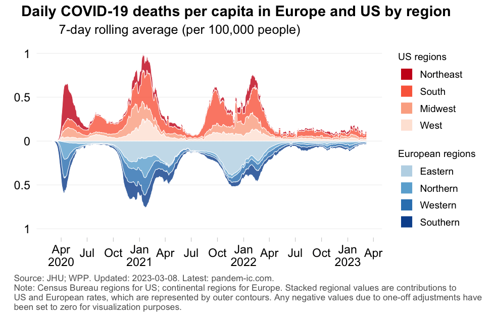
The general impression is that the mortality impact was more severe for the US, but the patterns differ considerably depending on the time period:
Post-spring 2022. Mortality rates decreased considerably, even though again the US sustained higher rates than Europe.
What stands out however is the regional diversity underneath the averages:
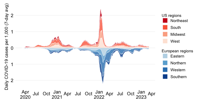
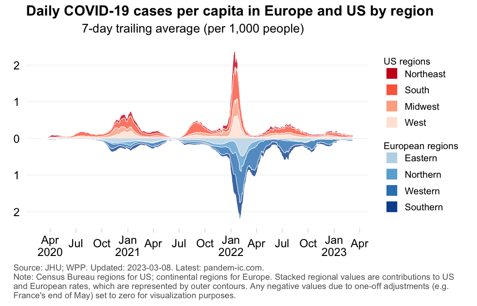
Let us now look at the actual case and mortality rates across regions – as opposed to the contributions to such rates at the aggregate. We will compare them with simple line charts and also, less conventionally, as contour charts. The latter will allow us to identify how long certain regions have been outliers relative to their regional peers.
Starting off with US regions, the chart below shows daily confirmed cases and deaths divided by the population of the region. Note how the scales in the chart below have a larger range. That is because the earlier contributions looked at cases and deaths divided by the population of the aggregate (Europe or US as a whole). In other words, the values shown here are scaled up by the inverse of the population share of each region.
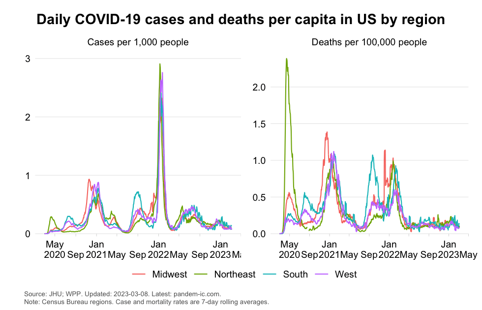
Two impressions obtain. One, we notice that the regions like to huddle together: the trends are highly correlated. This is particularly so for cases and less so for mortality. Two, major outliers pop up left and right. Let us look at these in some more detail now.
The chart below shows a multi-colored line, which is the upper contour of the case rate. For each date, this line shows the maximum case rate across regions and colors it by color code of the region that the maximum belongs to. The dashed line in black is the case rate for the US as a whole, which by definition (maxima always weakly exceed averages) wiggles below the contour line. Also featured is a box that displays the percentage of time (number of days in total pandemic days) that a particular region tops the ranking among regions.
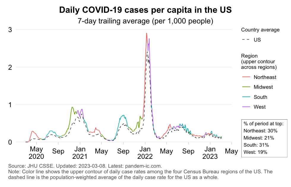
It appears that US regions are quite “democratically distributed” in terms of their outlier status with respect to cases. The South region exceeded other regions during 31% of the full pandemic period, the West region 19% and the other regions somewhere between these extremes.
The chart below plots the contour lines for daily mortality rates. It reveals a totally different picture than what we saw for case rates.
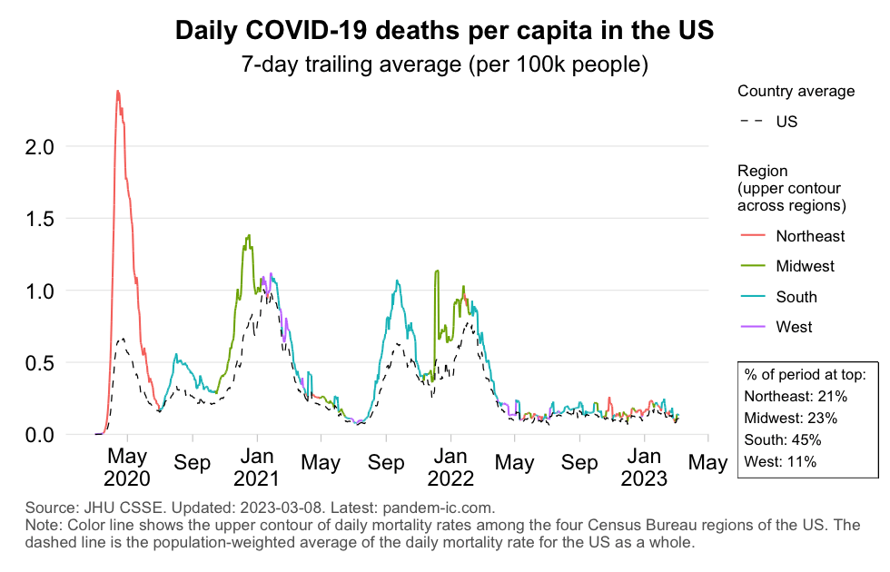
Mortality rates across US regions were initially dominated by the Northeast. But in later stages the region hardly popped up and over the full course of the pandemic it claimed outlier status only 21% of the period. Contrast that with the South, which topped the regional ranking for mortality rates 45% of the time. Notice also that the lowest value is for the West at 11%, with the Midwest claiming the remainer of 23%.
We can now repeat the same exercise for Europe. The chart below plots case and mortality rates across Europe’s four continental regions. The patterns, both for cases and deaths, are far less homogeneous than they were in the US. Of course, we are dealing with different aggregates, with Europe representing an entire continent and its regions groups of countries, so we would expect more heterogeneity. But the differences among them are nevertheless instructive.
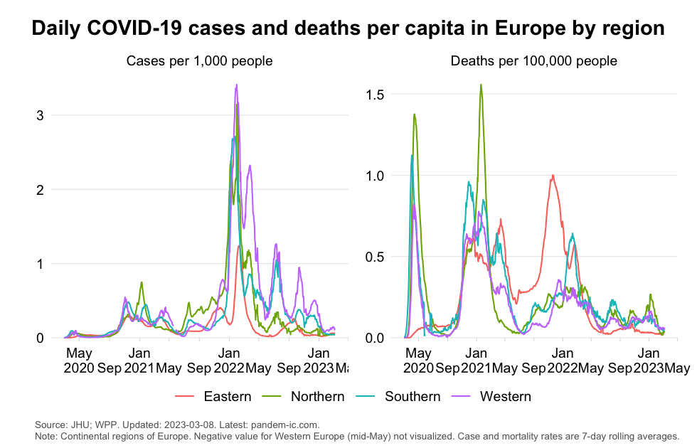
The above suggests that Western Europe seems to have had the highest case rates on several occasions. But on the mortality side, we see greater divergence, where the trends in Eastern Europe, which rises to ever greater prominence as the pandemic matures, are particularly notable.
What do the contour charts tell us about the outliers?
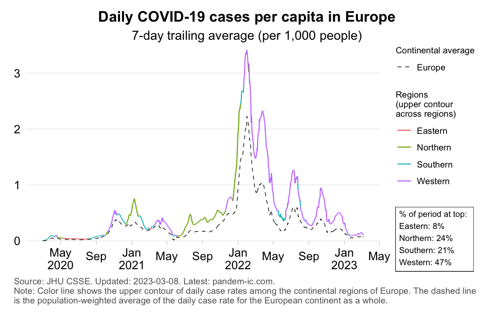
The above chart on case rates confirms the dominance of Western Europe in the rankings across European continental regions: it is at the top 47% of the time. Next in line are Southern Europe (at 21%) and Northern Europe (at 24%). Eastern Europe only featured 8% of the period as an outlier – a result we can partly attribute to differences in testing particularly in light of the region’s high mortality rates as discussed next.
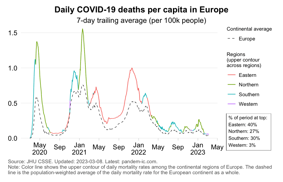
The above chart shows the contours lines for mortality rates across European continental regions. Notice how Eastern Europe stands out: it claimed the highest mortality rate 40% of the time. Conversely, Western Europe was an outlier over this period close to 3% of the time. Blame this on differences in vaccine coverage, where Eastern Europe has lagged global and European levels on both primary and booster vaccination. Southern Europe and Northern Europe registered high mortality rates too, particularly in the earlier spring wave in 2020 and the winter wave of 2020/21. They topped the rankings 30% and 27% of the pandemic period, respectively.
While the evolution of case rates appears roughly synchronized across Europe and US, this aggregate picture changes considerably when we look at the diversity underneath, especially, the mortality statistics. The amplitude of the mortality impact varies widely across regions. The regions of Eastern Europe and the US South have registered mortality rates that were higher than any regional peer during 50% of the entire pandemic period.
The usual caveats about measurement apply. Self-testing has become more common and this leads to fewer positives being centrally reported. The diminished severity of Omicron infection among better-immunized populations has also played its part, as fewer people end up in hospital where they normally would be tested and counted.
But the fact remains that actual fatalities are less easily ignored or obfuscated than suspected cases. In light of this, we should attribute greater credibility to the mortality picture, the sheerly concentrated nature of which has illustrated how unevenly the pandemic has impacted upon both Europe and US.
Disclaimer: Posts by the Center for Global Development reflect the views of the authors, drawing on prior research and experience in their areas of expertise. CGD is a nonpartisan, independent organization and does not take institutional positions. Likewise, views expressed do not necessarily reflect those of the United Nations, the United Nations Development Programme, its programmes/projects or governments. The designations employed do not imply the expression of any opinion whatsoever concerning the legal status of any country, territory or area, or its frontiers or boundaries.