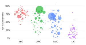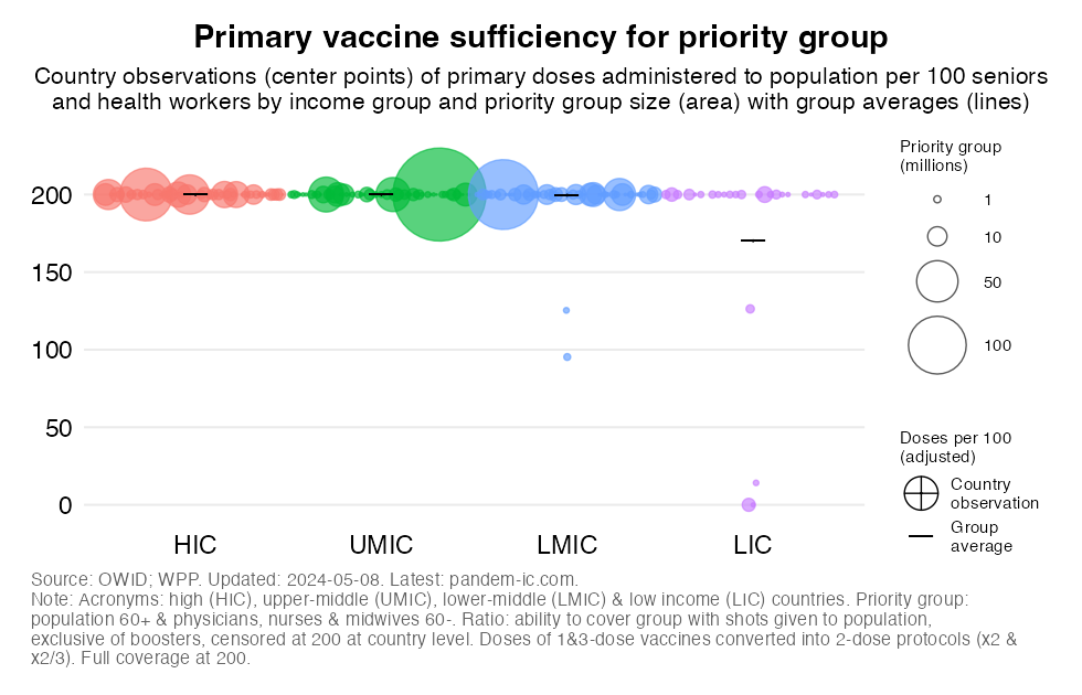
This beeswarm chart provides a snapshot of the primary vaccine sufficiency ratio for the priority group by World Bank income classification, where the size of the bubbles is proportional to the size of the priority group.
The vaccine sufficiency ratio is defined as the total number of primary doses that have been administered to the total population divided by the size of the priority group in that population. Primary doses are doses that pertain to the primary (first) vaccination cycle and thus exclude boosters. The priority group includes all seniors aged above 60 and all health workers (physicians, nurses and midwives) below 60 – the latter age cut-off to avoid double counting. For further details on the concept and measurement of the priority group, see the note on the priority group in the background section below.
Note that vaccine sufficiency for the priority group does not measure actual vaccination of the priority group.
It therefore measures, in a minimalistic way, whether the a proxy for the supply of vaccines (the total doses administered to the total population thus far) could have been sufficient to cover fully the priority group.
Like the vaccine coverage ratio, the vaccine sufficiency ratio converts the doses administered into double-dose equivalents, so that we get consistent comparisons across countries that are invariant to the mix of vaccines used. That means that doses belonging to 1-dose protocols are multiplied by 2 whereas doses belonging to 3-dose protocols are multiplied by 2/3. With this adjustment, we achieve 200 as the full coverage milestone.
The vaccine sufficiency ratio is censored at 200 at the country level (not the level of the aggregation). Once the priority group can be fully covered in a particular country with 200 adjusted shots per 100 people in the group, we consider that vaccine sufficiency (in the minimal sense of the concept) has been attained. Larger values are set at 200.
The midpoints of the bubbles represent country observations of the vaccine sufficiency ratio. Also shown are the weighted group averages for the vaccine sufficiency ratio of each group, which are represented by a horizontal line. Note again that the group vaccine sufficiency ratio at the group level is calculated based on the censored values at the country level.
As noted, the size of the bubbles in the chart reflects the size of the priority group. Compared to the other chart which shows vaccine coverage by income and total population size, we note that the bubbles for HICs are a lot larger in this chart, which is due to their generally much older populations. Conversely, note that the bubbles for LICs are a lot smaller. The large green bubble among UMICs is China. The large blue bubble among LMICs is India.
Note that the global priority group is estimated to count approximately 1.1 billion people and is distributed as follows across the World Bank income classification:
37 million in LICs.
For further details on the double-dose equivalent method, check out this post. See also below in the background section further details on the method as well as on the global priority group and other aspects.