This dynamic visualizations display the evolution over time of the primary vaccine sufficiency ratio for the priority group across countries by World Bank income classification.
The ratio is defined as the total number of primary doses that have been administered to the total population divided by the size of the priority group in that population. Two clarifications here:
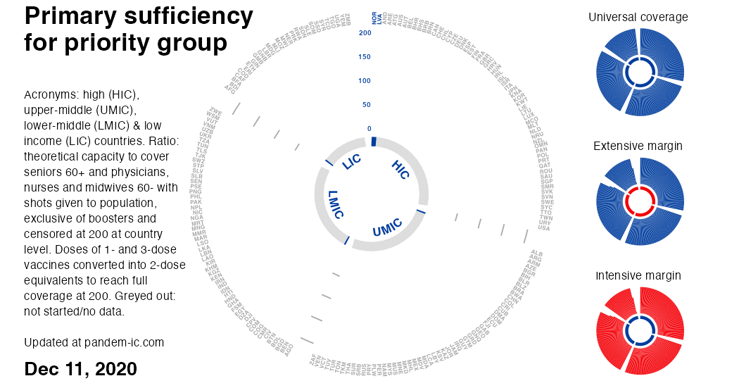
The priority group includes all seniors aged above 60 and all health workers (physicians, nurses and midwives) below 60 – the latter age cut-off to avoid double counting. For further details on the concept and measurement of the priority group, see the note on the priority group in the background section below.
Note that vaccine sufficiency for the priority group does not measure actual vaccination of the priority group.
It therefore measures, in a minimalistic way, whether the a proxy for the supply of vaccines (the total doses administered to the total population thus far) could have been sufficient to cover fully the priority group.
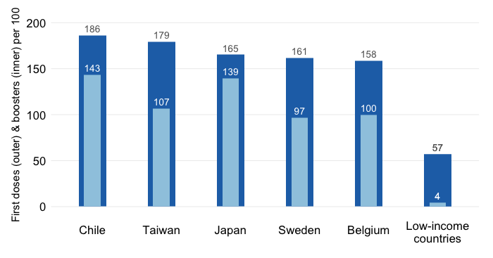
Like the vaccine coverage ratio, the vaccine sufficiency ratio converts the doses administered into double-dose equivalents, so that we get consistent comparisons across countries that are invariant to the mix of vaccines used. That means that doses belonging to 1-dose protocols are multiplied by 2 whereas doses belonging to 3-dose protocols are multiplied by 2/3. With this adjustment, we achieve 200 as the full coverage milestone.
The vaccine sufficiency ratio is censored at 200 at the country level (not the level of the aggregation). Once the priority group can be fully covered in a particular country with 200 adjusted shots per 100 people in the group, we consider that vaccine sufficiency (in the minimal sense of the concept) has been attained. Larger values are set at 200.
For each date, the visualization automatically ranks countries within each income group by the vaccine sufficiency ratio. This focuses the visualization on the evolution of two dimensions of vaccination progress at the global level while highlighting the inequalities we observe across income groups:
The intensive margin of vaccine sufficiency, which captures the extent to which countries have made progress in their ability to cover the priority group as measured by the level of the vaccine sufficiency ratio. This is represented by the vertical level of each bar in this chart with polar coordinates.The automatic sorting again helps focus attention on where the gaps remain. For universal coverage, we would need the donut shape to turn entirely blue.
For further details on this method, check out this post and the background note below on double-dose equivalents, the global priority group and other aspects.