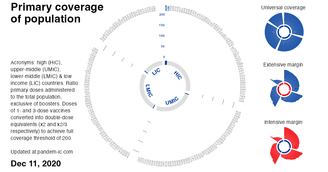
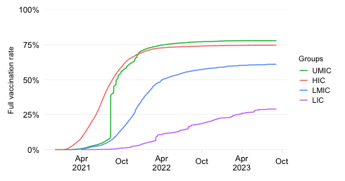
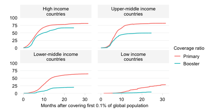
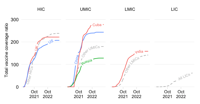
Primary vaccine coverage of population by country and income over time
Updated daily
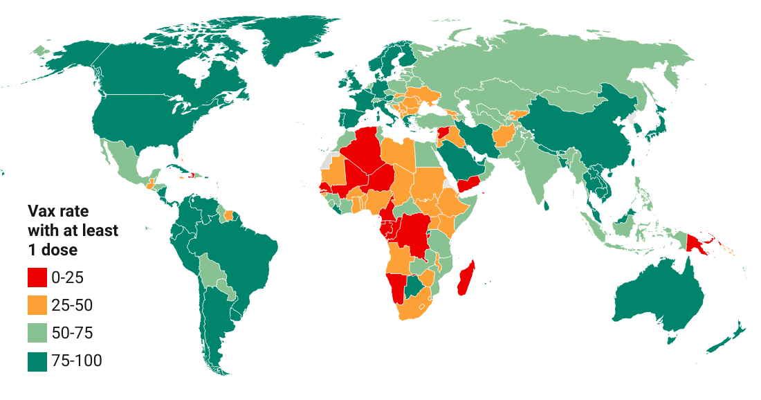
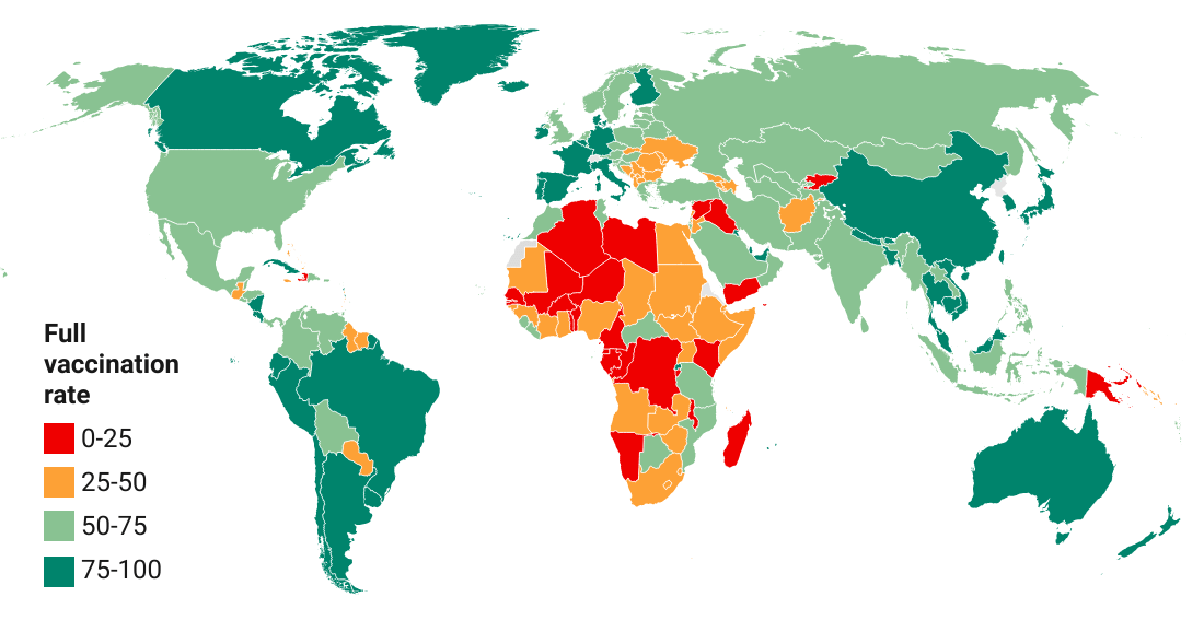
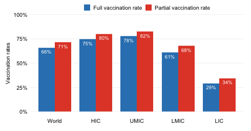
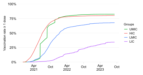
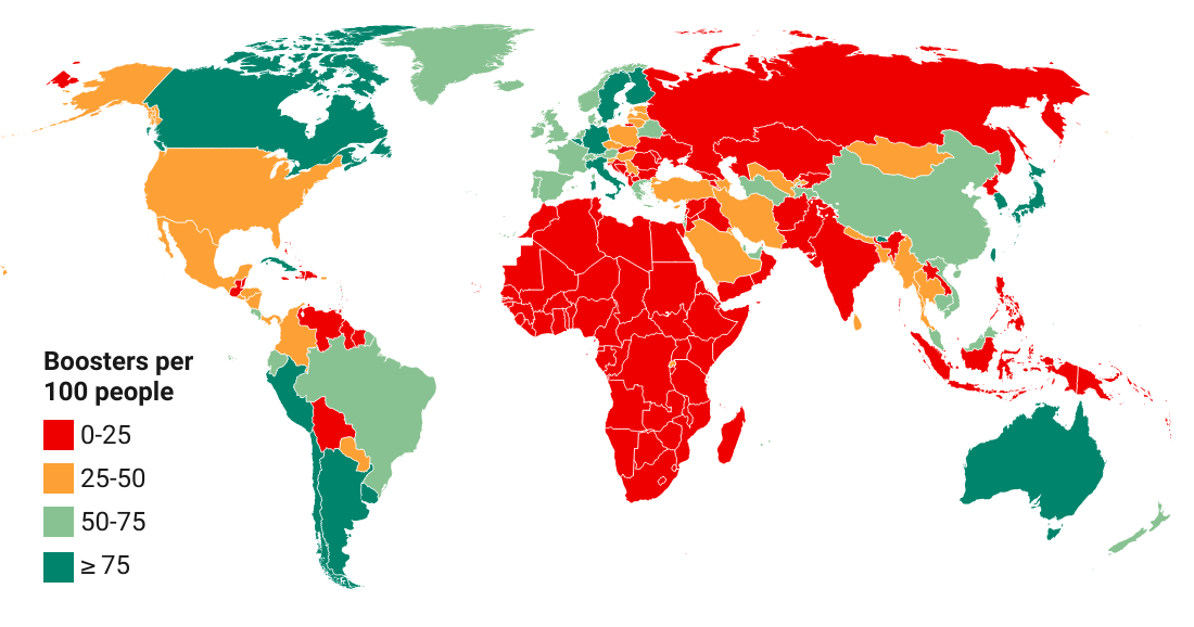
COVID-19 vaccine doses administered per 100 people
EXPLAINER
This dynamic visualization displays the evolution over time of the primary vaccine coverage ratio across countries by World Bank income classification.
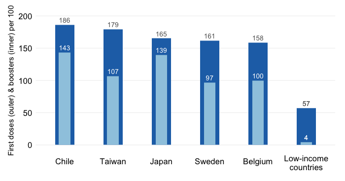
The vaccine coverage ratio is calculated as the number of primary doses administered divided by the total population. Full coverage is achieved at 200 primary doses per 100 people. Note that primary doses are the doses administered as per the primary (first) vaccination cycle, which excludes boosters. We distinguish from boosters to be able to compare vaccination progress across countries and country groups during the first round of vaccinations.
One further note on the calculation of the vaccine coverage ratio. The calculation represents a new way of assessing global vaccination progress that yields consistent comparisons across countries invariant to the mix of vaccines used. The method employed is to convert all primary doses administered into double-dose equivalents. That means that doses belonging to 1-dose protocols are multiplied by 2 whereas doses belonging to 3-dose protocols are multiplied by 2/3. With this adjustment, we achieve 200 as the full coverage milestone for primary vaccinations.
For further details on the adjustment method, check outthis post and the background note below on double-dose equivalents and other aspects (e.g. extensive and intensive margins, World Bank income classification and the universe of countries)
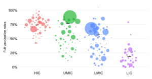
Finally, for each date, the visualization automatically ranks countries within each income group by the coverage ratio. This focuses the visualization on the evolution of two dimensions of vaccination progress at the global level while highlighting the inequalities we observe across income groups:
The extensive margin of vaccination, which captures whether countries are participating in the global vaccination campaign. This is represented by the changing color (from gray into blue) of the inner and outer circular bars. The automatic sorting focuses attention on who is left behind. As one can see, HICs have had a head start, UMICs followed, then LMICs and last LICs.
The intensive margin of vaccination, which captures the extent to which countries have made progress as measured by the primary vaccine coverage ratio. This is represented by the vertical level of each bar in this chart with polar coordinates.The automatic sorting again helps focus attention on where the gaps remain. For universal coverage, we would need the donut shape to turn entirely blue.