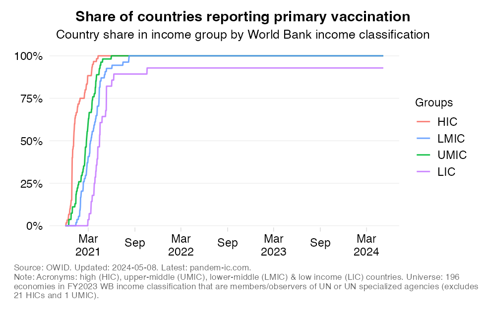
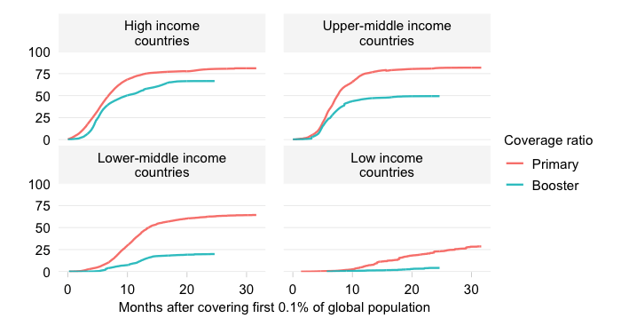
Countries administering primary vaccinations by income over time
Updated daily
Share of countries administering primary COVID-19 vaccinations by income group over time
EXPLAINER
This chart traces the evolution over time of the extensive margin of vaccine equity across World Bank income groups. It shows for each aggregate and over time the number of countries that have started to report positive primary vaccination data as a share in the total number of countries in that aggregate. “Reporting positive vaccination data” is a proxy for having started vaccination – a proxy because some countries may have started but are simply not reporting data.
The definition of the country universe matters considerably for this chart. We consider a total of 196 countries. This universe is based on the latest World Bank’s income classification updated every July 1 (see full details in the background section below) and reflects a further narrowing down to only include members and/or observers of UN or UN specialized agencies (which excludes 21 HICs and 1 UMIC, which are mostly overseas territories and dependencies). The full methodology is discussed in detail in the background notes copied below.