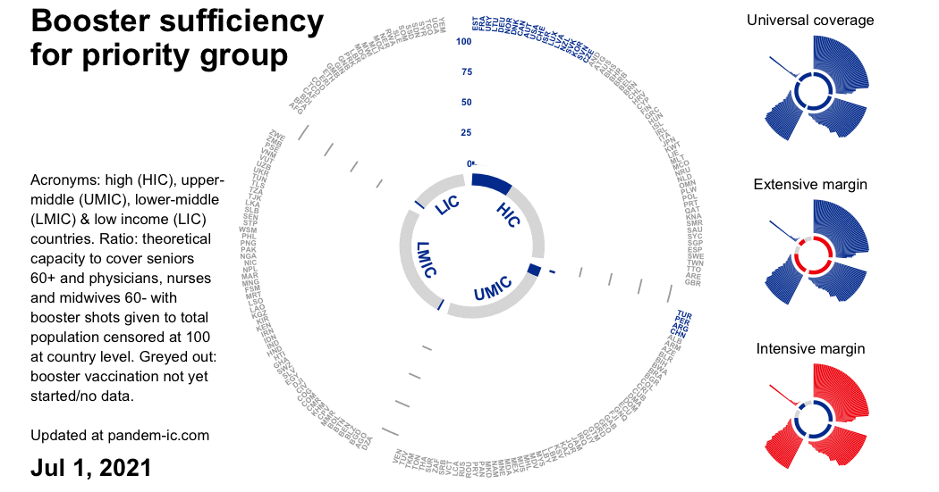
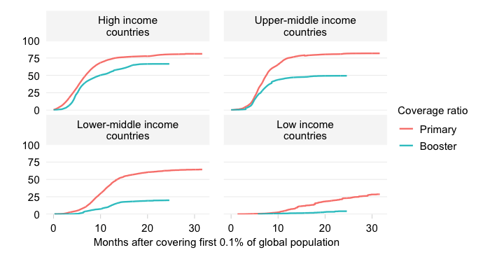
Booster sufficiency for priority group by country and income over time
Updated daily
Booster doses administered to total population per 100 people in the priority group
EXPLAINER
This dynamic visualizations display the evolution over time of the booster sufficiency ratio for the priority group across countries by World Bank income classification.
The ratio is defined as the total number of booster doses that have been administered to the total population divided by the size of the priority group in that population. Two clarifications here:
Booster doses are doses that occur outside of the primary vaccination cycle. For related charts on primary vaccination, see here.
The priority group includes all seniors aged above 60 and all health workers (physicians, nurses and midwives) below 60 – the latter age cut-off to avoid double counting. For further details on the concept and measurement of the priority group, see the note on the priority group in the background section below.
Note that booster sufficiency for the priority group does not measure actual booster vaccination of the priority group.
That is currently impossible to consistently assess at the global level given data gaps. Instead, it describes, on the basis of the size of the priority group and the number of doses administered, the extent to which the priority group could have been covered through the booster vaccination efforts up through the latest available data point.
It therefore measures, in a minimalistic way, whether the a proxy for the supply of boosters (the total boosters administered to the total population thus far) could have been sufficient to cover fully the priority group.
The booster sufficiency ratio is censored at 100 at the country level (not the level of the aggregation). Once the priority group can be fully covered in a particular country with 100 booster shots per 100 people in the group, we consider that booster sufficiency (in the minimal sense of the concept) has been attained. Larger values are set at 100.
For each date, the visualization automatically ranks countries within each income group by the booster sufficiency ratio. This focuses the visualization on the evolution of two dimensions of booster vaccination progress at the global level while highlighting the inequalities we observe across income groups:
The extensive margin of booster sufficiency, which captures whether countries are participating in the booster campaign and have started therefore to become able to cover their priority group. This is represented by the changing color (from gray into blue) of the inner and outer circular bars. The automatic sorting focuses attention on who is left behind. As one can see, HICs have had a head start, UMICs followed, then LMICs and last LICs.
The intensive margin of booster sufficiency, which captures the extent to which countries have made progress in their ability to cover the priority group as measured by the level of the booster sufficiency ratio. This is represented by the vertical level of each bar in this chart with polar coordinates.The automatic sorting again helps focus attention on where the gaps remain. For universal coverage, we would need the donut shape to turn entirely blue.