This blog was originally published at Brookings and later at OECD and is reposted here.
Here’s a striking statistic: Low-income and lower-middle income countries (LICs and LMICs) account for almost half of the global population but they make up only 2 percent of the global death toll attributed to COVID-19. We think this difference is unreal.
Views about the severity of the pandemic have evolved a lot since its outbreak in Wuhan. First, we thought it was just China. But in a matter of weeks, 3.5 million people in 210 countries and territories had become infected. A local epidemic became a full-scale pandemic, entire countries were locked down, and now the world faces the prospect of the worst economic downturn since the Great Depression.
Will we soon have to adjust our views again? Will the burden of COVID-19 mortality soon travel in a different direction? Will new epicenters emerge outside of the high-income world? Is this just the beginning for the developing world? To begin addressing these questions, it is useful to first analyze the reported data and get a better feel for the contrasts and inequalities.
In a recent paper, we present an alternative way of tracking the global distribution and progression of the pandemic based on an indicator of “relative severity.” The indicator is both globally comprehensive and country-specific because it compares the mortality burden of COVID-19 across countries to pre-pandemic mortality patterns of individual countries. Deviations from these patterns indicate pressure points, most notably on health systems. And comparisons like these can help us understand the dimensions of the crisis better by referring to typical mortality patterns and common causes of death.
Using the World Health Organization’s 2016 Global Health Estimates on causes of death, we compare COVID-related deaths to pre-pandemic deaths for all causes and country-specific top causes. We draw the specific causes from a list of 123 disease families (third level of ICD-10). We focus on 70 countries that have data and have registered at least 50 deaths.
On April 30, the global death toll due to the coronavirus was 230,000. That’s only about 1.5 times the number of deaths the world expects on an average day. The number would not seem large were it not for the fact that it is highly unevenly distributed. Just five high-income countries (HICs)—the United States, Italy, the United Kingdom, Spain, and France—account for 70 percent of global deaths.
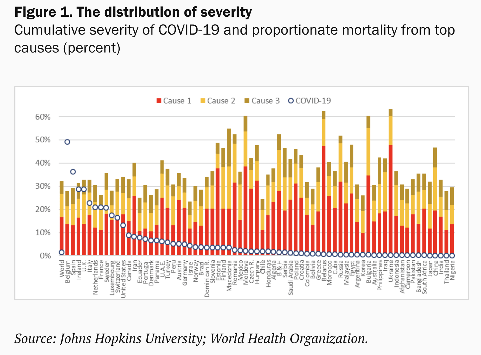
Figure 1 gives a sense of the unequal distribution of the severity of the mortality burden over the entire period of the outbreak, which also differs across countries. Belgium and Spain stand out. COVID-19 exceeds their first, second, and third causes of death combined (the bars). Ireland, the U.K., and France exceed their first and second causes, while Italy, Luxembourg, Netherlands, and Sweden their first ones. Only three developing countries are in these notorious lists. Ecuador exceeded its second cause of death, whereas Iran and Peru passed their third cause.
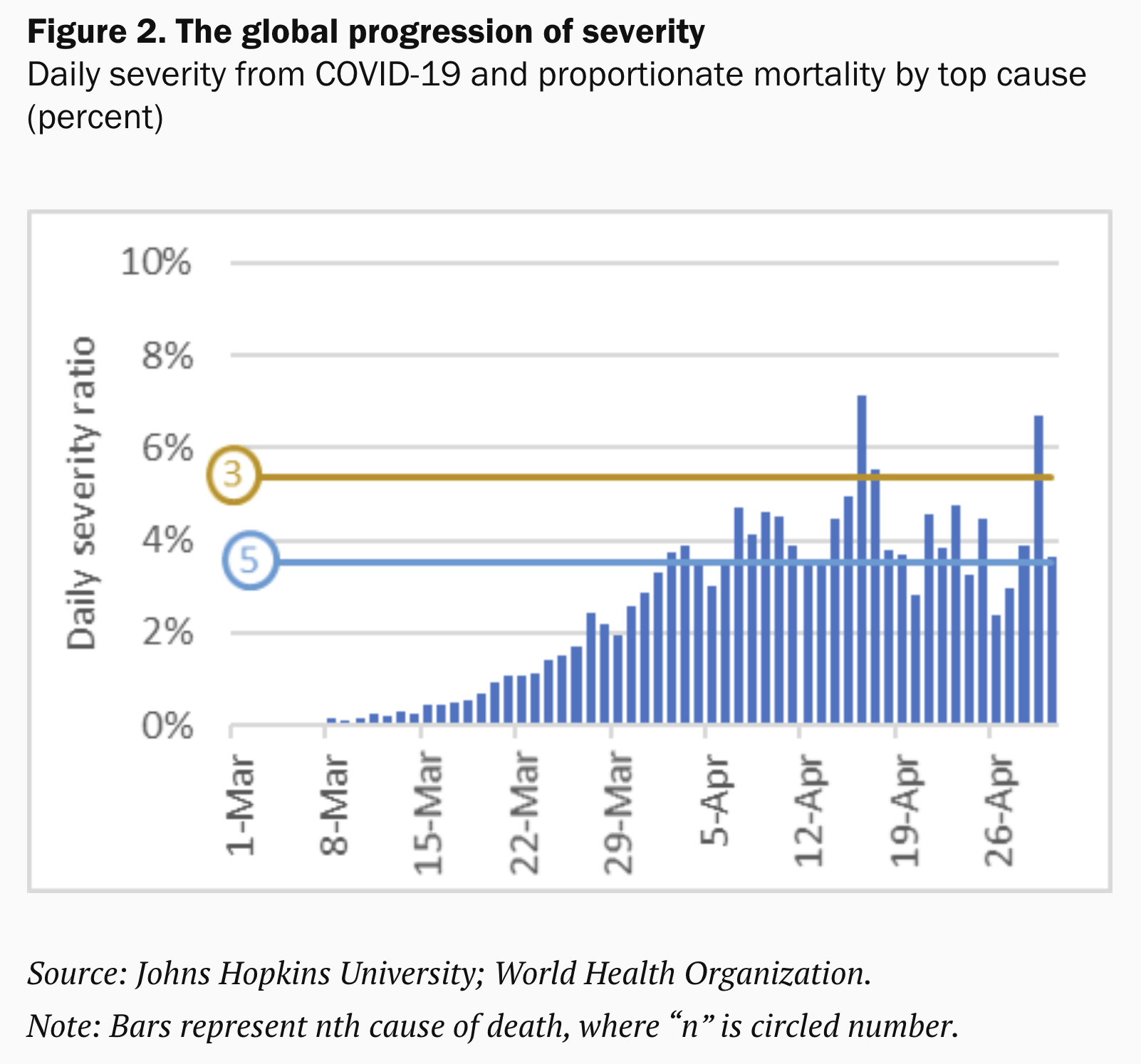
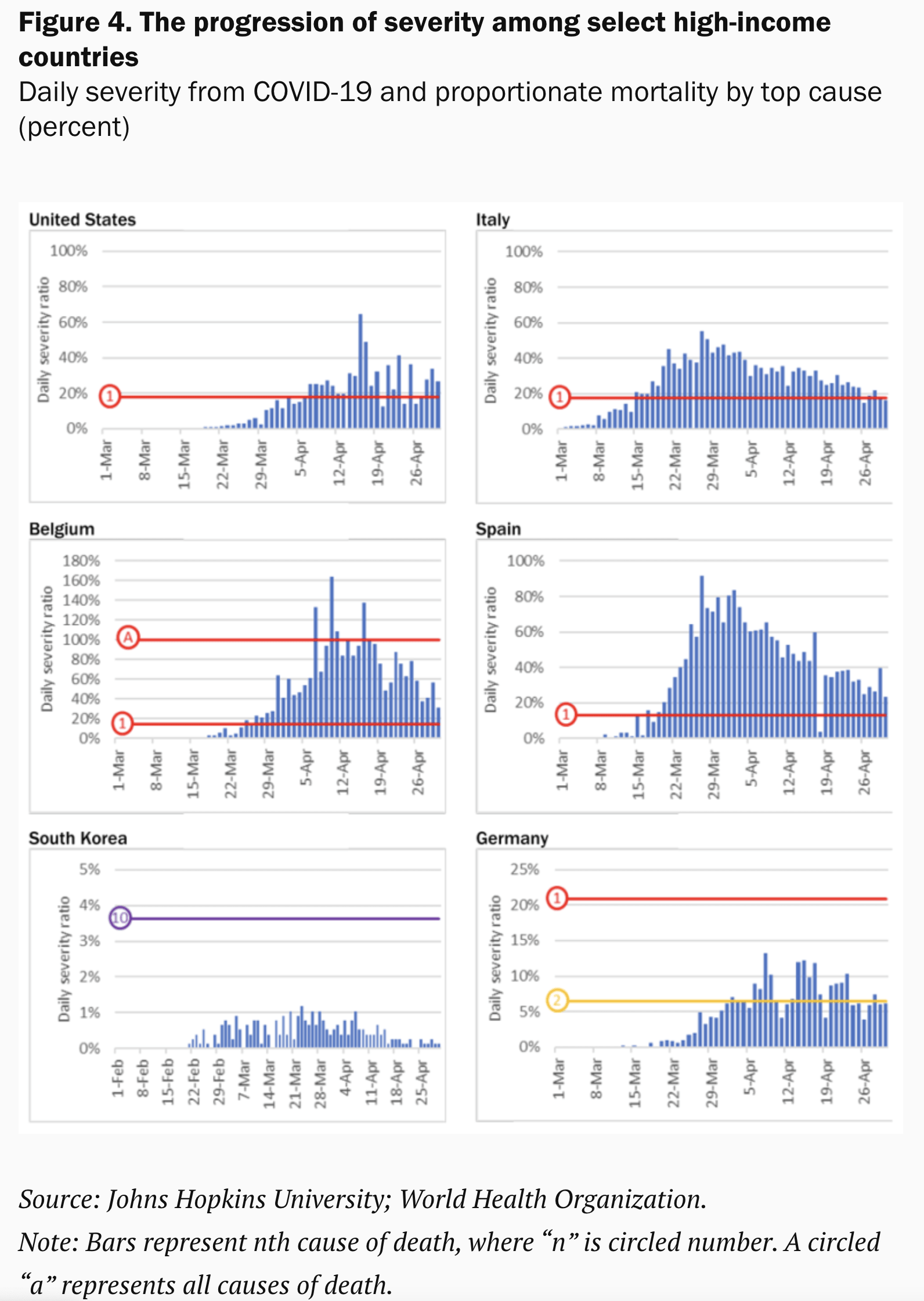
Switching from cumulative to daily data, we can see how severity evolves over time and how the progression relates to the typical cause of death on a daily basis. Daily numbers are naturally noisier, but they still display clear patterns. Globally, we saw a steep rise followed by some leveling off. COVID-19 exceeded Alzheimer’s disease as the fifth cause of death by the end of March. A few weeks later it surpassed chronic obstructive pulmonary disease as the third cause.
We see huge variations at the country level (Figures 4 and 5 at the end of this blog). The cumulative severity observed in Belgium and Spain is mirrored in a sustained high level of daily severity. The contrasts between Italy and the U.S. are also instructive. Germany and South Korea are often hailed as success stories, but there too we see marked differences.
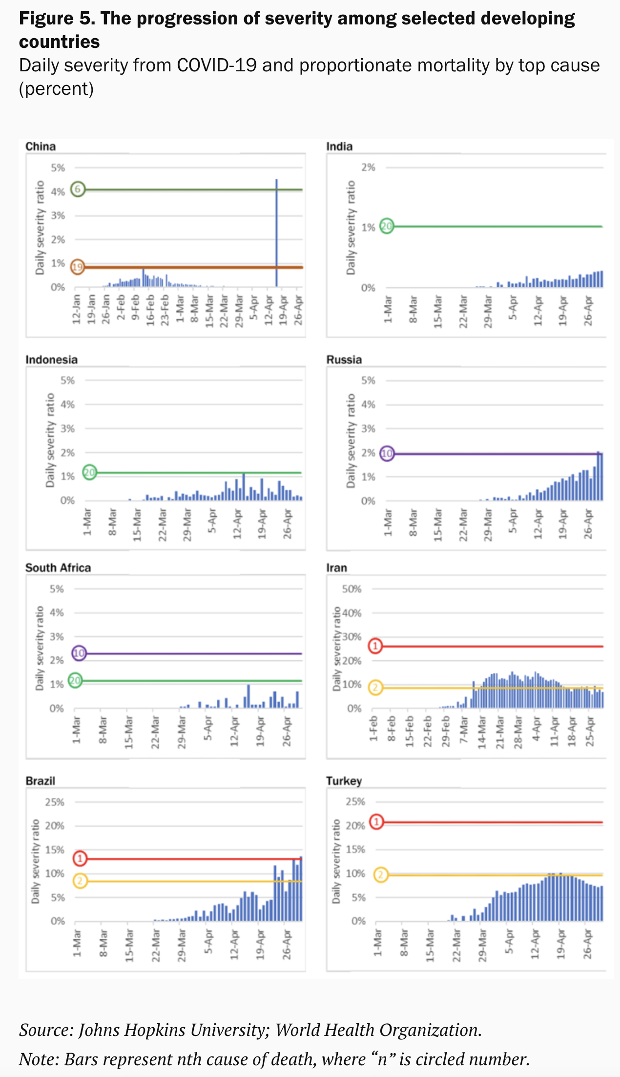
The patterns among developing countries are more muted, with some exceptions. Populous nations such as China and India report minimal severity at the level of the entire country; that obviously masks the severity in particular areas if the reported outbreak is more localized (think of China versus Hubei). Severity is still low in Indonesia, Russia, and South Africa, even though deaths in Russia are rising fast. Turkey has managed to keep severity below its second cause of death, but Brazil is registering sustained increases and COVID-19 has recently broken the threshold of the first cause of death.
For a disease that has spread so extensively and so rapidly, it is surprising that the distribution of the reported mortality burden is so unevenly tilted towards HICs. There are various reasons why we believe this is unreal. One culprit is data quality.
Demographic diversity confounds the numbers—most notably, the elderly are more vulnerable to the virus. But the developing world has been aging at breakneck speed and its population is huge, meaning there are many older people. In fact, developing countries count twice as many 60+ people as high-income countries.
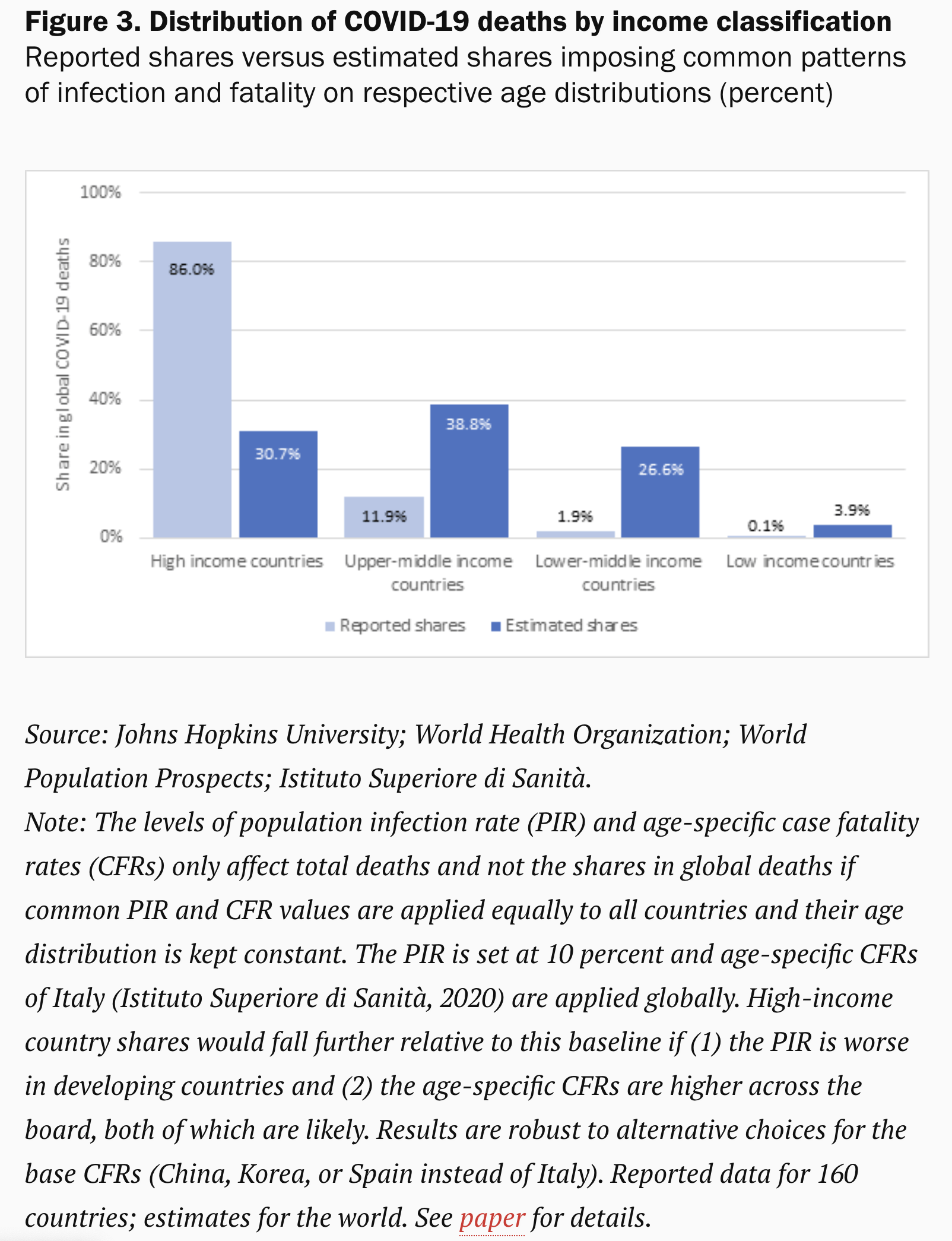
As Figure 3 suggests, proper accounting for age- and COVID-specific mortality patterns would tell us a radically different story (see paper for methods). We calculate that the share of HICs in total COVID-19 deaths could be three times lower on account of demography alone. The share for upper middle-income countries is likely three times higher. Those for LMICs and LICs would be, respectively, 14 and 39 times higher.
Comorbidities are another reason why the death toll in the developing world should be higher. A global meta-analysis highlights the importance of hypertension (21 percent), diabetes (10 percent), cardiovascular disease (8 percent), and respiratory system disease (1 percent) in severely infected patients. These are highly prevalent in the developing world. Two-thirds of the 1.1 billion people with hypertension live in developing countries. Diabetes has been increasingly rapidly.
Environmental factors such as temperature, population density, and sanitary conditions will matter too, in different ways, as does the availability and quality of health care. Furthermore, the policy response will have to differ across countries. Informal and self-employment will pose a particular challenge as will urban density. Some 65 percent of urban populations in LICs and 27 percent in middle-income countries live in slums.
Data quality—accuracy, completeness, consistence, timeliness, and validity—is likely the main culprit why the true death toll is not reflected in the statistics. Where testing has been limited or untimely, data quality will suffer—as the experience in high-income countries has demonstrated.
Death may be better measured than infection, especially in HICs, but even so there is ample evidence that COVID-19 deaths are being misattributed to different causes. By some estimates, reported death rates in selected countries could be underestimated by 60 percent.
While better data quality is obviously desirable, it is an even taller order for poorer countries than that evidenced in the struggles in the richest countries in the world. Where vital statistics were poorly reported before the pandemic, measurement of COVID-19 mortality will inevitably be much worse.
We argue that the dichotomy in the mortality stats between high-income and developing countries is likely very significantly overrepresented. This will apply to the static comparison across countries and also the dynamic progression over time.
COVID-19 has been described as a heat-seeking missile speeding toward the most vulnerable in society. That metaphor applies not just to the vulnerable in the rich world; the vulnerable in the rest of the world are not more immune. They may actually be easier targets.
Developing countries may of course be at earlier stages of the pandemic than high-income countries. If true, this would bring however only temporary respite. The virus has already traveled the world over and structural features of developing countries may make them more susceptible to contagion.
As the pandemic unfolds, there will be a great need for understanding the anomalies over time and dissimilarities between countries. The method we propose provides a simple way to capture and dimension the severity of the crisis relative to well-understood pre-pandemic patterns of mortality.
It lends itself to comprehensive dashboards that provide progressive layers of granularity in many dimensions, such as age groups, comorbidity patterns, socioeconomic status, or economic geography. It could provide a clearer understanding of this deadly disease, without which effective medical and economic remedies will always be out of reach.
Note: Philip Schellekens is Senior Economic Advisor at IFC – World Bank Group and Diego Sourrouille is an Analyst at the World Bank.
Disclaimer: Posts by the Center for Global Development reflect the views of the authors, drawing on prior research and experience in their areas of expertise. CGD is a nonpartisan, independent organization and does not take institutional positions. Likewise, views expressed do not necessarily reflect those of the United Nations, the United Nations Development Programme, its programmes/projects or governments. The designations employed do not imply the expression of any opinion whatsoever concerning the legal status of any country, territory or area, or its frontiers or boundaries.